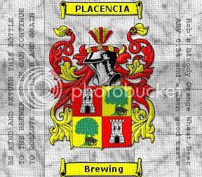
Think I'm going to change the bottom text so that it's in all caps and have it say "BREW HOUSE" instead of Brewery. It's still a work in progress though.
I think it might look better with out the banners there and fill the space with text.
Are the lines there suppose to make it look like the label had been folded? if so it should show over all the image and be a dark gray instead of black, a little thicker line that kinda fads on the edges.. nice work so far.
Does the crest have a meaning or is it just something you came up with?
Wow. That is a tough one. Not so certain I would want teh "Placencia" to be so prominent. Just me I am sure but, like scanning a beer shelf, when I scanned the thread title it said something entirely different that I would not want associated with my beer.
Placencia is an awesome little town in Belize. When I saw your brewery name I immediately thought of the great time I had in Placencia. In fact, I was expecting to see palm trees and coconuts instead of a castle and helmet on your logo.
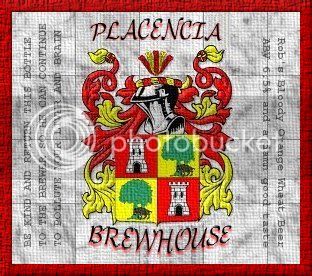
I like the crest but agree that the banners hinder the label. Perhaps a better typeface and the words right on the background would provide the possible "framing" of the label you are trying to create with the banners.
Placencia is also a town in SoCal. "The Bruery" in Placentia won two medals at the world beer cup this year.
Yeah I grew up in the high desert in SoCal and have passed by that city many times. It's said that the names Placencia/Placensia/Placentia all go back to the same family. Whether that's true or not I don't know. Yeah I think I'll ditch the banners and make some custom text in there.
I like the changes but I'd have to agree with Coy about those lines. I would suggest either getting rid of them or making them look like fold lines because right now it looks like a grid.
I like it better w/ out the banner/ribbon deals. But the font dosen't work w/ your image.
That font looks better not all caps.
Try a few serif fonts.
here are a few I thought might look good w/ your image. since your image has a history I thought a serif font would give it that timeless feel to it.
Bodoni
Cambria
Eccentric std
Garamond premier pro (or similar)
Georgia (prety close to garamond)
Gloucester mt.
I'm using GIMP, and my fonts are pretty limited at the moment. I need to look some up and import them. I would've loved to use some sort of old english or celctic style font bu I was just working with what I had. The lines will be a bit tricky to get rid of now that it's at this stage though, not impossible though
I like it better w/ out the banner/ribbon deals. But the font dosen't work w/ your image.
That font looks better not all caps.
Try a few serif fonts.
here are a few I thought might look good w/ your image. since your image has a history I thought a serif font would give it that timeless feel to it.
Bodoni
Cambria
Eccentric std
Garamond premier pro (or similar)
Georgia (prety close to garamond)
Gloucester

")
