What are you looking for? Do you have any ideas of how you want this to go? Do you have a brewery name? Are you looking for a clear simple oval image you and place on any label? Or do you want a detailed logo for large printing areas?
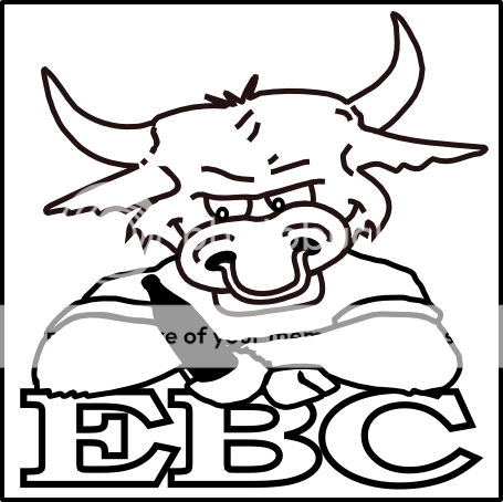
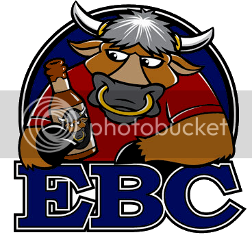
I would go with something like 3 colors to make it pop. I think this could easily go from being a good logo to an awesome one with some color added. The artwork itself is really solid, but it just doesn't smack a chair across your teeth without the contrast.
That's where I am having trouble. I've done a simple "fill in" with colors but it's still not very good. I have tried dropping in shadows and highlights but seems to go way beyond a simple 3 or 4 color process for printing.
If I used zazzle or whatever process would I be limited in amount of colors I used?
I can't remember about Zazzle, but CafePress is not limited in the number of colors like the old screen printing process is. Even local print shops are starting to get direct-print machines and saying to hell with tooling up for short-run screen prints.
That being said, I would stick to a limited palate but use gradients for more depth.