Need a logo for my labels...

Homebrew Talk - Beer, Wine, Mead, & Cider Brewing Discussion Forum

Help Support Homebrew Talk - Beer, Wine, Mead, & Cider Brewing Discussion Forum:

This site may earn a commission from merchant affiliate links, including eBay, Amazon, and others.

Chriso

Broken Robot Brewing Co.
Joined
Oct 31, 2007
Messages
4,618
Reaction score
89
Location
Someplace
Hey all.

I am competent at label design, but unfortunately, logo design is beyond my abilities. I really want one cohesive logo that I can use on all my labels, but have not come up with one yet.

The hard part is that I also do not have a clear idea of what I want - I just want it to be fun, probably simplistic/modern, and have the text "Damn Your Eyes! Brewing Co." on it. (Again, I plan to put this on every label I design, whether it's a weathered, antiqued style commemorative label, or just single-color for a haus ale.)

Anyone want to lend a hand? There could be packages with malt-based yeast samples in your future if you can help me out! :)
 
That's the inspiration for it. :D

Posts: 10,110 - by the way, nice binary!
 
as a fellow cornhusker fan, i'd be willing to give it a shot. other than the words, damn your eyes! brewing co., do you have any other thematic elements included from beer to beer (some people have named all their beers after trees (the bare tree brewing dude... uh, aekdbbop) or maritime phrases (the cutthroat brewery guy))... not suggesting either of those, but wondering if there were more thematic elements, or if it was more just a name for the brewing co. (and don't you love the parentheses inside paretheses?)

as far as the labels go, are you envisioning other graphics, or just the logo and text about the beer. if you're envisioning other graphics, i'm assuming you're planning on having them change from beer to beer?

colors? (personally a fan of scarlet and cream, for obvious reasons-- though i realize that this may not make for the most versatile logo.)
label shape? one shape for all your labels, or will it vary from beer to beer? if it's one shape, i'd want to make sure the logo would look good inside it (having a squarish logo inside an oval would make the logo smaller than if it was designed to fit) also, size of the logo?

probably WAY too many questions, and probably too detail oriented, but that's the way i think. let me know if you want me to take a stab at it, and such.
 
that's very cool of you, jeysiin. the more i think about it, the more i am envisioning some sort of a stamp - maybe even a wax seal. then, like old fashioned, perhaps slightly playbillesque, but not over the top bbq sauce playbillesque...... scarlet and cream could work into that, could look kinda like a maker's mark wax top.... what do you think?
 
THIS IS NOT what i've done for your logo. this is about 2.5 minutes in Paint. however, based on your posts, this is along the lines of what i envision. if it looks good, i'll go ahead and work from this. i just don't want to get all the way finished, and have you go "uh, not really what i was looking for." so this is kinda what i see when i think of the "damn your eyes! brewing co.

some other things: not the font i'd use. it was just the first one to come up in paint. also the text would wrap around the eye, rather than being straight. the exclamation point (at the bottom of the eye) would actually be a beer bottle. the "eyes" around the pupil would look more "veiny," and the eye would have veins running toward the pupil to give it a bit of a bloodshot look. this would make the word eyes look like part of that bloodshotty-ness, but would also make them pop a little bit (closer to the pupil/space between them and the rest of the veins)

it's hard to explain, but i can see it in my head. if you like this basic image, i'll go from there.

dyebc.JPG
 
the "eyes" would look more in place if you maybe made them look like the eye lashes...
 
RockfordWhite said:
the "eyes" would look more in place if you maybe made them look like the eye lashes...

i'd thought about doing that too.
 
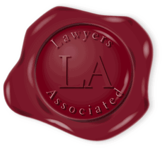
I'm picturing something very wax seal-y

00031-las.gif


Except even more part-of-the-wax than that one is.

sl1.jpg


Like that. Thats why i thought maybe scarlet and cream would work in well. I picture this being "stamped" as-is on every lable i design. Sometimes big, sometimes small. I picture "damn your eyes!" part very prominent with "brewing co" slightly diminished.

if you have deadspace you can fill with "lincoln, ne" too. that is totally cool.

i definitely get where you're going with that sketch, and i like it, but im thinking of something more modular, so to speak? more self-contained? idk. i should go back to drinking and football, and analyse this further when sober

thanks again for helping with this by the way! i really appreciate it! :D
 
OK, I came up with this concept.

logo%20copy.jpg


Except it's not waxy enough. I like the layout. I just want it to look more refined, and less like it's an orange 99c sticker that the gas station slaps on a bottle of Pepsi.
 
I was just messing around and came up with something like this...

the seal itself needs to be a little less jagged and more smooth around the edges to appear to be wax.. rather than a poorly drawn freeform that I have :D

waxseal-deadyoureyes.gif
 
Back
Top