Label Series Critique

Homebrew Talk - Beer, Wine, Mead, & Cider Brewing Discussion Forum

Help Support Homebrew Talk - Beer, Wine, Mead, & Cider Brewing Discussion Forum:

This site may earn a commission from merchant affiliate links, including eBay, Amazon, and others.

Panik

Active Member
Joined
Nov 14, 2009
Messages
41
Reaction score
0
Location
Tampa
Yup, another in a long list of requests for feedback on labels ;)

I kinda working on a bit of a theme here with my brew labels....a bit of a homage to SWMBO if you will. This is based partially on her willingness to put up with me spending money we don't have on brew stuff and largely on the fact that she's busy brewing our second child and won't be able to enjoy any of the fruits of my labors until mid-summer.

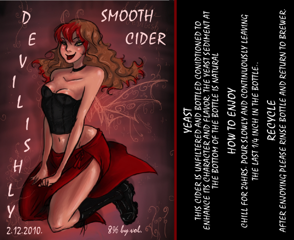
Anycase I would appreciate any help or feedback on how I can improve these labels. I've already used the cider label, as it was for my first homebrew, but I'm very much open to incorperating any suggestions folks have on it.

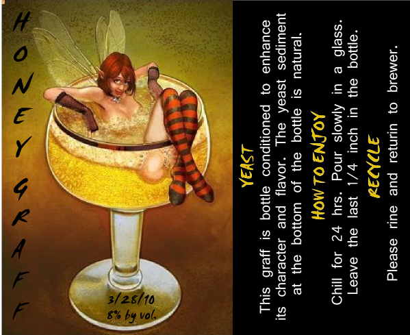
The second label is still a work in progress. Although I'm generally encouraged by how it's looking I think it could use a little polishing.

Smooth_Cider_Web.png


Honey_Do_Graff_Web.png


And yes the better half is a petite, pixie-ish red blonde fireball - hence the theme. She also happens to be the most beautiful woman I know. If I'm nice she might let me post some pics of her one day :D
 
Yup, another in a long list of requests for feedback on labels ;)
Honey_Do_Graff_Web.png

I might have to steal this(with permission, of course) and modify it for use on *my* Graff batch. I think it's *that* good.

Congrats on the familial addition. I am in a similar boat with our 4th due in October.

Z.
 
Thanks for the compliments dudes! I was in no way shape or form expecting that!

I do have to say that I can't really take credit for all of the work....I did a little creative browsing on that there interweb for the base art. I wish I could have used the original art for the Graff but little miss thing needed some strategic foam placement in order to make her decent for public viewing.

Zombie - Congrats to you as well! You've got more courage than I do, I'm barely handling one and a pregnant wife. Four....that's just wow! By all means feel free to use the label as you see fit. PM if you would like and I can see about sending you a copy of the master.

Smitty - Thanks again for the compliment! I just wish I was talented enough to take credit for the whole endeavor.
 
They look great! I'd suggest using another font for the information under Yeast, How to Enjoy, and Recycle (but leave those subheads as is), so you can have the copy be upper and lowercase--it's easier to read that way. And I'd give the words a bit more breathing room on the edges. What does the "DO" in the upper right mean?
 
Thanks for the suggestions machinelf! I agree about the spacing of the text on the side label and will make the change when I get a moment.

Unfortunately using lower case on the general text in the side bar actually makes it harder to read when the label is printed due to shrinkage issues. I would like to find a different font that works better but as of yet haven't come up with one. Any suggestions?

The "Do" in the upper right was actually supposed to be part of the name: "Honey Do Graff". I meant it as kinda a triple play on words....as in:

1) The graff would would be good to have after getting the "Honey do list"
2) I think that this might be a drink that my honey might actually do, as in drink
3) I used 1.5lbs of orange blossom honey in the receipe

I may just have to drop the "Do" and leave it as Honey Graff instead, I couldn't figure out a way to spatially incorperate the "Do" any better into the name of the beverage.
 
They are awesome, but I'd like to see the graff one with stockings that only come part way up the calf. Just curious to see how it would look with a little leg cleavage at the knee...
 
OK, 1st of all let me say that you sir, have some serious talent! Now that being said, I think the cider label could use a wee tweak. I notice that the way the upper portion of her butt curve back into her body kind of makes her butt look rather large & bulbous. Even if she's thrusting a hip out & arching her back, I don't think it should be quite so big.

I think if you make that butt curve a little smaller & bring the line up in a slow curve, reversed from the current one, and extend it upward to form her back, you'd get a much more natural looking butt. Other than that, I think it pretty much rocks. I could mention that her left boob is lower than her right boob, but Bettie Page had that same sort of thing going on & everybody likes to look @ Bettie. Nice subtle touch on her semi-translucent top.

Now the graff label: I think you need to change the text color, parts of it are kind of hard to read against the darker background areas. The vertical text worked for the cider label, but it doesn't seem to work quite as well for the graff. Maybe if you made "Honey do" into 1 word & put it on the left, with "Graff" on the right it would work better. Other than that, I wouldn't touch a thing, the artwork is superb!

And lastly, I gotta say (with all the respect I can muster) your swmbo is one HOT mama! Congrats & good luck with the wee one on the way. Regards, GF.
 
Gratus - You are giving me way too much credit. Thank you....but as I said early I did a little shopping on the internet to find the base images. I wish I could take credit for drawing these women. While I can manage to edit and change images, developing them from scratch is sadly beyond my capabilities. I do agree with you however about the issues with cider image.

Lol, one of the reason's I was drawn to the girl in the first image was her booty. What can I say I'm a fan of them :rockin: Unfortunately, at printing the semi-translucent top doesn't really show up on the label, but you are right the person who drew these had a pretty good eye for detail!

All that being said I do have some edits for the Graff logo. Dropped the "Do" from the text, changed the sidebar text styles and colors, and for you Homercidal a bit of a comparision. I was able to edit out the stockings so there knee highs.

Again folks I very much appreciate your input, and SWMBO was very flattered by all the attention this post is getting. Please let me know what you think of the changes.

Honey_Do_Graff_Wup1.png


Honey_Do_Graff_Wup2.png
 
I think these are great! My only criticism is font, in both examples.

I'd probably be inclined to go with Garamond, Trajan, or maybe even Bickham Script if it looks good on the label.

Perhaps smaller on a bottle it'll look a bit nicer though.
 
Whoops! Thanks for the head up on the mispelling - missed that in the rework. Thanks for the tip on the fonts. I'll check them out this evening.... one of the problems I had been having was readability once the label was shrunk down to printing size. I'll give those fonts a try.
 
Very Nice. Maybe make the title a san sarif in white. I would also keep the "do" in the title. Move the date & abv to the right corner. I understand you are not trying to make that look like it is part of the glass, but my eye thinks it's part of the glass regardless. As for the descriptions; I might make put the title on the left on the same plane as the rest of the text, which i would make a bit smaller, but a little bigger and with color as you have. This will emphisize the label more than the info.
 

Latest posts

Back
Top