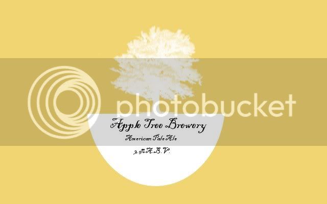
i think it looks great i really like the simplicity of it as well as your choice of colors. why the half oval at the bottom? is it an oval label? if it will be printed as a rectangle like it looks, consider making an apple with a tree growing out of the top of it. apple + tree. i am not a huge fan of your type choice but everyone likes what they like. if you change the half oval into a apple then have a tree coming out of the top of it do you need to write the brewery name? the name of the brewery could be inferred pictorially if it is done well. just some thoughts