You are using an out of date browser. It may not display this or other websites correctly.
You should upgrade or use an alternative browser.
You should upgrade or use an alternative browser.
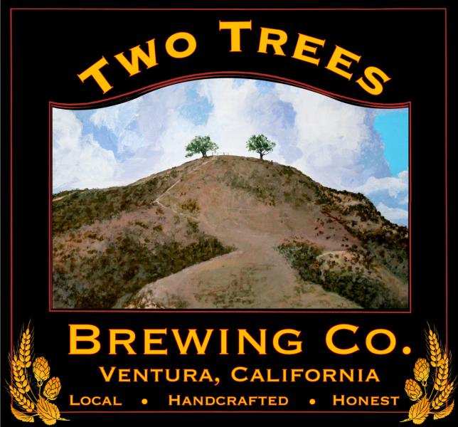
Two Trees Brewing Logo/Label
- Thread starter Phunhog
- Start date

Help Support Homebrew Talk:
This site may earn a commission from merchant affiliate
links, including eBay, Amazon, and others.
pretty cool. Id scale down the size of the picture and maybe crop it a little smaller so that the hill is not the focal point, but the trees are the focus. Honestly I didnt notice the 2 trees till I looked. Just a little small to be the representative feature in the name of your brewery.
D-MOTITAN
Well-Known Member
I like it. The two trees in the distance give it a more micro brew feeling. With the large mountain it gives it some depth. Ill take a extra large......

i like everything about it except the picture.. for some reason its not appealing to me when people incorporate images in their labels that look "too real"
that said, i would zoom in on the two trees more and put some effects on the photo that would make it look more artsy (maybe a posterize filter)?
that said, i would zoom in on the two trees more and put some effects on the photo that would make it look more artsy (maybe a posterize filter)?
Thanks for the comments and suggestions!! The scale of the two trees is something I was struggling with. I decided to show more of the hillsides because the Two Trees are a popular, local landmark and hiking area. Heck Two Trees even has it's own FB page with over 10K fans
 The scale of the two trees is something I was struggling with. I decided to show more of the hillsides because the Two Trees are a popular, local landmark and hiking area. Heck Two Trees even has it's own FB page with over 10K fans
Here is the finished product on a t-shirt! http://www.facebook.com/pages/Two-T...53428554.47044.102323289804018&type=1&theater I pretty much just kept it the same but I am really happy with the finished product. Cheers!! Al
$22.00 ($623.23 / Ounce)
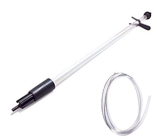
AMZLMPKNTW Ball Lock Sample Faucet 30cm Reinforced Silicone Hose Secondary Fermentation Homebrew Kegging joyful
无为中南商贸有限公司

$27.29 ($13.64 / Count)
$41.99 ($21.00 / Count)
2 Pack 1 Gallon Large Fermentation Jars with 3 Airlocks and 2 SCREW Lids(100% Airtight Heavy Duty Lid w Silicone) - Wide Mouth Glass Jars w Scale Mark - Pickle Jars for Sauerkraut, Sourdough Starter
Qianfenie Direct

$172.35
2 Inch Tri Clamp Keg Manifold With Ball Lock Posts, Pressure Gauge, PRV (0-30 PSI) – Homebrew, Fermentation, Kegging System
wuhanshijiayangzhiyimaoyiyouxiangongsi

$58.16
HUIZHUGS Brewing Equipment Keg Ball Lock Faucet 30cm Reinforced Silicone Hose Secondary Fermentation Homebrew Kegging Brewing Equipment
xiangshuizhenzhanglingfengshop

$7.79 ($7.79 / Count)
Craft A Brew - LalBrew Voss™ - Kveik Ale Yeast - For Craft Lagers - Ingredients for Home Brewing - Beer Making Supplies - (1 Pack)
Craft a Brew

$53.24
1pc Hose Barb/MFL 1.5" Tri Clamp to Ball Lock Post Liquid Gas Homebrew Kegging Fermentation Parts Brewer Hardware SUS304(Liquid Hose Barb)
Guangshui Weilu You Trading Co., Ltd

$53.24
1pc Hose Barb/MFL 1.5" Tri Clamp to Ball Lock Post Liquid Gas Homebrew Kegging Fermentation Parts Brewer Hardware SUS304(Liquid Hose Barb)
yunchengshiyanhuqucuichendianzishangwuyouxiangongsi

$39.22 ($39.22 / Count)
Brewer's Best Home Brew Beer Ingredient Kit - 5 Gallon (Mexican Cerveza)
Amazon.com

$176.97
1pc Commercial Keg Manifold 2" Tri Clamp,Ball Lock Tapping Head,Pressure Gauge/Adjustable PRV for Kegging,Fermentation Control
hanhanbaihuoxiaoshoudian

$10.99 ($31.16 / Ounce)
Hornindal Kveik Yeast for Homebrewing - Mead, Cider, Wine, Beer - 10g Packet - Saccharomyces Cerevisiae - Sold by Shadowhive.com
Shadowhive
![Craft A Brew - Safale S-04 Dry Yeast - Fermentis - English Ale Dry Yeast - For English and American Ales and Hard Apple Ciders - Ingredients for Home Brewing - Beer Making Supplies - [1 Pack]](https://m.media-amazon.com/images/I/41fVGNh6JfL._SL500_.jpg)
$6.95 ($17.38 / Ounce)
$7.47 ($18.68 / Ounce)
Craft A Brew - Safale S-04 Dry Yeast - Fermentis - English Ale Dry Yeast - For English and American Ales and Hard Apple Ciders - Ingredients for Home Brewing - Beer Making Supplies - [1 Pack]
Hobby Homebrew

$33.95
Five Star - 6022b_ - Star San - 32 Ounce - High Foaming Sanitizer
Bridgeview Beer and Wine Supply
Bottom-Side-Up
Well-Known Member
The Shirts look Sweet!
Similar threads
- Replies
- 2
- Views
- 531
- Replies
- 17
- Views
- 2K
Latest posts
-
-
-
-
-
I just poured 42 bottles of HB Dunkelweizen down the drain
- Latest: IslandLizard
-
-

