The "We'll fix your label for you" thread

Homebrew Talk - Beer, Wine, Mead, & Cider Brewing Discussion Forum

Help Support Homebrew Talk - Beer, Wine, Mead, & Cider Brewing Discussion Forum:

This site may earn a commission from merchant affiliate links, including eBay, Amazon, and others.
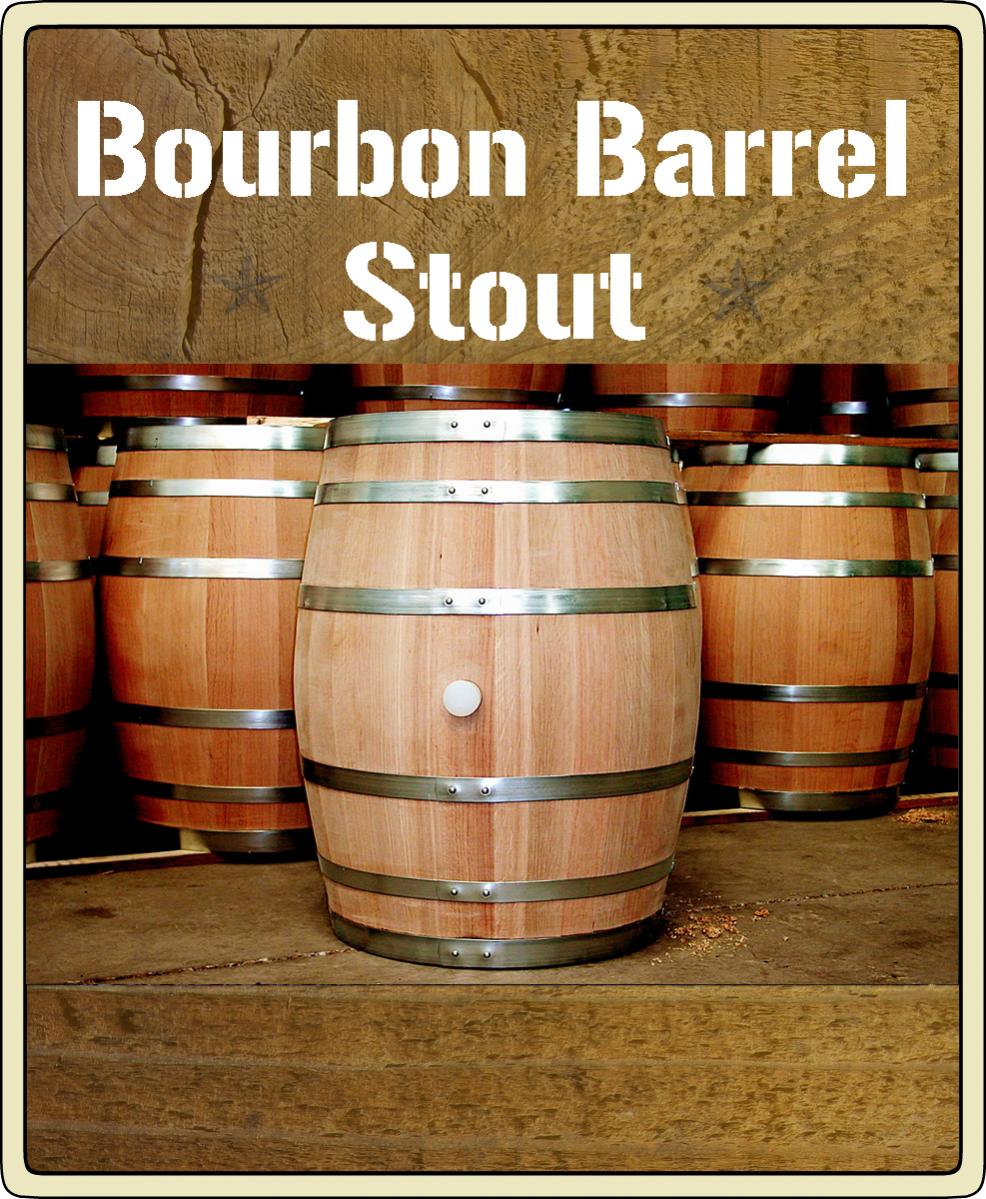
This is my attempt at like a brand into wood for a bourbon barrel stout. I don't really like it that much. I want to incorporate wood into the design somehow but other than that feel free to do whatever.. the Nebraska outline was just something to take up space (I just recently moved to the Omaha area) so it doesn't have to be in there. Thanks in advance!
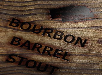
BourbonBarrel1.jpg
 
This is my attempt at like a brand into wood for a bourbon barrel stout. I don't really like it that much. I want to incorporate wood into the design somehow but other than that feel free to do whatever.. the Nebraska outline was just something to take up space (I just recently moved to the Omaha area) so it doesn't have to be in there. Thanks in advance!

I think all you need to do is change the perspective, make it more straight on, and not from the top down.

T
 
This is my attempt at like a brand into wood for a bourbon barrel stout. I don't really like it that much. I want to incorporate wood into the design somehow but other than that feel free to do whatever.. the Nebraska outline was just something to take up space (I just recently moved to the Omaha area) so it doesn't have to be in there. Thanks in advance!

Google "wood" and find one you like, then Google "fonts" and also find one you like then post your choices here and I'll take it from there.
 
Okay awesome thanks so much!!
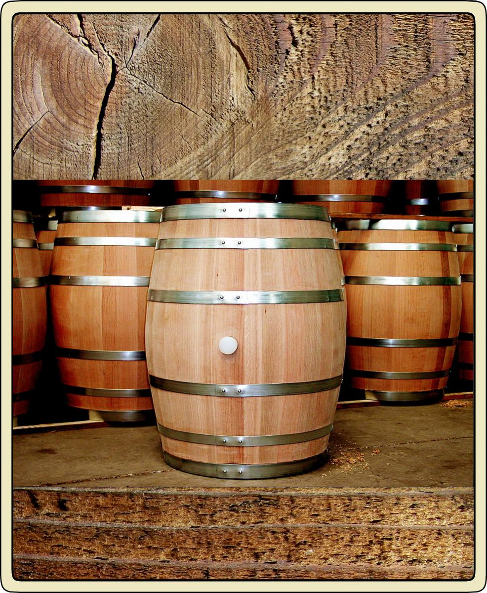
Here is the wood I think would look good. As far as fonts I am not picky at all just pick one you think looks good and I will be happy with it!
Thanks again!

wood.jpg
 
Here is a full blank if you want to add your own text and such.

bbstout1full.jpg
 
Not really at the label stage, but if someone wanted to spruce up my logo that would be cool. The extent of my photo editing skills - I drew this by hand, printed it out, and used a combination of copy/pasting screenshots, and cutting out, taping together and photocopying. So terrible.

In any case, I'm not set on the font, but its called "a song for jennifer" from some free font website. I thought it went well with the line-drawing look of the background, but I'm not set on it.

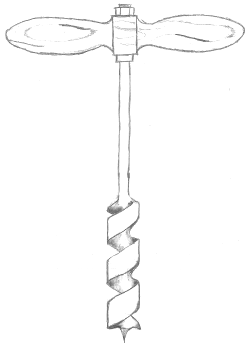
Anyway, here's the logo I've come up with so far, plus the original line drawing.

ABC logo.JPG


large auger line drawing.png
 
Not really at the label stage, but if someone wanted to spruce up my logo that would be cool. The extent of my photo editing skills - I drew this by hand, printed it out, and used a combination of copy/pasting screenshots, and cutting out, taping together and photocopying. So terrible.

In any case, I'm not set on the font, but its called "a song for jennifer" from some free font website. I thought it went well with the line-drawing look of the background, but I'm not set on it.

Anyway, here's the logo I've come up with so far, plus the original line drawing.

Nice drawing! I'll put a few ideas together for you in the morning if nobody else takes it up. Like it.
 
Not really at the label stage, but if someone wanted to spruce up my logo that would be cool. The extent of my photo editing skills - I drew this by hand, printed it out, and used a combination of copy/pasting screenshots, and cutting out, taping together and photocopying. So terrible.

In any case, I'm not set on the font, but its called "a song for jennifer" from some free font website. I thought it went well with the line-drawing look of the background, but I'm not set on it.

Anyway, here's the logo I've come up with so far, plus the original line drawing.

Do you have anything else to add to it? Interests, beer styles, or do you just want the auger and text?
 
For now just the auger and the text...once I get that part worked out I want to work it into a standard label format where I can plug in beer name and info to print for bottles.
 
For now just the auger and the text...once I get that part worked out I want to work it into a standard label format where I can plug in beer name and info to print for bottles.

2aetl5y.jpg


257egdk.jpg


1esvly.jpg


n1qals.png


Here are a few quick sketches I did on CAD, let me know what I can fix, change, or if it's way off.

I do not have access to the font type you posted, AutoCAD has this Cityblueprint type though. If you prefer the text you had maybe someone else can slap it on.
 
I like the third one...I'm really just looking to get the logo to "pop" a little more with some color, bolder font etc vs. the kind of plain jane b&w line drawing style I had some up with. Like I said, I'm not at all set on the font I had chosen, open to suggestion there. I think the wood-grain theme works well with the name. The circle style works well because it leaves some room on the lower right for beer information as well. Thanks!
 
I had a friend of mine sketch this, but we don't have a program to make it cleaner or with color and I'm terrible at MS Paint. I'd be thrilled to have someone take a look and see if this can be dressed up. I'd like this to be the generic on-every-bottle label and then add the particular beer name to the label later. The Cantrell and Greene can be removed and for the shield I'd like the spade to be black, the RH to be red and the shield some other color that goes well with the first two, but I'm ready for any and all suggestions.

We're in Naval aviation, helicopters to be exact and that's where the wrench, wings, and trident come from.

Thanks for taking a look!

View attachment Rotor Head1.PDF
 
I like the third one...I'm really just looking to get the logo to "pop" a little more with some color, bolder font etc vs. the kind of plain jane b&w line drawing style I had some up with. Like I said, I'm not at all set on the font I had chosen, open to suggestion there. I think the wood-grain theme works well with the name. The circle style works well because it leaves some room on the lower right for beer information as well. Thanks!

I agree...that looks really good! Great logo...good work cad jockey!
 
I had a friend of mine sketch this, but we don't have a program to make it cleaner or with color and I'm terrible at MS Paint. I'd be thrilled to have someone take a look and see if this can be dressed up. I'd like this to be the generic on-every-bottle label and then add the particular beer name to the label later. The Cantrell and Greene can be removed and for the shield I'd like the spade to be black, the RH to be red and the shield some other color that goes well with the first two, but I'm ready for any and all suggestions.

We're in Naval aviation, helicopters to be exact and that's where the wrench, wings, and trident come from.

Thanks for taking a look!

Wings are a little out of my league but here is the center part.
Now if you find a set of wings on google you like I can incorporate them.

Original logo.jpg


Logo.jpg
 
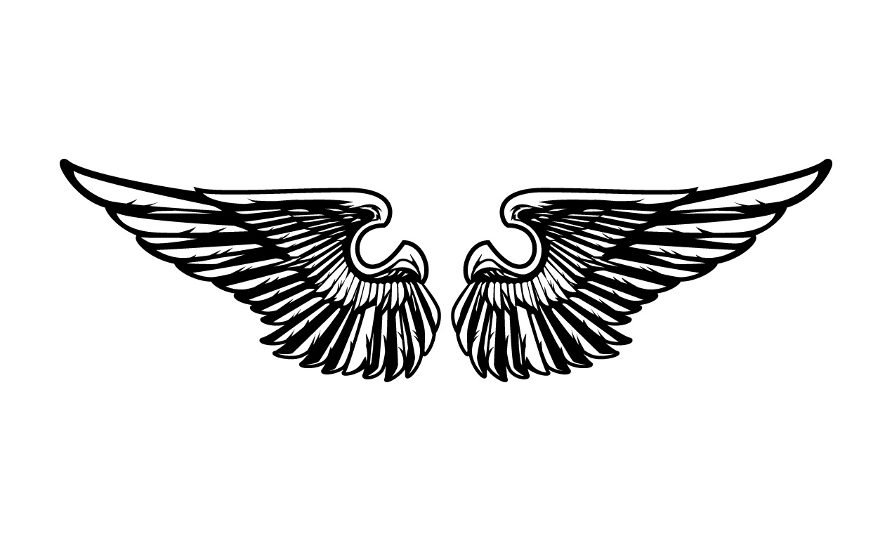
Thanks Jinks! Here's a set of wings that look pretty cool. What do you use to make the designs? I'd like to be able to figure out how to do this on my own instead of taking up your time.

image.jpg
 
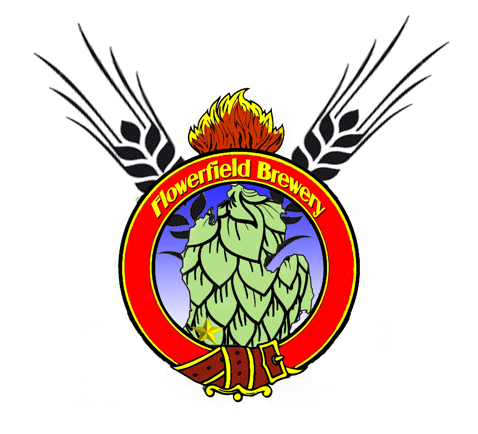
Had a different idea with my logo, I was a mechanic in the army and I'd like to use the ordnance crest and then I found this one I attached with the state of Michigan in it and I think its perfect except its not for my brewery...was thinking something with Barley replacing the cannons, recoloring the outline of Michigan to make it look like a hop cone, and changing the text to Flowerfield Brewery and possibly moving that star in the Michigan shape to the lower SW corner where Marcellus is.

I attached the original ordnance crest also for reference as I want it to be recognizable if possible

View attachment 1416472102883.jpg

View attachment 1416472121715.jpg
 
Thanks Jinks! Here's a set of wings that look pretty cool. What do you use to make the designs? I'd like to be able to figure out how to do this on my own instead of taking up your time.

If you become a little more familiar with MS Paint, it is possible to make something decent. Even if you find a picture of each element of your logo and save it in Paint as .PNG with a white background, you can use the drop down command of Select > Enable transparent background > Select all.

Then with a little planning you can simply layer one piece on top of another. Clever use of Print Screen - Copy - Paste commands can make Paint a valuable, easy to use tool if you don't have a better program.

I was screwing around with your logo on lunch yesterday but of all things, could not find a trident that looked good with the other pieces I found.
 
I'll definitely look into that CAD, as with all the other things in brewing, if I can figure out how to do it on my own (armed with the amazing amount of knowledge on HBT) the finished product seems to be more satisfying. I'll play around with MS Paint this weekend and see where I get. Thank you!
 
I'll definitely look into that CAD, as with all the other things in brewing, if I can figure out how to do it on my own (armed with the amazing amount of knowledge on HBT) the finished product seems to be more satisfying. I'll play around with MS Paint this weekend and see where I get. Thank you!

No problem man. If nobody hits you up I will put some time into yours if you like. Its a cool idea so I'll play with it when I have time. I'm sure tomorrow is going to be brutally slow around here so I can probably get our graphic designer to let me use her programs for a bit.
 
Thanks Jinks! Here's a set of wings that look pretty cool. What do you use to make the designs? I'd like to be able to figure out how to do this on my own instead of taking up your time.

I use Adobe Photoshop Elements 2.0 that I got many moons ago with a Canon Rebel Camera I bought.
Inkscape does alot of the same things.withwings.jpg

A little bit of color for the wings.Greywings.jpg

Fun with gradient for the wings.Gradientwings.jpg
 
JINKS I absolutely love it, my only concerns are the two sides of the red circle seem empty but I have no idea what to put there and also the brewery name doesn't seem pronounced enough...

However, I do appreciate it very much and if you don't feel like messing with it anymore that's fine too. I enjoy it very much. Thank you
 
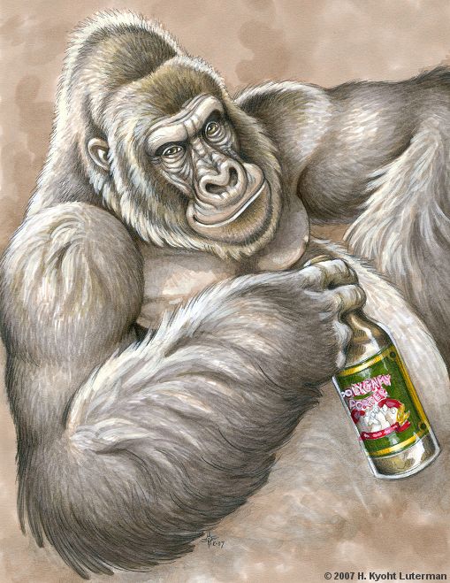
I'm not really ready for labels yet... Silverback Brewing, is what I call my brewery. I was thinking a handsome silverback like myself ;-) holding a stein, Silverback Brewing up top and "When It Comes To Beer, We Don't Monkey Around " at the bottom. Or something or not... Thanks for even considering to help us schnucks. Tom
 
I'm not really ready for labels yet... Silverback Brewing, is what I call my brewery. I was thinking a handsome silverback like myself ;-) holding a stein, Silverback Brewing up top and "When It Comes To Beer, We Don't Monkey Around " at the bottom. Or something or not... Thanks for even considering to help us schnucks. Tom

That sounds awesome
 
JINKS I absolutely love it, my only concerns are the two sides of the red circle seem empty but I have no idea what to put there and also the brewery name doesn't seem pronounced enough...

However, I do appreciate it very much and if you don't feel like messing with it anymore that's fine too. I enjoy it very much. Thank you

Blue from Michigan state flag?
And a little drop shadow to the text. It gets late and I forget the obvious.

messinground.jpg
 
I'm not really ready for labels yet... Silverback Brewing, is what I call my brewery. I was thinking a handsome silverback like myself ;-) holding a stein, Silverback Brewing up top and "When It Comes To Beer, We Don't Monkey Around " at the bottom. Or something or not... Thanks for even considering to help us schnucks. Tom

Hey found this on g**gle
Maybe someone creative can replace the bottle with a stein etc. Way beyond my limited skills

Polygamy_Porter_Gorilla_by_kyoht.jpg
 
I really like the blue, however the area I was referring to was actually on the red on either side of flowerfield brewery

Also the drop shadow on the font seems fantastic...thanks again jinks
 
I'm not really ready for labels yet... Silverback Brewing, is what I call my brewery. I was thinking a handsome silverback like myself ;-) holding a stein, Silverback Brewing up top and "When It Comes To Beer, We Don't Monkey Around " at the bottom. Or something or not... Thanks for even considering to help us schnucks. Tom

I'll give this one a shot.

SILVERBACK_BREWING.PNG
 
Anyone want to help with this one? I like the crest/plaque idea and the black bird holding a hop bone (kinda like the dove and the olive branch)
 
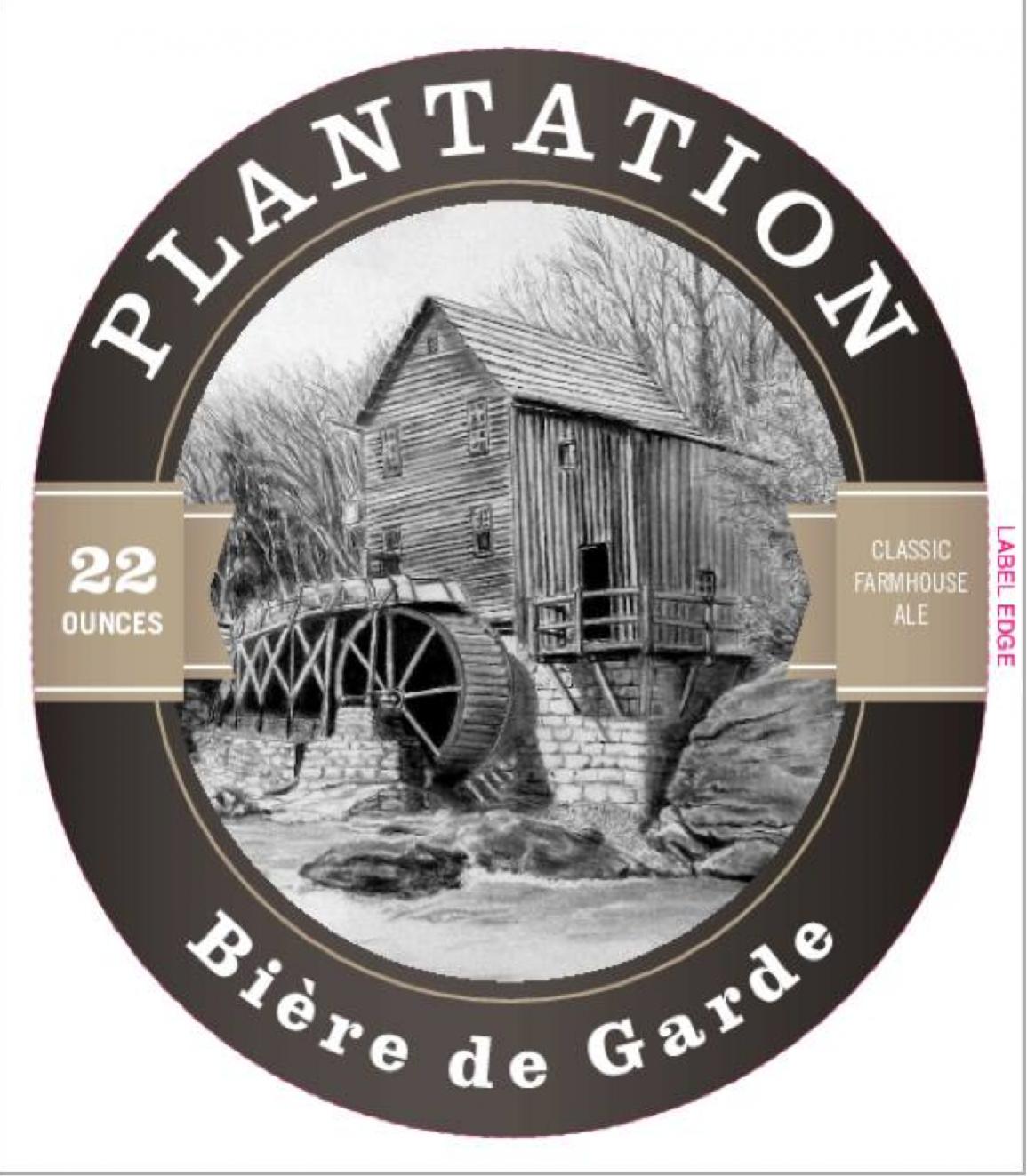
Just came across this thread. Great Idea. I was actually going to have some of my daughter's artistic friends take my current label and see if they could simplify it for me. I brew under the name Quaboag Brewing. We live along the Quaboag river in Central Massachusetts and wanted my label to reflect the mill history along the banks of the river. Wanted to use the image of an old Grist Mill with the waterwheel. Problem is the label that I put together is too detailed and I wanted something that was a bit less busy and could be etched onto glass. Love the way the folks at http://treehousebrew.com/ did their label so looking for something along those lines with regard to the design/style. I'll attach the detailed version that I have been using from my last batch of Biere de Garde. Any assistance I could get with this would be greatly appreciated. Thanks.

Screen Shot 2014-10-17 at 4.26.59 PM.jpg
 
I really like the blue, however the area I was referring to was actually on the red on either side of flowerfield brewery

Also the drop shadow on the font seems fantastic...thanks again jinks

With est date

messinground.jpg
 

Latest posts

Back
Top