Tell me who I'm ripping off / if you like these labels

Homebrew Talk - Beer, Wine, Mead, & Cider Brewing Discussion Forum

Help Support Homebrew Talk - Beer, Wine, Mead, & Cider Brewing Discussion Forum:

This site may earn a commission from merchant affiliate links, including eBay, Amazon, and others.

cladinshadows

Well-Known Member
Joined
Jan 8, 2009
Messages
217
Reaction score
25
Location
Long Beach
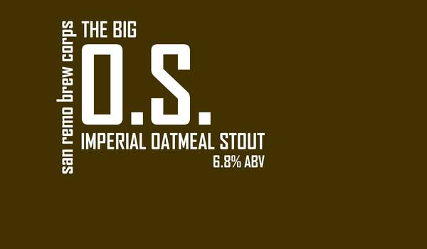
So I came up with these labels late one night, and I know I've seen this style somewhere....who/what am I ripping off with these? And if nobody can figure out the answer to that, what do you think of them?

munich.jpg


hopjuice_v2.jpg


iipaii_v2.jpg


Summit_v2.jpg


and lastly...
 
Simple. Effective. I kinda like em.

I think you're ripping off an album cover - maybe multiple - but I can't recall which...
 
I like the labels a lot!

The remind me of Nick at Night for some reason. Something 60's or 70's... Very retro!
 
Remind me of Joy Division Album covers..wait..New Order Album covers! Except they are to bright, but the style is similar.
 
I also think they look like Redhook. They get my stamp of approval FWIW. I am usually not a fan of putting a lot of text on beer labels but you've done it excellently. Just enough wit to make me read them all and the text isn't crowding the rest of it. Very nice.
 
are'nt they like one of those vitamin waters? I like them though, dont feel bad about it, cuz I think I'm gonna steal them now.:D
 
Argh... Why can't I be creative!?

Well if it makes you feel any better, it took me the better part of 6 months full of horrible ideas before I came up with one that I even liked at all! You can't force it, just play around with some ideas and all of a sudden, at 3AM on a weeknight it'll happen...
 
Bauhaus, modernist typography, constructivism, suprematism, off the top of my head it reminds me of Merz Magazine by El Lizzitsky. i couldnt find the specific work on line but i will look in some books at home.
 
Whoa those are sharp.

They remind me of cleaned up Great Divide labels. I really like those.
 
Jan Tschichold
tscichold1.gif


El Lizzitsky
lissitzky-mayakovsky.jpg


Couldnt find what i was looking for in any of my books but these give you an idea of the typographic structure these guys used. The one i was looking for is a solid red rectangle with black type arranged in a geometric structure like yours. I am guessing this was not the answer you were looking for but who ever you are "ripping off" was "ripping" it off of these guys.


Haha yeah I'm pretty sure that what I've got, like many things, is a seventh generation rip-off and nobody really remembers who started it anyway! The images you have there are definitely the closest thing I've seen, though. Fig 19-25, especially.
 
+1 on Great Divide.. knew I knew I recognized it a little but I couldn't place it. As soon as you said it, it clicked.

Who cares if they're close though? I think they look great.

grdiv1.jpg
 

Latest posts

Back
Top