Streamline Brewing Company

Homebrew Talk - Beer, Wine, Mead, & Cider Brewing Discussion Forum

Help Support Homebrew Talk - Beer, Wine, Mead, & Cider Brewing Discussion Forum:

This site may earn a commission from merchant affiliate links, including eBay, Amazon, and others.

Mountainbeers

Well-Known Member
Joined
Aug 31, 2009
Messages
473
Reaction score
0
Location
Morgantown, WV
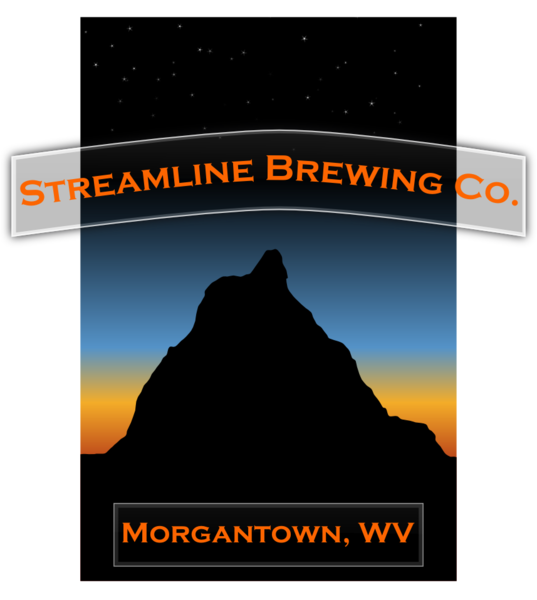
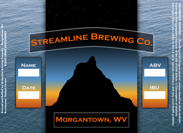
So I just spent the last few hours working on a generic label for all my beers. I am going to have blank spaces off to the left where I can fill in:

Name:
Date:
ABV:
IBU:

And the government warning off to the right.

I need labels that I will still be able to write on once they get here. I heard that www.onlinelabels.com was an OK resource but that the glue sticks to the bottles. What do you guys use?

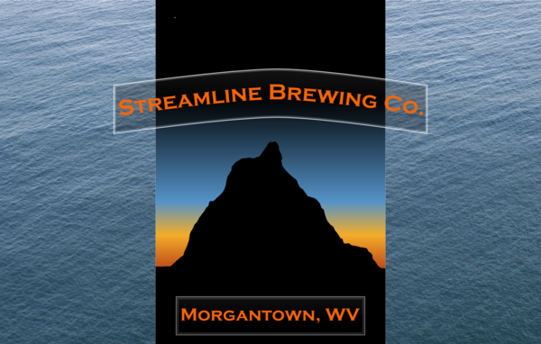
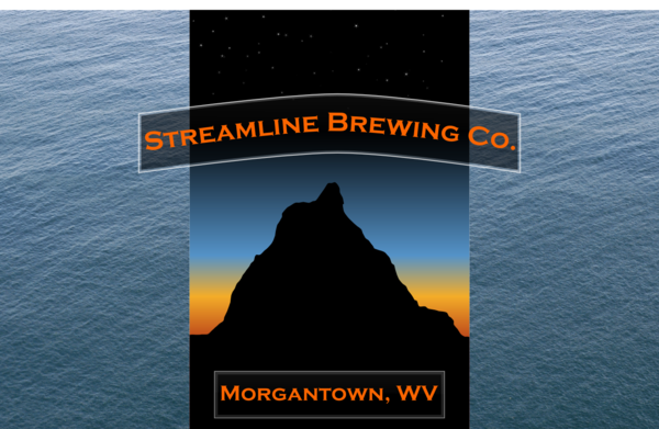
Here's what I've got so far:

StreamlineBrewing2.png


I used Inkscape and the tutorials from http://screencasters.heathenx.org/ to create it. Prior to this I had no experience with Inkscape so I'm hoping this was a good first go at it!

Please give me feedback even if you hate it!

EDIT: I put a link to this thread in my signature because I want everybody's input on this. Even if you tell me to scratch it and start over!
 
Hey Mtnbeer-

I really like your label art, and I like your name.....just don't know if they go together.....to me, "Streamline" means quick and efficient, but your label conveys slow and relaxed...tranquil. Maybe thats what you are going for though...the opposites?

Just my 2 cents

DHBM
 
Hey Mtnbeer-

I really like your label art, and I like your name.....just don't know if they go together.....to me, "Streamline" means quick and efficient, but your label conveys slow and relaxed...tranquil. Maybe thats what you are going for though...the opposites?

Just my 2 cents

DHBM

Yea I agree. I am a swimmer and streamline is a position in swimming lingo so that's where the name came from and I really like the sound of it. The mountains come in bc I'm brewing it up in the mountains. I also want to put "Morgantown, WV" at the bottom. I was thinking somehow trying to incorporate water, or something cutting through water, might tie it together better. But that still might not translate to people who don't get the whole streamline thing.
 
Maybe if you can make the pic look just a bit more "daylight", then you could put a small lake in front with a swimmer in it?
 
I'd suggest changing the font to something more 'streamlined', and choosing a different colour. The turquoise doesn't really stand out.

Otherwise, a nice concept :D
 
What do you think? Too Halloweeny? I can't decide on a font color that stands out.

StreamlineBrewing3.png


I really think I should decide on a font before I move on to the rest.
 
OK so I realize the water isn't showing up behind the text. That is a fair amount of work and I wanted to get some opinions on the water before I go any further. I like it. I don't know that I love it. Although I could probably keep the water and do some pretty cool touch ups to make it look more professional and less like clip art.

I found the water at http://www.cgtextures.com/. Let me know if you see something on there you like more. It's all free!!!!

StreamlineBrewing4.png
 
Here I increased the opacity behind the text so that there was more contrast on the "STR" and the "CO."

Don't know how it happened but somewhere along the line I lost my stars. I have to fix that one!

StreamlineBrewing4_3.png
 
for me, the water background doesn't really fit. the original with the orange text looked fine to me.
if it doesn't bother you having the name refering to water but not having any in the graphic, then leave it. you have a good name and a good original graphic, it's just how they fit together.
Remember, you can get good advice here on the forum, but in the end, you can ignore us and do what you want if you like it better.:D

Yea to tell you the truth I just kind of like the water. I don't think most people would make a connection between that and the name anyway.
 

Latest posts

Back
Top