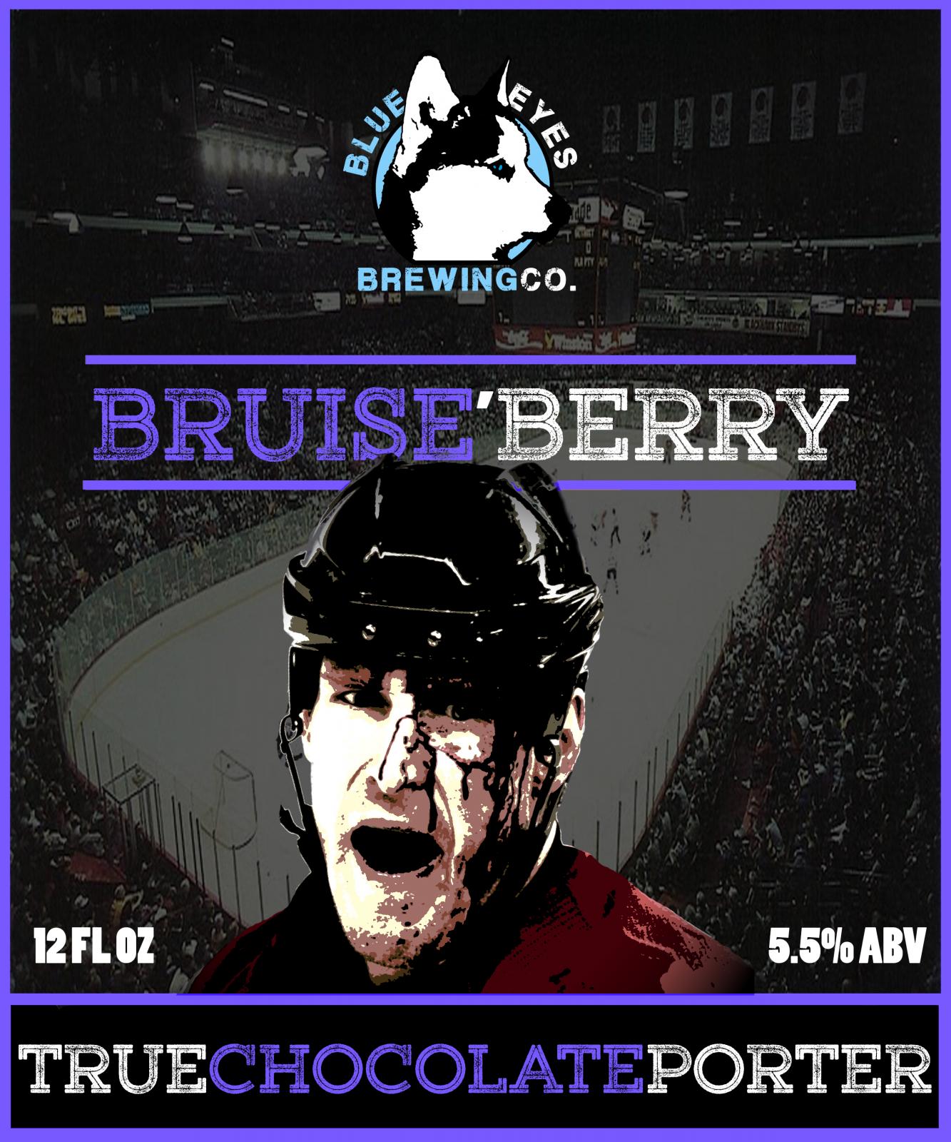
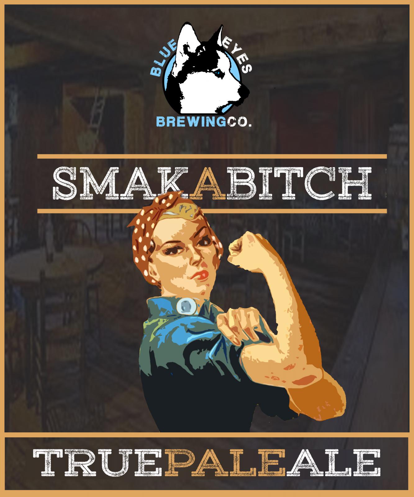
Not finished yet but here goes... I may draw my own ship instead of using the clipart version.
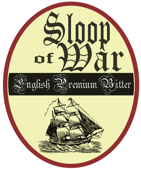







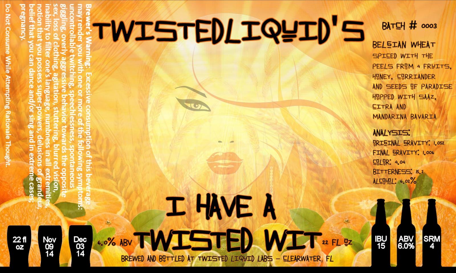
Finished my 2nd label this morning for my Wit.
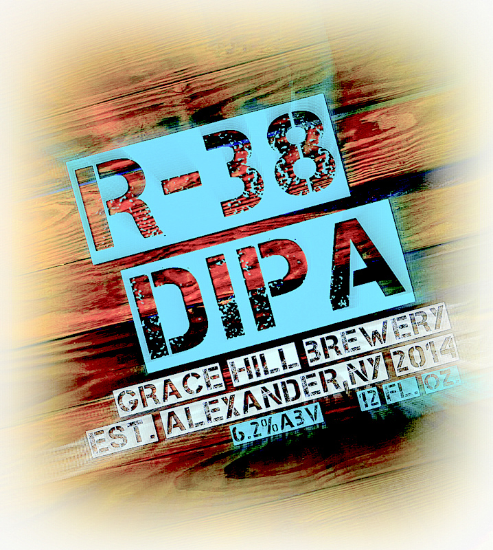
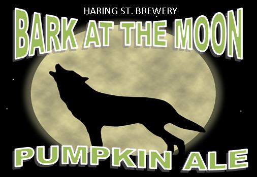

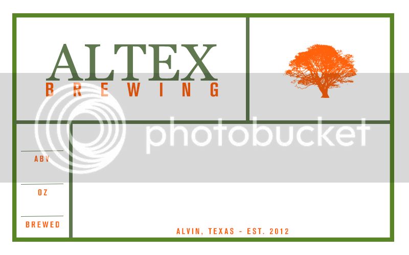
So.. this isn't yet a label... that's in the works as well!
I've been messing around with a bunch of random ideas, but I like the potential of this design. I'd appreciate some feedback before I continue to re-learn/experiment with PS.

In the interest if complete honesty, I would say that it looks cheap. Conceptually I think it works but it looks very unrefined. Have you played with turning the mug around 180 and using the naturally curved handle as your first "C"?
