How about this? The color of the hops didn't come across correctly on the web, they are much duller and blend well with the rest of the label. They're too brightly colored in the browser, dang HTML colors...
Oooh yeah! That looks way better!

How about this? The color of the hops didn't come across correctly on the web, they are much duller and blend well with the rest of the label. They're too brightly colored in the browser, dang HTML colors...
I do not like the location of hopsMy first attempt at a label and logo for my brewery. Pretty simple for now as I am not that good at graphic design. Critique it, I wanna know what you guys think!
well inside the triangleI really like it! I don't think you need to change anything but since you asked for a critique... The only critique I really have for it is about the hop cones. They look a little out of place to me but I like the idea of having them somewhere in the label, maybe inside the triangle? I don't know, I'm not an expert graphic artist or anything.

I do not like the location of hops
well inside the triangle
I do not like the location of hops
well inside the triangle


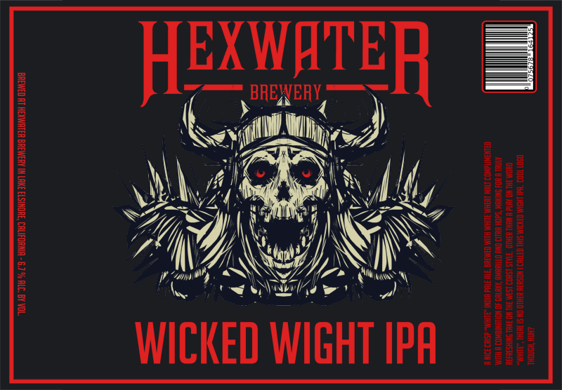
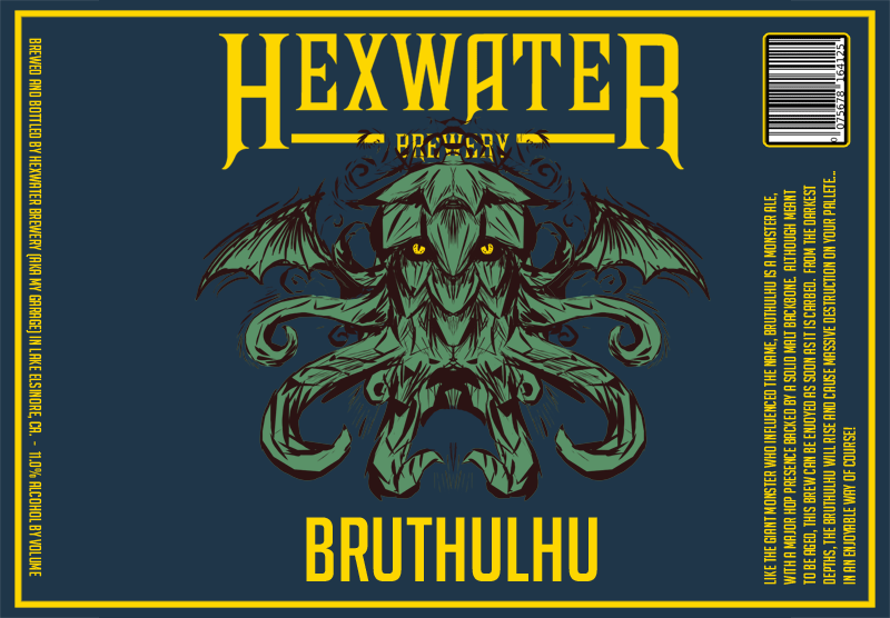
Couple more
I do not like the location of hops
well inside the triangle


A few I've been working on...
NICE job. I like the labels a lot.
Just sent you a friend request on Untappd btw...

A few I've been working on...

@Titan88 Matt your French Ale label reminds me of my Napoleonic Stout...
@Titan88 Matt your French Ale label reminds me of my Napoleonic Stout...


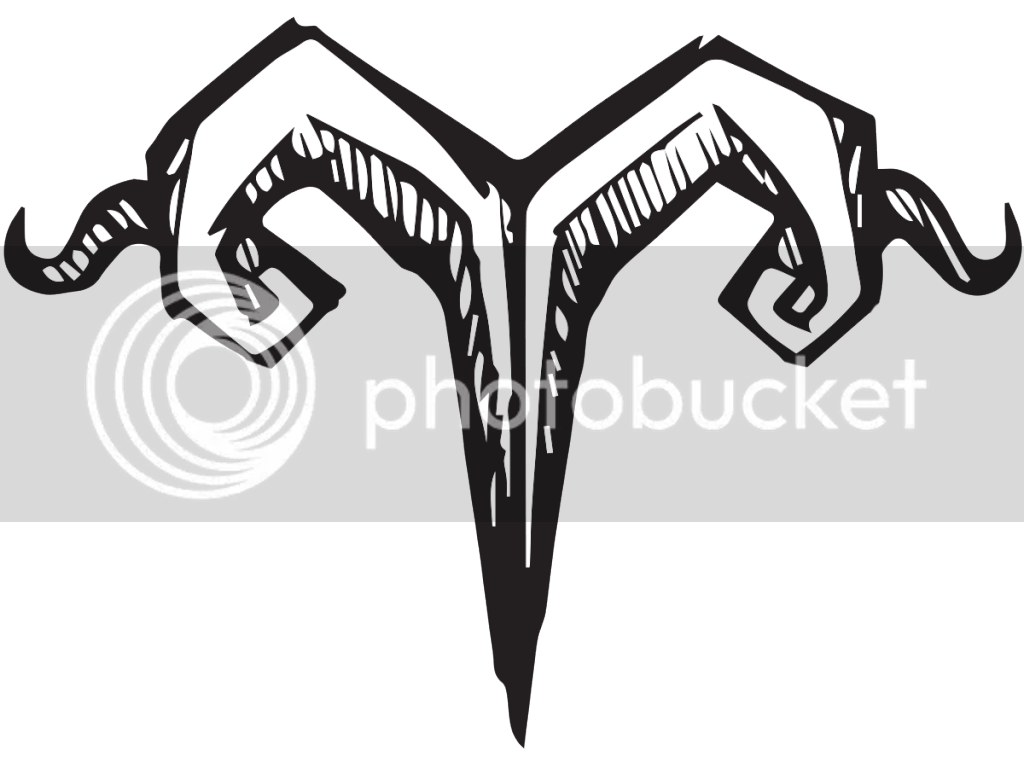
Ive been wanting to come up with a simplistic label template. Took my inspiration from wine bottle formats. Both me and my daughter are aries so I figured this would go good. Not sure which one I like better though, Let me know what you think.
Ive been wanting to come up with a simplistic label template. Took my inspiration from wine bottle formats. Both me and my daughter are aries so I figured this would go good. Not sure which one I like better though, Let me know what you think.
Ive been wanting to come up with a simplistic label template. Took my inspiration from wine bottle formats. Both me and my daughter are aries so I figured this would go good. Not sure which one I like better though, Let me know what you think.


![Craft A Brew - Safale BE-256 Yeast - Fermentis - Belgian Ale Dry Yeast - For Belgian & Strong Ales - Ingredients for Home Brewing - Beer Making Supplies - [3 Pack]](https://m.media-amazon.com/images/I/51bcKEwQmWL._SL500_.jpg)


