You are using an out of date browser. It may not display this or other websites correctly.
You should upgrade or use an alternative browser.
You should upgrade or use an alternative browser.
Show Us Your Label
- Thread starter muse435
- Start date

Help Support Homebrew Talk:
This site may earn a commission from merchant affiliate
links, including eBay, Amazon, and others.
Sean
Well-Known Member
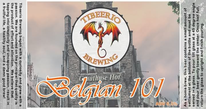
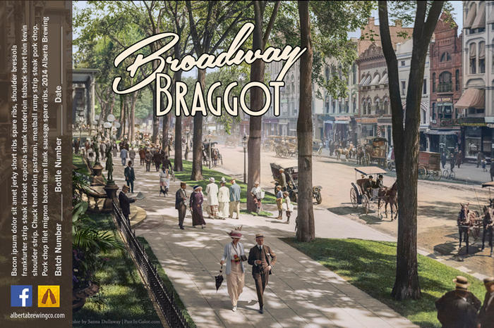
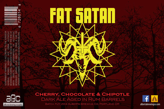
My label!

MarshmallowBlue
Well-Known Member
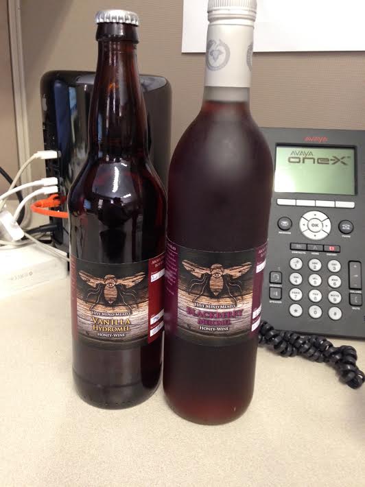
Blackberry Melomel and Vanilla hydromel. Labeled for a work party
cheesehed007
Well-Known Member
View attachment 210676
Just labeled up my Blackberry Wheat. Cheers!
Sent from my van, down by the river.
Clean and very simple. What method did you use to label your beers?
$22.00 ($623.23 / Ounce)
AMZLMPKNTW Ball Lock Sample Faucet 30cm Reinforced Silicone Hose Secondary Fermentation Homebrew Kegging joyful
无为中南商贸有限公司

$7.79 ($7.79 / Count)
Craft A Brew - LalBrew Voss™ - Kveik Ale Yeast - For Craft Lagers - Ingredients for Home Brewing - Beer Making Supplies - (1 Pack)
Craft a Brew

$10.99 ($31.16 / Ounce)
Hornindal Kveik Yeast for Homebrewing - Mead, Cider, Wine, Beer - 10g Packet - Saccharomyces Cerevisiae - Sold by Shadowhive.com
Shadowhive

$53.24
1pc Hose Barb/MFL 1.5" Tri Clamp to Ball Lock Post Liquid Gas Homebrew Kegging Fermentation Parts Brewer Hardware SUS304(Liquid Hose Barb)
Guangshui Weilu You Trading Co., Ltd

$53.24
1pc Hose Barb/MFL 1.5" Tri Clamp to Ball Lock Post Liquid Gas Homebrew Kegging Fermentation Parts Brewer Hardware SUS304(Liquid Hose Barb)
yunchengshiyanhuqucuichendianzishangwuyouxiangongsi

$176.97
1pc Commercial Keg Manifold 2" Tri Clamp,Ball Lock Tapping Head,Pressure Gauge/Adjustable PRV for Kegging,Fermentation Control
hanhanbaihuoxiaoshoudian

$479.00
$559.00
EdgeStar KC1000SS Craft Brew Kegerator for 1/6 Barrel and Cornelius Kegs
Amazon.com

$76.92 ($2,179.04 / Ounce)
Brewing accessories 1.5" Tri Clamp to Ball Lock Post Liquid Gas Homebrew Kegging Fermentation Parts Brewer Hardware SUS304 Brewing accessories(Gas Hose Barb)
chuhanhandianzishangwu

$44.99
$49.95
Craft A Brew - Mead Making Kit – Reusable Make Your Own Mead Kit – Yields 1 Gallon of Mead
Craft a Brew

$33.99 ($17.00 / Count)
$41.99 ($21.00 / Count)
2 Pack 1 Gallon Large Fermentation Jars with 3 Airlocks and 2 SCREW Lids(100% Airtight Heavy Duty Lid w Silicone) - Wide Mouth Glass Jars w Scale Mark - Pickle Jars for Sauerkraut, Sourdough Starter
Qianfenie Direct

$58.16
HUIZHUGS Brewing Equipment Keg Ball Lock Faucet 30cm Reinforced Silicone Hose Secondary Fermentation Homebrew Kegging Brewing Equipment
xiangshuizhenzhanglingfengshop

$20.94
$29.99
The Brew Your Own Big Book of Clone Recipes: Featuring 300 Homebrew Recipes from Your Favorite Breweries
Amazon.com
![Craft A Brew - Safale S-04 Dry Yeast - Fermentis - English Ale Dry Yeast - For English and American Ales and Hard Apple Ciders - Ingredients for Home Brewing - Beer Making Supplies - [1 Pack]](https://m.media-amazon.com/images/I/41fVGNh6JfL._SL500_.jpg)
$6.95 ($17.38 / Ounce)
$7.47 ($18.68 / Ounce)
Craft A Brew - Safale S-04 Dry Yeast - Fermentis - English Ale Dry Yeast - For English and American Ales and Hard Apple Ciders - Ingredients for Home Brewing - Beer Making Supplies - [1 Pack]
Hobby Homebrew

$159.50 ($26.58 / Count)
3M High Flow Series System BREW120-MS, 5616001, For Brewed Coffee and Hot Tea, Valve-in-Head Design
Amazon.com

$719.00
$799.00
EdgeStar KC2000TWIN Full Size Dual Tap Kegerator & Draft Beer Dispenser - Black
Amazon.com
JINKS
Fermentator Extrordinaire
- Joined
- Mar 2, 2014
- Messages
- 846
- Reaction score
- 357
View attachment 210676
Just labeled up my Blackberry Wheat. Cheers!
Sent from my van, down by the river.
Beerlabelizer is the bomb.
cheesehed007
Well-Known Member
MX1
Texas Ale Works
Here's the labels for our 2 beers we have already made (red ale, and porter) and the label for the pale ale that is fermenting now. Pale ale ABV is not correct on the current label. View attachment 208316
View attachment 208316View attachment 208317View attachment 208318
Sent from my iPhone using Home Brew
Where, how or whatever did you find or make the layout, I love it, the side text withthe gov warning and such, I need this...lol
J187
Well-Known Member
- Joined
- Jan 2, 2012
- Messages
- 857
- Reaction score
- 99
good idea for honey moonshine
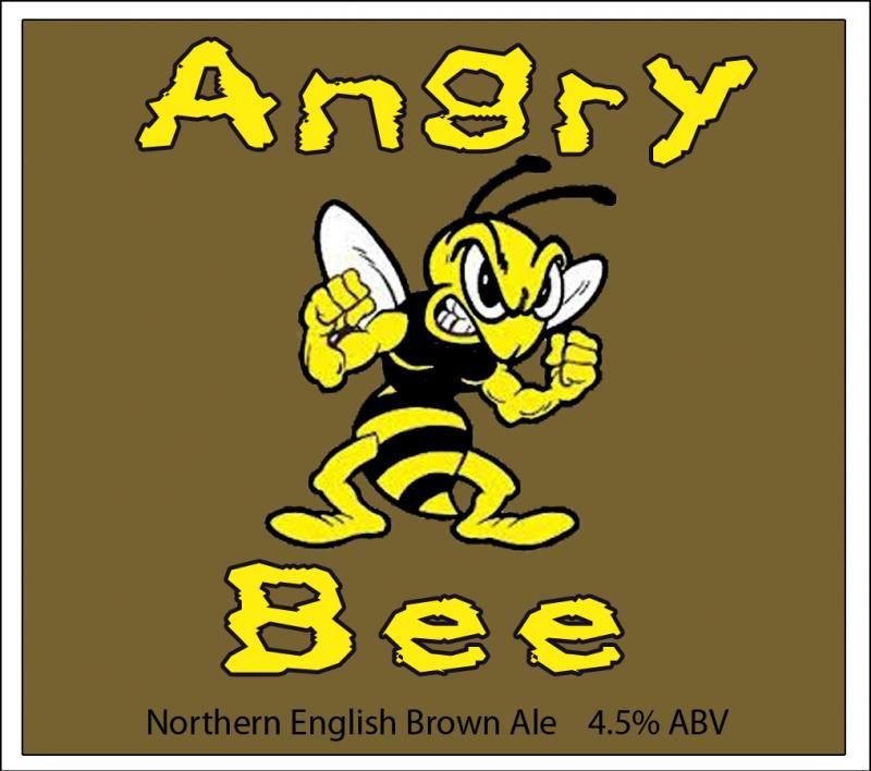
This idea came about because I set up everything to brew that beer on my deck...then I realized there was a HUGE bee hive in the gutter- the bees chased me off the deck and into the driveway... moving everything off the deck SUCKED.
philipCT
Brewniversity student
- Joined
- May 10, 2013
- Messages
- 771
- Reaction score
- 171
I'll be sampling the first bottle from this batch over this weekend. It was supposed to be more like 7.0% than 8.4%ABV so I hope it's not too dry. Fermented using a starter with 1056 at a lower temp than usual - around 62-64 rather than 68 and it really ate through that wort.


My first brew turned out great (a Brewers Best Dunkelweizen kit with black cherry added). Pretty happy with the label too, although I may change the name.
I'm a web designer by trade so I spend plenty of time in photoshop/illustrator.

I'm a web designer by trade so I spend plenty of time in photoshop/illustrator.

Bennywisest
Well-Known Member
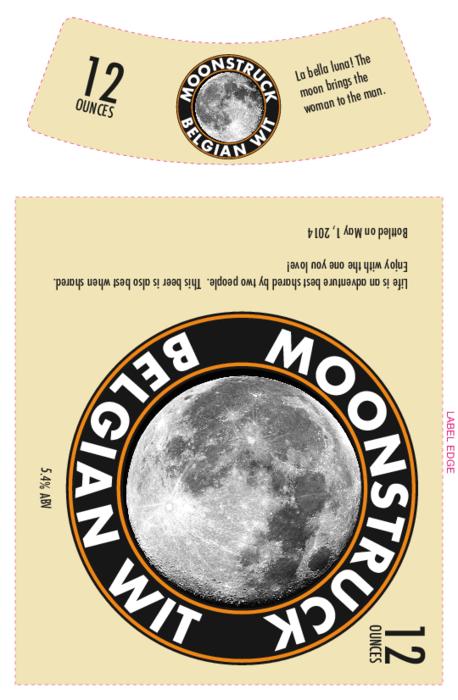
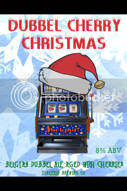
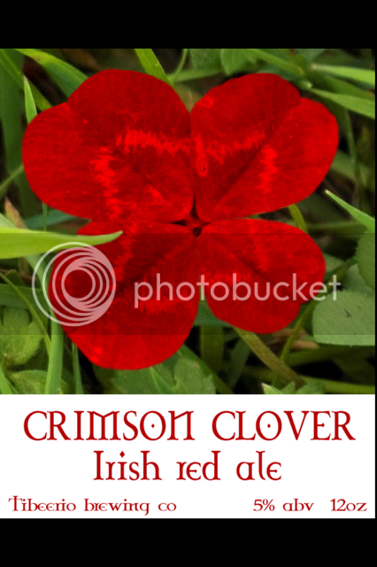
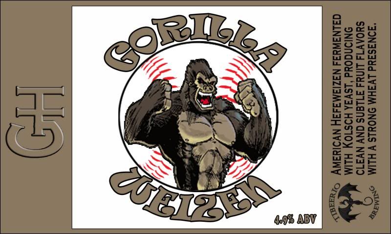
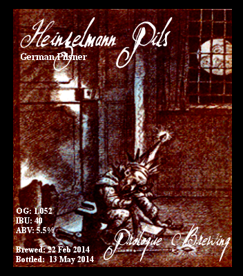
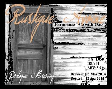
Here are two labels I put together recently.


Agentaaron
Well-Known Member
Working on a few labels...trying to keep them consistent...done in photoshop using borrowed ideas and elements from beerlabelizer.com
feedback is welcome and certainly appreciated...Cheers
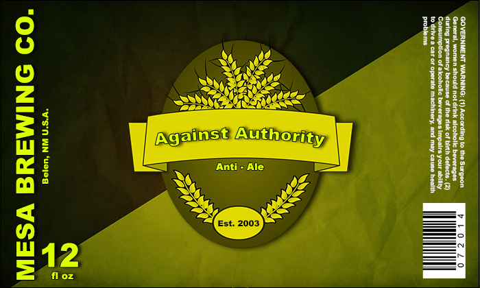

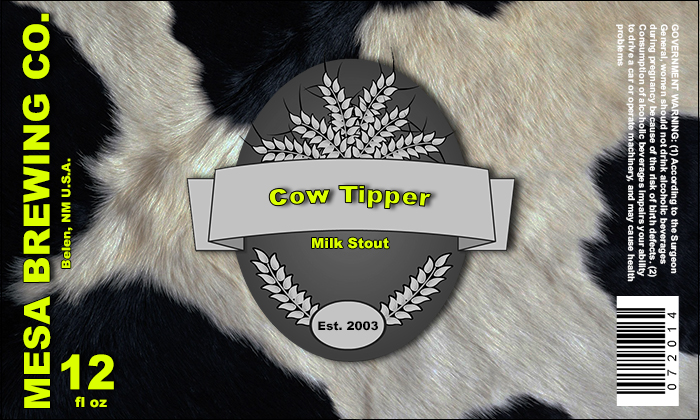

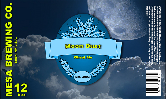
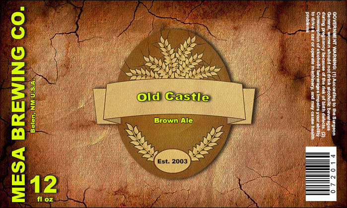
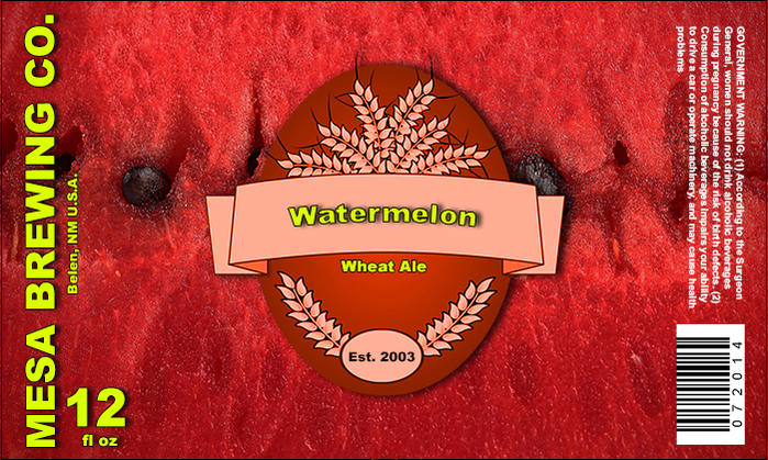
feedback is welcome and certainly appreciated...Cheers


Agentaaron
Well-Known Member
Sorry...duplicate post
Working on a few labels...trying to keep them consistent...done in photoshop using borrowed ideas and elements from beerlabelizer.com
feedback is welcome and certainly appreciated...Cheers
Nice job Agentaaron! Consistency is key and you did a great job with the overall template. I think the bright yellow could be more mellow, less green tint to it. I think it would blend better with your various designs.

twisted_metal
Active Member
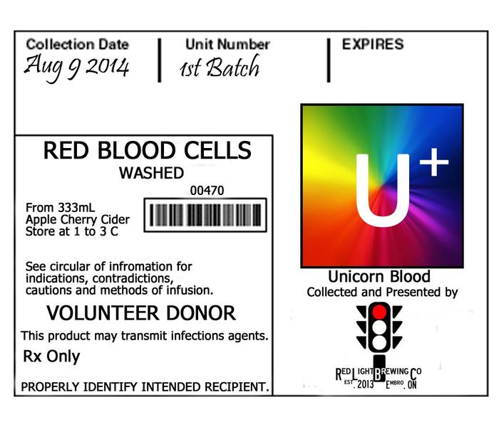
for the latest batch of Unicorn Blood.

sstapley_56
Member
- Joined
- Jul 16, 2014
- Messages
- 6
- Reaction score
- 8
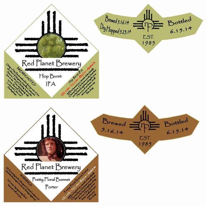
My first attempt at a label and logo for my brewery. Pretty simple for now as I am not that good at graphic design. Critique it, I wanna know what you guys think!


Finished the label for my BDSA which is a good thing since I bottled it today!
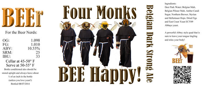

My first attempt at a label and logo for my brewery. Pretty simple for now as I am not that good at graphic design. Critique it, I wanna know what you guys think!
I really like it! I don't think you need to change anything but since you asked for a critique... The only critique I really have for it is about the hop cones. They look a little out of place to me but I like the idea of having them somewhere in the label, maybe inside the triangle? I don't know, I'm not an expert graphic artist or anything.
sstapley_56
Member
- Joined
- Jul 16, 2014
- Messages
- 6
- Reaction score
- 8
I really like it! I don't think you need to change anything but since you asked for a critique... The only critique I really have for it is about the hop cones. They look a little out of place to me but I like the idea of having them somewhere in the label, maybe inside the triangle? I don't know, I'm not an expert graphic artist or anything.
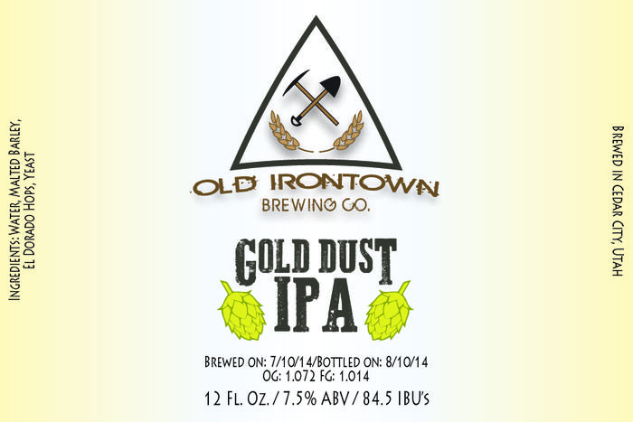
Thank you for the feedback, this was my first time working with illustrator so it's good to get positive comments. I'm with you on the hop cones. I knew I wanted to incorporate them somewhere because I love hops but didn't know where to put them. Maybe take them out of the logo and incorporate them into the brew name instead?
sstapley_56
Member
- Joined
- Jul 16, 2014
- Messages
- 6
- Reaction score
- 8
How about this? The color of the hops didn't come across correctly on the web, they are much duller and blend well with the rest of the label. They're too brightly colored in the browser, dang HTML colors...

Similar threads
- Replies
- 17
- Views
- 2K
- Replies
- 0
- Views
- 352
- Replies
- 130
- Views
- 7K

