My SMaSH
Nice! I think I can hear "Suicide is painless" playing in the background....

My SMaSH
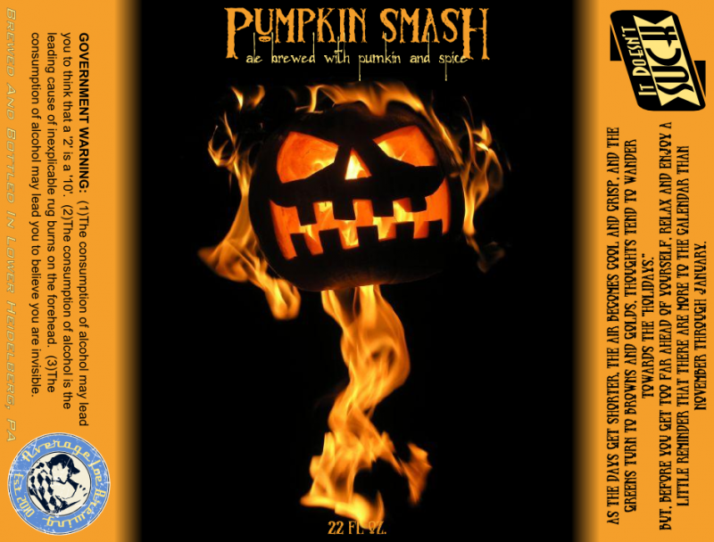
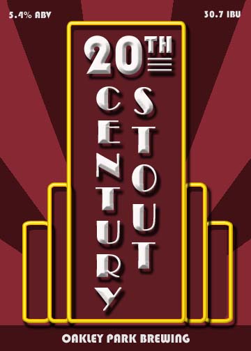
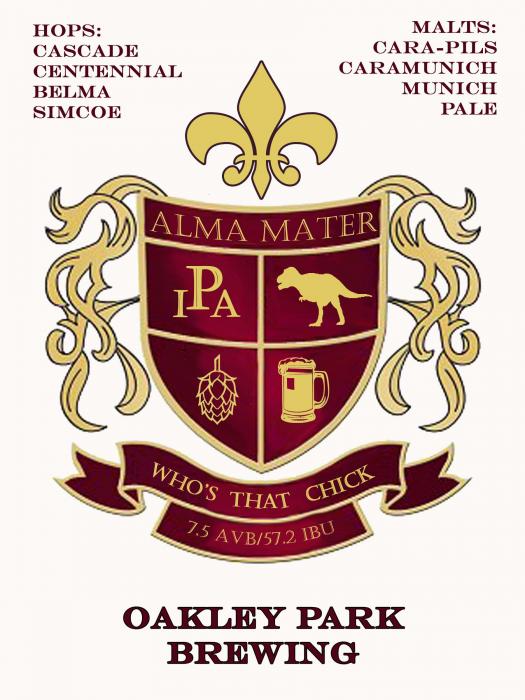
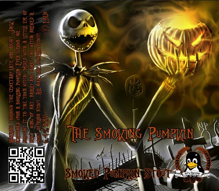
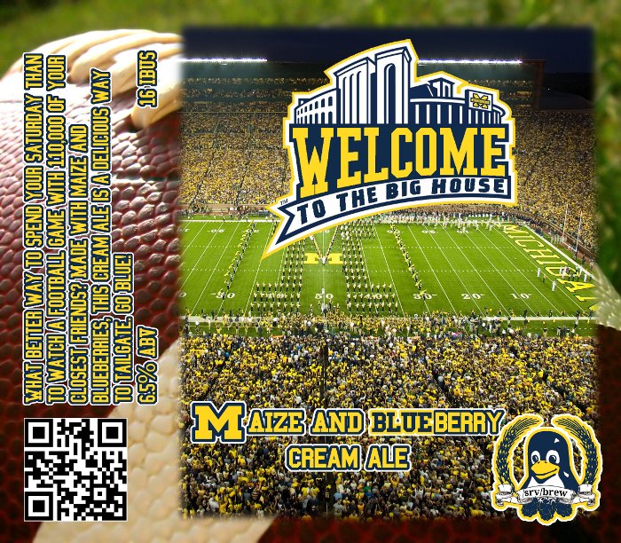
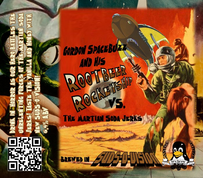
latest labels for a pumpkin ale and a smash
I like the look, but isn't the label or your logo on the smash sideways?
Borders rule! Well done.
Working to incorporate this into a label with QR code and link to SurveyMonkey poll to get customer feedback on the brews.




![Craft A Brew - Safale S-04 Dry Yeast - Fermentis - English Ale Dry Yeast - For English and American Ales and Hard Apple Ciders - Ingredients for Home Brewing - Beer Making Supplies - [1 Pack]](https://m.media-amazon.com/images/I/41fVGNh6JfL._SL500_.jpg)



Yeah, I think that's the way to go. I found a how-to on outlining text with the Paths tool, but the only hitch is that it will only outline it in black. Which works fine for this, since I think black outlining red would look better than vice-versa.
I use GIMP a lot. The easy way to do outlining for text is to use the select by color tool. It looks like a finger pointing at a blue, red and green strip. With your text layer selected, use the select by color tool, and select any of the text. Then, create a new layer (full size, transparent), position it underneath the text layer (using the layer dialog), then in the select menu, click grow. Grow it by however many pixels looks good (usually between 1 and 3), then use the paint bucket to fill it in. Make sure to select "Fill whole selection" for the bucket tool options. It may sound hard or like a lot of work, but it only takes a few seconds. Way easier than trying to mess with paths. Afterwards, you can merge the text layer down, and then autocrop layer (both in the layer menu at the top) to move it around if you want. I'm not sure how you got the glowy white stuff behind the font, but you can also use the same method to do that. All you have to do is grow it out more, then use the feather tool under the select menu. Play around with what you feel looks good.
GIMP is good, given a bit of time to get antiquated with it.
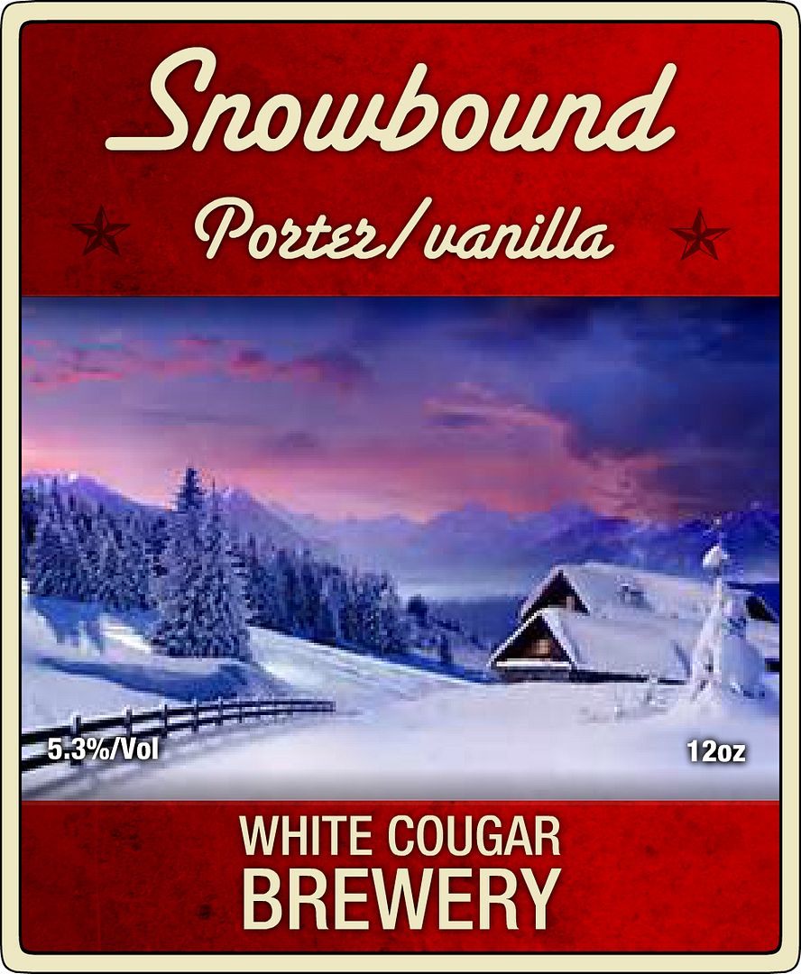
This was for my latest porter
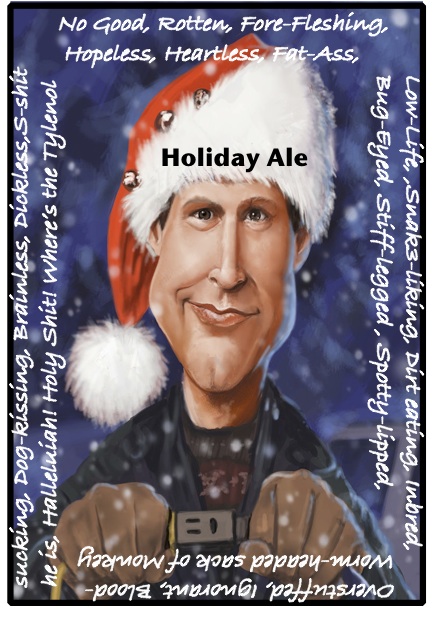
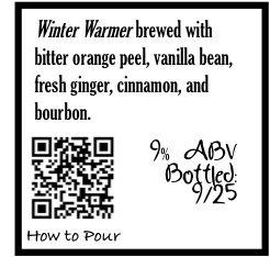
Looking for some constructive criticism.
This is only the 2nd label I've ever made.
I like to make the 'Holiday Ale' fit the contour of Clark's hat, and I think the quote might be too busy
 Just had an idea, seeing Holiday ale lit up brite would be pretty cool. Like on the plug or something.

Feeble attemptI think the busy-ness of the quote is fitting. Pretty creative. I think though you could do something different with Holiday Ale. Not shure what though.Different color or/transparent or different lettering style to start maybe?I could be wrong about that though. I still like it as is though.Just had an idea, seeing Holiday ale lit up brite would be pretty cool. Like on the plug or something. Just a thought...


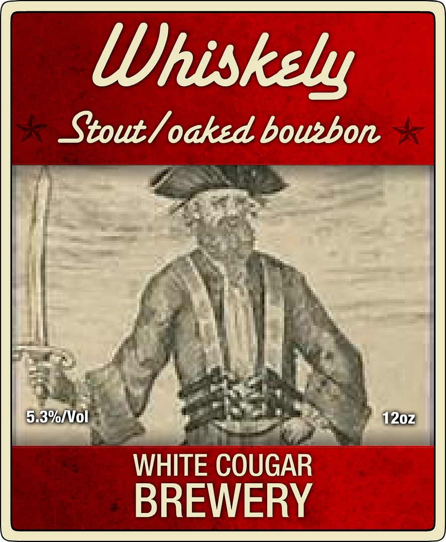
MikeCass said:My buddy just finished up the label for my pumpkin beer that will be ready to bottle on Sunday! I plan to print it on like a like brown type paper, same shade as cardboard. Anyone have any advice/info on printing or on where to find nice paper that would look good with this logo?
When we were kids we always considered ourselves "punks" haha and a popular saying is "up the punx" so I kind of combined them with pumpkins.
What do you guys think?
 [/URL]
 [/URL]
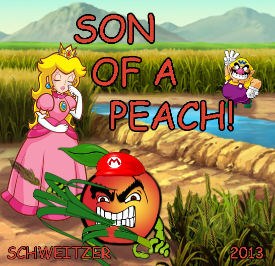
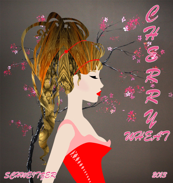


MikeCass said:The latest labels. I'm super excited the way they are turning out!
Awesome!MikeCass said:The latest labels. I'm super excited the way they are turning out!
Beersnob16 said:These are the labels for my first 3 batches.