• Please visit and share your knowledge at our sister communities:
  • If you have not, please join our official Homebrewing Facebook Group!

    Homebrewing Facebook Group

Show Us Your Label

Homebrew Talk

Help Support Homebrew Talk:

This site may earn a commission from merchant affiliate links, including eBay, Amazon, and others.
My first time playing around with Gimp. Looking for some input on the concept more then the execution sine it was my first time. I will look for a better font that is more vintage WWII poster font to use. But what do yall think of the military them and the basic idea of the labels. Any advice would be much appreciated.

Make the font stand out more use a solid white or something that doesnt blend quite so much.

Also use a stylized font for your brewery name.
Www.dafonts.comm

Military theme is awesome by the way.
 
MisterPhoton said:
Harkening back to the glory days of PC roleplaying games, here's a work-in-progress for an upcoming super-pale ale:

Love the Gold Box series...
 
My first time playing around with Gimp. Looking for some input on the concept more then the execution sine it was my first time. I will look for a better font that is more vintage WWII poster font to use. But what do yall think of the military them and the basic idea of the labels. Any advice would be much appreciated.

The resistance theme really does not work well with heavy military equipment. In most cases the resistance movement did not have access to that stuff.

Good work though, just IMHO need to become more realistic.
 
Here's my logo I'm Still working with Josh at brew brand creative for some labels.
Working on going pro right now so I paid more to own the rights to the logo, even then the price was unbeatable. He definitely comes highly recommended.
Logo+V3.1+%2528Final%2529.jpg
 
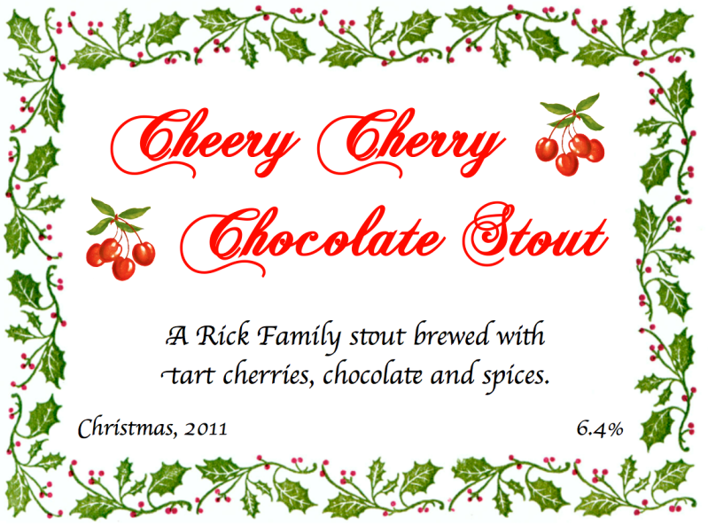
My first ever try at a label. I always remove the commercial stuff, but for this year's Christmas gifts I wanted to make 'em mine. My family's last name is "Rick."

Screenshot2011-11-29at110757AM.png
 
Here's my logo I'm Still working with Josh at brew brand creative for some labels.
Working on going pro right now so I paid more to own the rights to the logo, even then the price was unbeatable. He definitely comes highly recommended.

Excellent.
 
My first time playing around with Gimp. Looking for some input on the concept more then the execution sine it was my first time. I will look for a better font that is more vintage WWII poster font to use. But what do yall think of the military them and the basic idea of the labels. Any advice would be much appreciated.

I agree with TwoRiders font change suggestion. Also, there's kind of a lot going on in the images that you're using... They're great images (especially the tank one) but the text gets lost and the design starts to seem cluttered. Could you maybe fade some of the background parts to black to allocate more space for the text. Alternatively, maybe you could try playing around with the hue/saturation settings (don't go overboard) a little to give a more stylized look to the images that you are using.
 
Here are a few of mine so far. The general theme is the same and the contents of the flask change depending on the beer. Some of them get hard to read on here at 72dpi. They tend to look better in person when printed at closer to 2400dpi. I'm also looking for other styles of paper to use...something similar to that used by Odell.

These things look absolutely incredible!
 
tshore said:
Great label BlackJaw

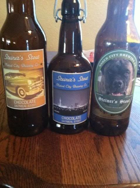
heres a couple i was messing with

I assume Steiner is the dog? If so, I like the one on the right the most. It'd look more cohesive if the pic of the dog was Illustrated and not an actual pic
 
I assume Steiner is the dog? If so, I like the one on the right the most. It'd look more cohesive if the pic of the dog was Illustrated and not an actual pic

yes, steiners my dog, pictured on the right. i had never tried labels so was just playing around using a pic of my '49, vegas skyline and my dog. will try an illustrated pic. thanks for the reply!
 
Okay I'm new here, yes. But isn't it in bad form to use someone else's work and pass it off as your own? I always thought it doesn't count if you don't actually make the labels yourself!
 
paulster2626 said:
Okay I'm new here, yes. But isn't it in bad form to use someone else's work and pass it off as your own? I always thought it doesn't count if you don't actually make the labels yourself!

Are you referring to people using images off the Internet, etc rather than actually owning rights to the image or creating an illustration themselves?

While it would certainly be frowned upon for a professional brewery, I think most would let it slide for the homebrewer. Most folks on here lack the skills and software needed to make their vision a reality. Since there's no profit to be made in homebrewing I don't really see the issue.
 
No, I'm referring to goign to BEER LABELIZER, clicking a few things here and there, and then saying "look at the labels I made!". Then when people say they like them, you say something like "oh thanks man" rather than "thank Andy Biggs, cause you can make your own!".

I dunno, I guess I just appreciate people who try to make something unique.

If you are referring to me. Its not hard to tell they came from beer labelizer. For everyone that didnt know, go to BEER LABELIZER its a great starter for making your labels. If you are not referring to me then I dont think anyone who has used that site is saying "thanks man, i made the label and design all on my own." i think its more like "thanks man." Its also not like anyone is being sneaky in using the designs. I know for myself I just started homebrewing 3 months ago and found the site and used the designs, which is what it is meant for. Didnt know I needed an * next to each one.
 
374015_318133064883400_144617355568306_1224102_939400314_n.jpg


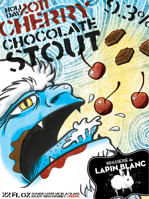
Here's a new label of mine. However, I don't expect most home brewers to have gone to art school like I have. So, I think BEER LABELIZER still serves a purpose for those without Photoshop or Illustrator.
 
374015_318133064883400_144617355568306_1224102_939400314_n.jpg


Here's a new label of mine. However, I don't expect most home brewers to have gone to art school like I have. So, I think BEER LABELIZER still serves a purpose for those without Photoshop or Illustrator.

I love it!

Even some of us who have Photoshop and Illustrator only do so out of necessity (work) and have no real artistic skills. They're dangerous tools that should be treated with respect ;-)
 
374015_318133064883400_144617355568306_1224102_939400314_n.jpg


Here's a new label of mine. However, I don't expect most home brewers to have gone to art school like I have. So, I think BEER LABELIZER still serves a purpose for those without Photoshop or Illustrator.

Holy crap that is a cool label!
 
Skyphoxx' labels don't show up for me - just a white box with a red x...any idea why?
 
@Skyphoxx it looks like a solid progression of better balance, imagery use and typography through all of your labels. I agree, this is the best label thus far.
 
It's hands down my best one. Here are all the ones I've done so far.

https://www.homebrewtalk.com/f46/dubbel-d-labels-248928/

I would have to say my 2nd best one was Sausage Fest from the link above. Still, Limey Bastard is one of our better tasting and better looking beers. :rockin:

Very nice. Personally I like Wit's End the best of all of them. It's formatted differently than most beer labels (centered ovals, ribbons, curved text) and I like the colors.
 
Back
Top