Golddiggie
Well-Known Member
I like the labels, but not sure 5.9% constitutes a strong ale.
Aye, very true... At 5.9% it's barely above a mild, def. not in the "warmer" class of brews...

I like the labels, but not sure 5.9% constitutes a strong ale.
. . . At 5.9% it's barely above a mild . . .
Its nearly twice the strength of the Mild batch we're currently drinking.


Wow, weak mild... The style goes up to 4.5% (2.8-4.5%)... I guess it's all in how you view things. Still 5.9% is below the low end for a strong Scotch ale (6.5-10%)... So it's really a weak strong Scotch ale...
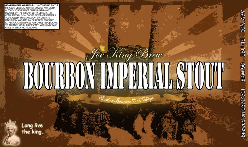
keeping the same template as all of my labels.....brewing this weekend
I really like these ones. Cool background with the graffiti.


Here is my first label.. I use photoshop for my art. This is my October holiday beer.

paulster2626 said:Man don't you just hate what Photoshop does when you reduce your selection of an oval by a good amount of pixels? the way it makes the 2nd oval all boxy drives me nuts. If there's a way around this I'd love to hear it.


Ya illustrator is all vector so you can reduce ovals, but I'm much more comfortable in photoshop so it's give and take..
I'm sure this has been asked before, but im asking again.. for the guys on here that have the more professional looking logos, how do you do it. I can manage the design, and I'm sure I will revise it again and again.. what I was hoping for was the proper size I will need to use as well as how you print it. I'm assuming you order online somewhere?