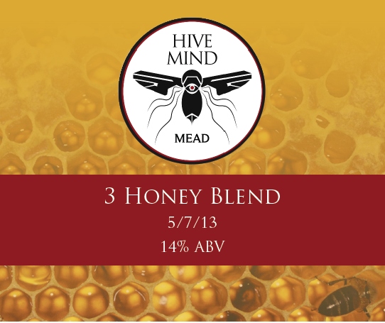
For a mead that i currently have aging for September
The mead that's poets muse can be drunk now?
I dig it. How did it turn out? I've been toying with the idea of a blueberry vanilla mead for a while now.

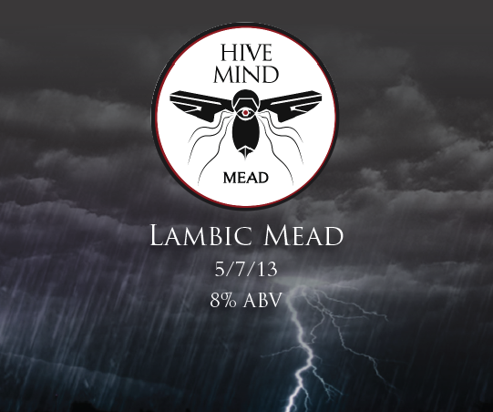
For a mead that i currently have aging for September
") but shows promise
but shows promise
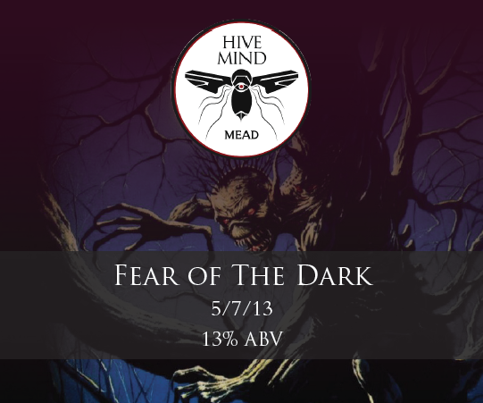
For a mead that i currently have aging for September
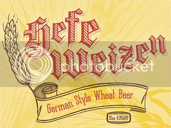
When I see "mocha latte", I have to chuckle. It is only in the South that I have confused the barrista by ordering a "mocha", only to be asked "do you mean a mocha latte?". Growing up in the land of Starbucks, we drop the "latte".A simple labelizer freebie, but I think it works for this beer. But I just spotted a fat finger mistake. The date should be 3/28/14, not 5/28/14. Back to editing!


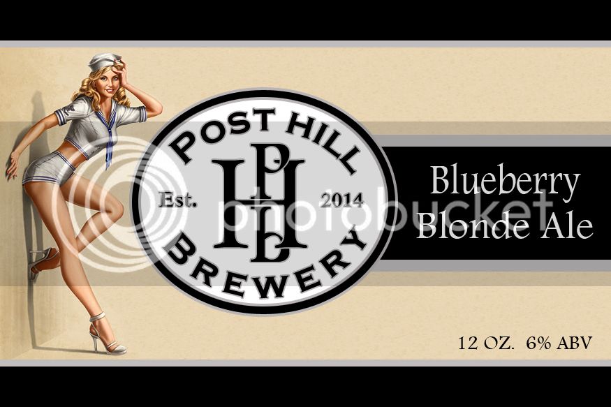
Is the "Bueberry" a play on words, or a typo?
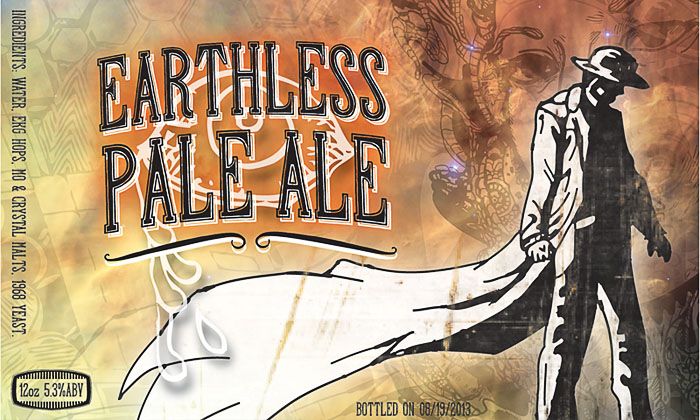
Love the berserker graphic!
Typo thanks for the catch my L key dosnt work lol
When I see "mocha latte", I have to chuckle. It is only in the South that I have confused the barrista by ordering a "mocha", only to be asked "do you mean a mocha latte?". Growing up in the land of Starbucks, we drop the "latte".
Which labelizer are you using?


Ha! I grew up getting "jamocha" milkshakes at Arby's and mocha ice cream at Baskin-Robbins. Mocha just indicates a flavor combination of chocolate and coffee...


Hey guys! I'm new here, but i thought I share the labels that I came up with for the beer my buddy and I brewed...
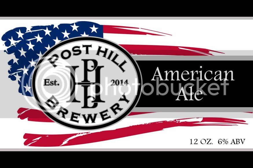
Here's my labels, They are already printed, I just need to get them on a few bottles.


![Craft A Brew - Safale BE-256 Yeast - Fermentis - Belgian Ale Dry Yeast - For Belgian & Strong Ales - Ingredients for Home Brewing - Beer Making Supplies - [3 Pack]](https://m.media-amazon.com/images/I/51bcKEwQmWL._SL500_.jpg)