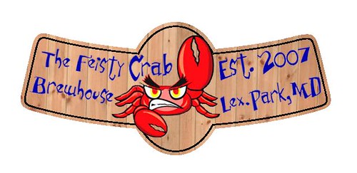
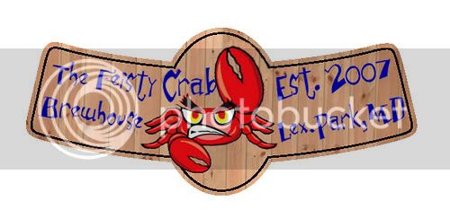
It shouldn't be that difficult with an image like that. I say change the text, move the crab's claw a little, and curve the text to the curve of the label.
Here is what I am going with now....thanks to all for your suggestions. I changed the text and it does look a lot better. I tried to make the bulge follow the claws, but I got frustrated and gave up on it. I don't think that it is noticeable once the label is shrunk down to fit on the bottle neck.


")