• Please visit and share your knowledge at our sister communities:
  • If you have not, please join our official Homebrewing Facebook Group!

    Homebrewing Facebook Group

Logo Thread

Homebrew Talk

Help Support Homebrew Talk:

This site may earn a commission from merchant affiliate links, including eBay, Amazon, and others.
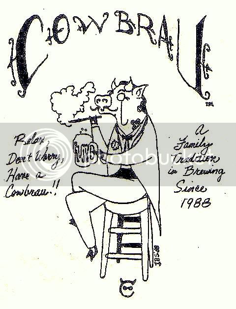
This is mine so far, still being worked on

Jason.jpg
 
first shot at what may become something; hand drawn center scanned and then colored in with a very old version of photoshop. Critiques welcome!

I don't mean to target you specifically because there are quite a few that are guilty of this. I'm actually a web designer by day (brewer by night), and the biggest no-nos in design are using papyrus and comic sans font. There are a ton of really beautiful free fonts out there, try looking around a bit. A few sites will let you preview the text that your using before you download the font.

trying to be helpful, don't take offense. :mug:

http://www.1001freefonts.com/
 
My logo is still a work in progress but I'm satisfied with rev 1. It can be seen on the header of my website: Fluke-Homebrew

1225111019.jpg


A buddy of mine his having a new logo drawn up by a dude he knows. Will post the new logo once it's done!
 
I've had this logo and brewery name since, well, 1988. It was hand drawn by a 16 year old kid who's now an illustrator at Pixar. The little bull horned C at the bottom goes on a neck label when I feel ambitous.

cowbrau3.jpg
 

Oh... My... Gosh... I want that sticker! Plus I need to have a drinking contest with that little guy so as to decide who of us gets to keep the name. I fear he may win if he is drinking those tiny brews.
 
I got bored and made this for my Chocolate Milk Stout. I use Avery shipping labels #8168, which come off after a day soaking in a PBW solution. Let me know what you think.

ChocolateStoutLabel3.jpg
 
Pretty simple logo. Having a brass stamp made so I can emboss the wax seals that will be used for the wedding beers and the bombers I bottle from my 3 sour batches.

logo.jpg
 
Not as fancy and nice as some of the logos here, but handdrawn seems to fit us a bit better at this point. That said, any and all advice/comments welcome and appreciated.:mug:

No Border with Name.jpg
 
Only advice I would offer is that over the last year Bleeding Cowboy font has been used by everybody and their mother. Build a long list of fonts and write out a word or two and then use it for every font. It's a good way to get a lot of ideas about what you like and do not. It's also a good way to keep track of all your fonts if you're like me and have 500+

The drawing is super badass!
 
Love the painting, but I have to agree that Bleeding Cowboys is not a suitable font. I suggest trying various brush typefaces.
 
Yeah, Bleeding Cowboy is the new Papyrus. It really is too bad because I used to love that font. I used it on my Smoky Boggart Label :(

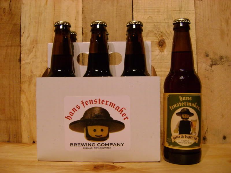
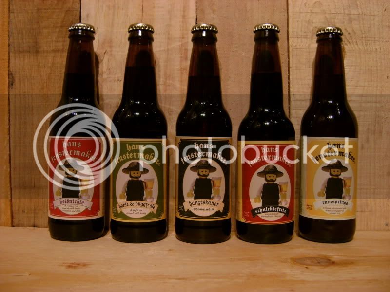
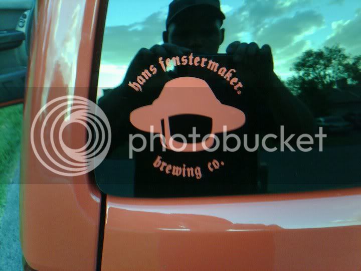
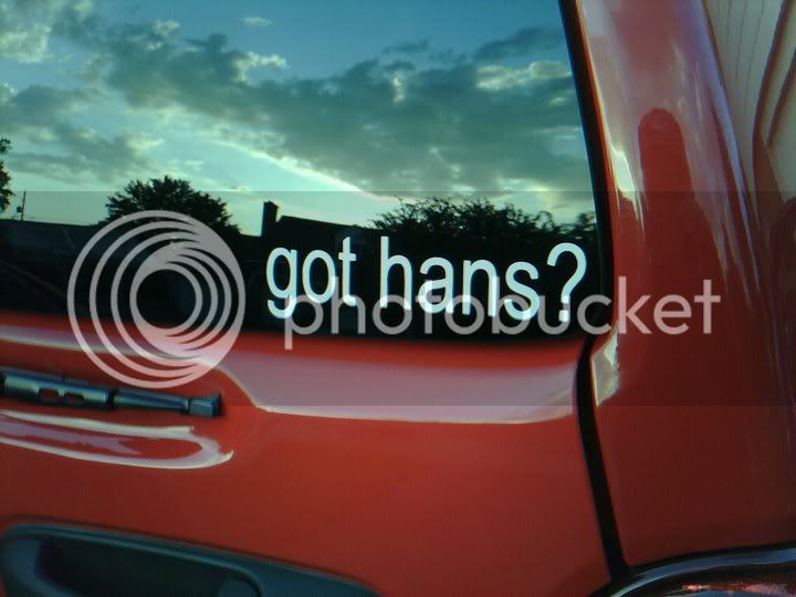
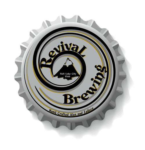
Hans-Brau is one of the best I have seen. Great work!
 
I suggest trying various brush typefaces.

Old english or caligraphy type might work well also.

Boerderij_Kabouter- "Bleeding Cowboy is the new Papyrus" great point about the importance of typography. I created my Noontime Labels logo about 8 years ago using the papyrus font as the source. I started seeing it everywhere kind of annoying me...now it's just ridiculous how often it's used.
 
Back
Top