• Please visit and share your knowledge at our sister communities:
  • If you have not, please join our official Homebrewing Facebook Group!

    Homebrewing Facebook Group

Logo Thread

Homebrew Talk

Help Support Homebrew Talk:

This site may earn a commission from merchant affiliate links, including eBay, Amazon, and others.
And I think you could pull of a predator theme without making it cheesy. more of a tribute thing than an outright parody. That would at least make people take it a little more seriously.. unless that doesn't matter to you, which it may not, but just sayin.
 
I love the idea of mashing two dissimilar movie titles into a name for a brew! It could get really funny or ironic which would be cool.

Not sure if anyone has posted this, but if you want to make the labels look as "authentic" as possible, here is a link to the TTB guidlines for US malt beverage labels:
http://www.ttb.gov/pdf/brochures/p51903.pdf

Of course, the layout on the second page does not have to be followed, only that the information is included. It would be a blast to mess around with some of it, like the government warning....
 
This label is nothing but cheesy and I have it that way on purpose. This is just a joke for me and my friends. I'm not sure if you read the warning label but that clearly gives it away that it's just for fun.......that's what pretty much the only reason why I started brewing my own brew, and I like beer!
 
. . . . like on a "SWMBO-Friendly" sweet fruity brew: GOVERNMENT WARNING: CONSUMPTION OF THREE OR MORE OF THIS BEVERAGE BY SWMBO MAY IMPAIR THE ABILITY TO DRIVE A CAR OR OPERATE MACHINERY, AND MAY CAUSE LOSS OF PANTIES"

just for example!
 
And I think you could pull of a predator theme without making it cheesy. more of a tribute thing than an outright parody. That would at least make people take it a little more seriously.. unless that doesn't matter to you, which it may not, but just sayin.

It's got to be a cheesy label for a cheesy movie!:D
 
I really like this; great design. It's bright, symetrical, visually appealing, and simple. Great job. The only thing I would suggest trying is either center the text and have the point of the "w" intrude on the color, or rasterize the text and shrink that point of the "w" down. It's a little off balance with the text not being in the center of the "channels". It still works...just a thought.

Your right. I like simple and bright and when I first came up with the cap sticker idea I just ran with it. I will refine & balance it & maybee save some headache and have someone print me a roll of 1000 or so.
 
Here's mine. Many thanks to Burro 2882 for all the hard work!

Eye4NFinal-1.jpg
 
Love the old video games so thus this was born


edit again: Having problems with the new flickr, should be fixed
 
Those links don't go directly to pictures, they go to a page asking me to login to flickr.
 
Here is a logo I've been working on for a while. It needs a little cleanup, but it's getting there. I have the same look to each label, but the background color and beer name font changes with each beer.

Master Label Logo_Body.jpg
 
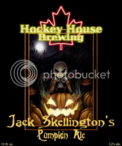
I actually made some changes this week. Since everyone knows "the hockey house" as the guys with the neon maple leaf in the window I came up with a themed brewery logo and then changed my pumpkin ale logo too.

HHBFinal.jpg


Finalsmall.jpg
 
Back
Top