You are using an out of date browser. It may not display this or other websites correctly.
You should upgrade or use an alternative browser.
You should upgrade or use an alternative browser.
Logo Thread
- Thread starter DBake
- Start date

Help Support Homebrew Talk:
This site may earn a commission from merchant affiliate
links, including eBay, Amazon, and others.

Pommy
Well-Known Member
iron_city_ap
Well-Known Member
Here is my base label...
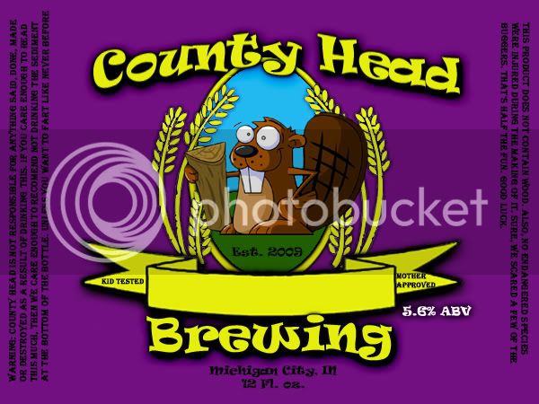
I designed it so that with a few quick changes, I can adapt it to whatever beer I'm making. These are just examples I made up...
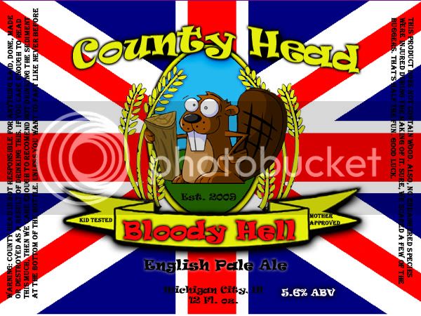

I also have a version with a horizontal oval rather than the verticle one. I'm not sure which I like better...

I designed it so that with a few quick changes, I can adapt it to whatever beer I'm making. These are just examples I made up...
I also have a version with a horizontal oval rather than the verticle one. I'm not sure which I like better...
iron_city_ap
Well-Known Member
Thanks.
I use an old version of Photoshop (5.5) so between that and my skill level, I'm pretty limited with what I can do.
I just slip the layer with whatever I would like for my background under all the other layers (picture, words, etc...). It really is just a matter of adding something here and adding a little something there. The ovals are 3 layers each for the vertical and for the horizontal. I just show whichever layers I want. "Save a copy" as a .jpeg and the rest is history.
ptakers, what program are you using?
frenchandindianclub
Member
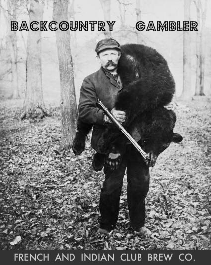
I just made this i need suggestions on making this awesomer
questions: what is the convention about having the columns on the sides of labels that im seeing? with the information on both sides, what are the dimensions of a standard beer bottle label? you guys that put the surgeon generals warning on your bottles are you guys legit commericial brewers or being ironic? what else goes on a label


$44.99
$49.95
Craft A Brew - Mead Making Kit – Reusable Make Your Own Mead Kit – Yields 1 Gallon of Mead
Craft a Brew


$10.99 ($31.16 / Ounce)
Hornindal Kveik Yeast for Homebrewing - Mead, Cider, Wine, Beer - 10g Packet - Saccharomyces Cerevisiae - Sold by Shadowhive.com
Shadowhive


$76.92 ($2,179.04 / Ounce)
Brewing accessories 1.5" Tri Clamp to Ball Lock Post Liquid Gas Homebrew Kegging Fermentation Parts Brewer Hardware SUS304 Brewing accessories(Gas Hose Barb)
chuhanhandianzishangwu


$719.00
$799.00
EdgeStar KC2000TWIN Full Size Dual Tap Kegerator & Draft Beer Dispenser - Black
Amazon.com


$20.94
$29.99
The Brew Your Own Big Book of Clone Recipes: Featuring 300 Homebrew Recipes from Your Favorite Breweries
Amazon.com


$58.16
HUIZHUGS Brewing Equipment Keg Ball Lock Faucet 30cm Reinforced Silicone Hose Secondary Fermentation Homebrew Kegging Brewing Equipment
xiangshuizhenzhanglingfengshop

$53.24
1pc Hose Barb/MFL 1.5" Tri Clamp to Ball Lock Post Liquid Gas Homebrew Kegging Fermentation Parts Brewer Hardware SUS304(Liquid Hose Barb)
yunchengshiyanhuqucuichendianzishangwuyouxiangongsi


$22.00 ($623.23 / Ounce)
AMZLMPKNTW Ball Lock Sample Faucet 30cm Reinforced Silicone Hose Secondary Fermentation Homebrew Kegging joyful
无为中南商贸有限公司

$28.98
Five Star - 6022b_ - Star San - 32 Ounce - High Foaming Sanitizer
Great Fermentations of Indiana


$176.97
1pc Commercial Keg Manifold 2" Tri Clamp,Ball Lock Tapping Head,Pressure Gauge/Adjustable PRV for Kegging,Fermentation Control
hanhanbaihuoxiaoshoudian


$172.35
2 Inch Tri Clamp Keg Manifold With Ball Lock Posts, Pressure Gauge, PRV (0-30 PSI) – Homebrew, Fermentation, Kegging System
wuhanshijiayangzhiyimaoyiyouxiangongsi


$53.24
1pc Hose Barb/MFL 1.5" Tri Clamp to Ball Lock Post Liquid Gas Homebrew Kegging Fermentation Parts Brewer Hardware SUS304(Gas Hose Barb)
Guangshui Weilu You Trading Co., Ltd


$33.99 ($17.00 / Count)
$41.99 ($21.00 / Count)
2 Pack 1 Gallon Large Fermentation Jars with 3 Airlocks and 2 SCREW Lids(100% Airtight Heavy Duty Lid w Silicone) - Wide Mouth Glass Jars w Scale Mark - Pickle Jars for Sauerkraut, Sourdough Starter
Qianfenie Direct
![Craft A Brew - Safale BE-256 Yeast - Fermentis - Belgian Ale Dry Yeast - For Belgian & Strong Ales - Ingredients for Home Brewing - Beer Making Supplies - [3 Pack]](https://m.media-amazon.com/images/I/51bcKEwQmWL._SL500_.jpg)


$159.99 ($26.66 / Count)
3M High Flow Series System BREW120-MS, 5616001, For Brewed Coffee and Hot Tea, Valve-in-Head Design
SpaceCityProviders

$479.00
$559.00
EdgeStar KC1000SS Craft Brew Kegerator for 1/6 Barrel and Cornelius Kegs
Amazon.com


$7.79 ($7.79 / Count)
Craft A Brew - LalBrew Voss™ - Kveik Ale Yeast - For Craft Lagers - Ingredients for Home Brewing - Beer Making Supplies - (1 Pack)
Craft a Brew

iron_city_ap
Well-Known Member
I use 4x3 labels, and if you read my 'warnings' you will see I'm far from legit. Its just fun.
frenchandindianclub
Member
where did you get that beaver? did you draw it yourself? its awesome
iron_city_ap
Well-Known Member
I wish I drew it. Just did a google image search for 'beaver clip art' and eventually it popped up.
user 40839
Well-Known Member
- Joined
- Jul 13, 2009
- Messages
- 1,176
- Reaction score
- 86
where did you get that beaver?
*much childish giggling*
I used Paint.NET and saw that it supports layers, but had no idea what function that served. I'll go back and see what I can do with it....Thanks.
I use an old version of Photoshop (5.5) so between that and my skill level, I'm pretty limited with what I can do.
I just slip the layer with whatever I would like for my background under all the other layers (picture, words, etc...). It really is just a matter of adding something here and adding a little something there. The ovals are 3 layers each for the vertical and for the horizontal. I just show whichever layers I want. "Save a copy" as a .jpeg and the rest is history.
ptakers, what program are you using?
iron_city_ap
Well-Known Member
Definately play around with layers. You spend quite a bit of time just erasing the stuff around what you want to be in a layer, like a single person from a photograph and things like that, but it opens a whole new world to you.
I usually open a picture I want something from, then draw a box around it with the 'marquee tool' (dashed line box), click 'copy'. Then I go to the image I want it placed onto and just 'paste'. PS automatically makes it a new layer. From there I'll erase the bits and pieces around the object I want to get rid of, rescale, tweak colors, etc... To move a layer 'above' or 'below' another one, at the point on the screen where it shows all the layers for the project, you just drag them in the order you want them. There is SOO much you can do, but that is a good basic to get you going hopefully, if paint.net is anything like PS.
I'm not framiliar with paint.net, but I may download it and see how well I like it. The version of PS I'm using is probably a good 10 years old and doesn't do some things very well, like curving text. Yes, there is a way to do it, but its a major pain.
Edit: Just downloaded and played with paint for a minute. Its not too shabby. I'm still very used to PS, but I like some of the stuff that Paint does. I think you could do alot with it.
SkyWalker
Active Member
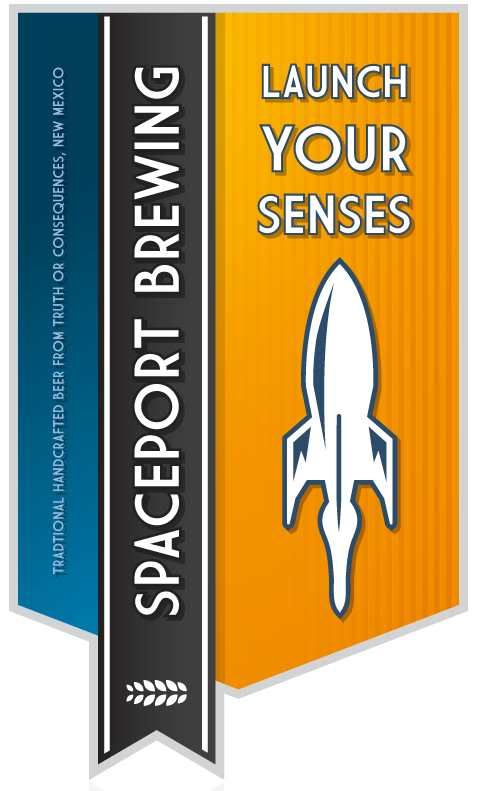
playing around with some ideas... i like this so far

Captain_Bigelow
Well-Known Member
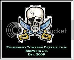
Here is my first draft. My brewery is called Propensity Towards Destruction.
MetallHed
Well-Known Member
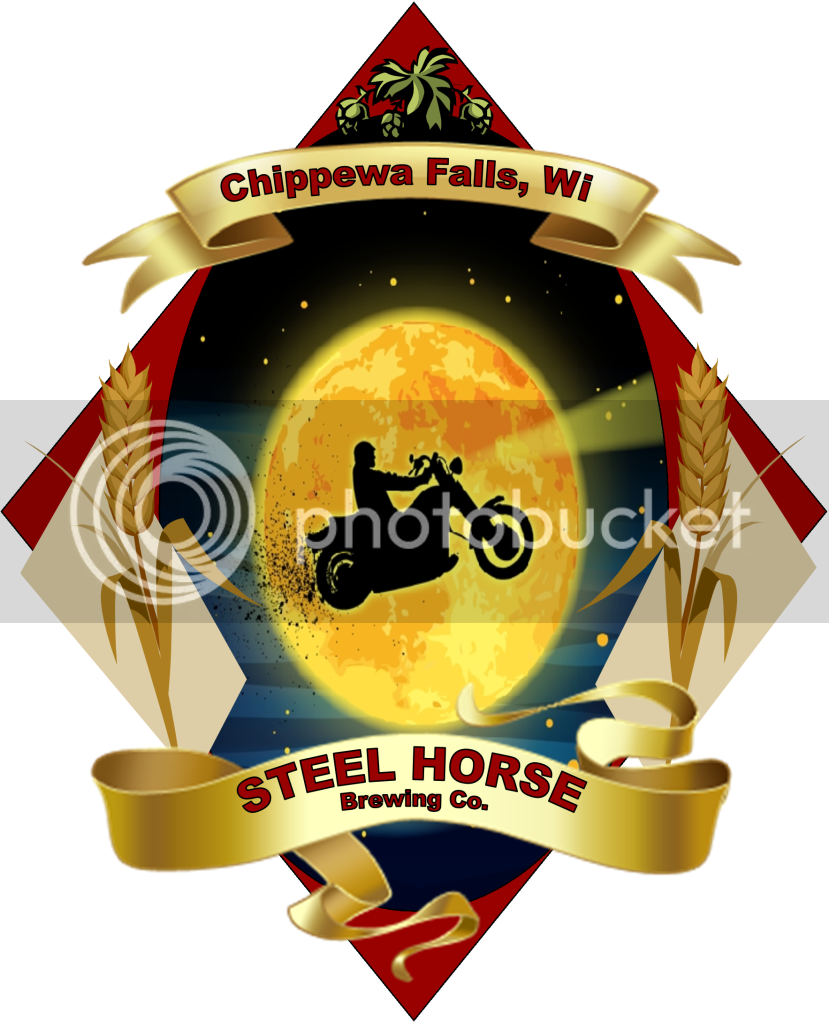
Was bored at work and you all gave me motivation to come up with something.. I searched for the name and I couldn't find anyone with the name.. so correct me if I'm wrong so I can change it:
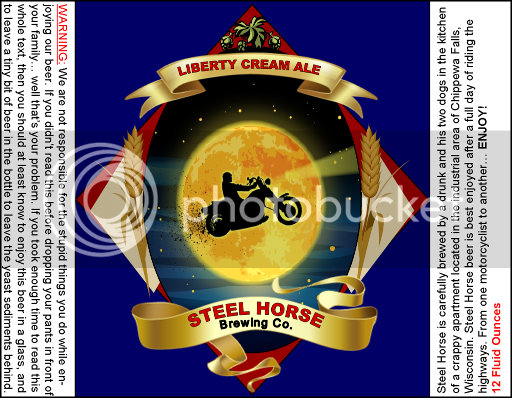
and a label for the bottles.. i have one on a bottle.. will post a pic tomorrow
sorry, i borrowed some ideas from what i've seen on here. If you dont want me to use one of your ideas, just let me know and I'll change it!
and a label for the bottles.. i have one on a bottle.. will post a pic tomorrow
sorry, i borrowed some ideas from what i've seen on here. If you dont want me to use one of your ideas, just let me know and I'll change it!
MetallHed
Well-Known Member
here it is on a bottle:

chrisguz4300
Member
something I threw together while I'm sitting here bored at work... this site just makes want to go home and crack open a brew every second I'm here

Our logo has been finalized. This is going to be our main version of the logo. We will also be using a version without the lettering and the flame more pronounced for some branding.

smmcdermott
Well-Known Member
Kind of confused what the bell is for?
Boerderij_Kabouter
Well-Known Member
He is from Philadelphia. That is the Liberty Bell.
smmcdermott
Well-Known Member
I realized it was the liberty bell, but maybe put Philadelphia, PA on the bottom so it makes more sense.
MetallHed
Well-Known Member
Edit.. already stated
TheBeerNerd
Well-Known Member
Here's mine... it's gone through a few changes...

chrisguz4300
Member
I realized it was the liberty bell, but maybe put Philadelphia, PA on the bottom so it makes more sense.
If I had replaced the Liberty Bell with the Gateway Arch, would I need to write St Louis at the bottom? Paris, France if I had put in the Eiffel Tower?
I'm just bustin' balls. I tried it and actually like the look of including the city in the logo

stinkypants
Active Member
these are fantastic. Mine's not showing up but that's OK - got lots of work to do compared to all the above. I'm inspired.
Here's mine... it's gone through a few changes...
I really like this design. That looks cool.
If you are up for suggestions, I would suggest backing off on the "shiny" effect on the lettering. It seems a little too over done. If you are using photoshop I would back off the beveled edges a bit and maybe fade the plastic look just a hair too.
Love the design. That kicks ass. Reminds me a bit of the Isotopes logo from the Simpsons. I dig it.
Brewdouche-RuBrew
Well-Known Member

I know its not real fancy but I print these out on 1/2" white disk printer sheets from staples and stickem on top of all my crown caps. Looks way better than a plain Jane gold crown cap.
I love it, but I'd try an alternative and have maybe a bottle of beer in the middle being orbited by 2 hops "atoms" or one hops and one grain atom each.Here's mine... it's gone through a few changes...
Science rules.
specialized
Well-Known Member
Here's the logo I've been working on, would love some constructive criticism.
Similar threads
- Replies
- 2
- Views
- 480
- Replies
- 17
- Views
- 1K
- Replies
- 18
- Views
- 858
