• Please visit and share your knowledge at our sister communities:
  • If you have not, please join our official Homebrewing Facebook Group!

    Homebrewing Facebook Group

Label style critique

Homebrew Talk

Help Support Homebrew Talk:

This site may earn a commission from merchant affiliate links, including eBay, Amazon, and others.

Pommy

Well-Known Member
Joined
May 9, 2009
Messages
727
Reaction score
12
Location
Auckland, NZ
Looking for some feedback on how the labels are coming on to see if this will be the direction that I go. They are designed to stand out and look cool lined up on the shelf
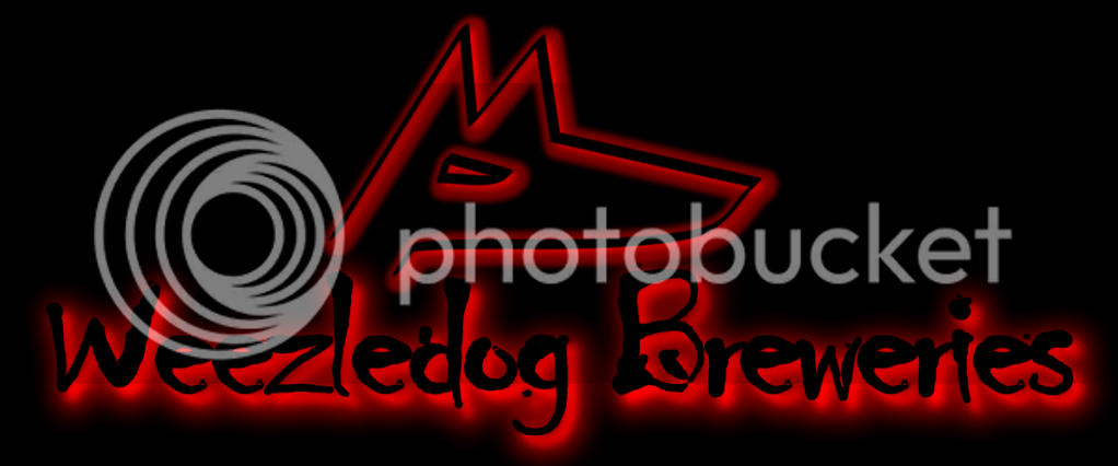
 :mug:

Brewery Logo:
WeezledogBreweriesLogo.png


Labels: (sorry if they come out a bit big)
HairoftheWeezledog.png

KiwiPaleAle.png

KiwiBlondeHoney.png
 
i like them they are cool looking. They are simple and to the point. Among all you should like your lables and piss on anyone else that says they dont. Cause at the end of the day its you beer so do what you want. But thats just my 2 cents.

Cheers
Ren & Julia :mug:
 
Back
Top