Amarillo SkyPA

Homebrew Talk - Beer, Wine, Mead, & Cider Brewing Discussion Forum

Help Support Homebrew Talk - Beer, Wine, Mead, & Cider Brewing Discussion Forum:

This site may earn a commission from merchant affiliate links, including eBay, Amazon, and others.

brokenanchor

Well-Known Member
Joined
Sep 2, 2008
Messages
289
Reaction score
1
Location
Columbia, MO
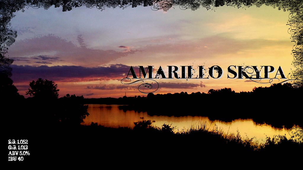
Here's a new label I put together. It's for an an Amarillo IPA...if you couldn't already figure it out. I should be bottling this sometime later this week, and it will be the first time I'll have labeled an entire batch, but I'm worried it's going to be too much black and use up a *&%# ton of ink. The picture was actually taken over the Tennessee River close to Clifton on a golf trip, so pretty much no where near Amarillo, TX.

4809837505_b1f28a5728_b.jpg
 
The grungy font actually seems to work with the photo. I just don't know about the floral frame around it.

It would be funny to say, this is my Amarillo IPA the picture is of the Tennessee River taken in Kentucky.
 
It was actually taken in Clifton Tennessee near Ross Creek Landing. Floral frame is a bit much, I was just trying to extend the tree/grassline.
 
So does that make you BA South? :off: but the brew closet is coming together nicely...and I have cascade residue under my fingernails from repackaging...everyone at work must think I'm trying to get high on something, and they would be right.
 
Glad to see there's another Columbian on the forums too. And praise the lord for Sycamore tapping the Mikkeller Yeast Series last night!
 
I like the label...it's a great photo and I agree the font works well. I have a couple of suggestions to try (or not...it only matters if you like it).

I think the Amarillo Sky could move up to the middle of the sky (vertically)...it's covering up some nice clouds near the horizon and the label is visually heavy on the bottom so throwing some weight nearer the top might help balance things out. And the border is fine and I think you need one just because of all that black on the bottom, but you might want to try just a thick black line. That might frame it better.

You could also try stringing the OG, FG, etc along one line on the bottom.

And ink...luckily black is cheapest! :)
 
I would crop the photo a little more. On the left you could get rid of the part just past where the big bush obscures the river. Then, on the bottom, crop most of the black foreground leaving just a little bit as a border. You might also try moving the font a little more to the left so it doesn't overlap with the black silhouette.
 
Back
Top