CherryStScallywag
Member
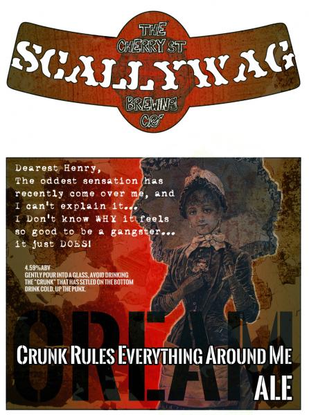
I've noticed a lot of lackluster label designs out there. A lot of un-inspired quick photoshop jobs... which in my opinion, why even bother with a label at that point?
So here's a few suggestions/tips:
- the scanner is your friend. try scanning in drawings. look for stuff with an interesting texture to scan in (cloth, duct tape, sand-paper, your face, etc.) This is the best tip I can give, it frees you up from designs that look boring and unoriginal.
- move beyond the printable-labels. they're not cheap and they limit you to pre-determined sizes and shapes
- use 50/50 water/elmer's glue. it's cheap and easy to remove. use a foam brush (or your finger) and remember to apply it to the surface of the label if you want extra protection. This is time-consuming for sure, but you get more interesting results.
- explore and experiment with odd/unusual shapes and sizes. try really huge or micro-sized labels. try a skinny rectangle, star shape, labels with shapes cut out of the center, etc.
- crayon and spray paint. write/draw on the clean glass with a white/clear wax crayon. then spray paint over it... the paint won't stick to the wax.
- stencils. cut a stencil out of flexible material (acetate transparencies work well, also the colored plastic dividers from your 3-ring binder). and paint the glass.
- etching. it can be dangerous and expensive and is obviously permanent. but you can get some awesome results from glass etching. safety first tho!





![Craft A Brew - Safale S-04 Dry Yeast - Fermentis - English Ale Dry Yeast - For English and American Ales and Hard Apple Ciders - Ingredients for Home Brewing - Beer Making Supplies - [1 Pack]](https://m.media-amazon.com/images/I/41fVGNh6JfL._SL500_.jpg)


