Hops and Malt first draft logo

Homebrew Talk - Beer, Wine, Mead, & Cider Brewing Discussion Forum

Help Support Homebrew Talk - Beer, Wine, Mead, & Cider Brewing Discussion Forum:

This site may earn a commission from merchant affiliate links, including eBay, Amazon, and others.

JamesKY

Well-Known Member
Joined
Sep 5, 2007
Messages
87
Reaction score
7
Location
Louisville, KY
Here is the first draft for a new logo for my home brewery. It was designed only to convey the ideas in my head to an artist who would be able to sketch it out better. The wheat and hop cone in the back form a fleur-de-lis which is a symbol of Louisville and the slogan at the bottom is a take-off from the "Keep Louisville Weird" campaign.

logo.jpg
 
Looks good. Very cool idea for the fleur-de-lis to be out of barley bushels like that. I have a suggestion (only a suggestion because I like what you have), how about a larger barley head for the top and a hop for the smaller bottom of the fleur-de-lis. Great logo, I think it will make for great stickers and coasters too.
 
Thanks for the suggestion. I'll definitely give it a shot and see what it looks like with the hop cone on the bottom and a wheat bushel on top.
 
clever.. i have a lot of friends in the ville..

went to WKU...

like the idea.. maybe a border or something for the logo would help distinguish itself from the whitespace around it.
 
JamesKY said:
Thanks for the suggestion. I'll definitely give it a shot and see what it looks like with the hop cone on the bottom and a wheat bushel on top.

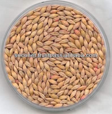
I was talking about a head of barley, like an up close of the 2 row barley korn kernel, or like an up close of a whole barley head with all its korns still attached. I'm just throwing this stuff out there in case you find it helpful. I don't mean to tell you how to do something, but here is a picture of what I am talking about in the later part of my description.
DSCN1784.JPG


I know it is a little squared off, but maybe the contrast between something so sharp would look good with what you have, I don't know. As for the single large korn kernel of barley; maybe a more curvy design of a real seed would compliment your artwork nicely.
Barley_For_Animal_Feed.jpg
 
It's fine so long as you lose the comic sans "keep louisville beered". Comic sans is the devil and should be outlawed.

That, and it reads, to me, like "hops & malt, micro & brews". Dunno how you'd fix that, but that's how it reads.
 
Yeah, the Comic Sans Serif was only temporary until I could find a font that more closely resembles the actual "Keep Louisville Weird" font. Still, I took your concern and worked a little Photoshop magic to alter the actual one.

Here is a new version with some of the suggestions made here. I appreciate everyone's input. Wort, I tried moving the hop cone to the bottom but it made it so small that it was hard to tell what it was supposed to be. But I like your idea for the head of barley on top so I will try again once I get better sketches of a hop cone and head of barley.

I'm not sure how to keep it from reading "Micro & Brews" but I'm open to suggestions. I tried making the words different colors in an attempt to avoid that problem but there may just not be an ideal solution.

logo2.jpg
 
My friend and I have dreams to open a brew pub one day but there is a lot of work, planning, and life decisions to be made before then. Even though we homebrew, we have a long way to go before we could begin to brew commercially. I'm just finishing my MBA at UofL and my friend is in his first year of law school there. I'm in the process of starting another business venture so we don't have a lot of time to dedicate to this project at the moment.

Still, we will continue to think about it for the time being and who knows what the future could hold. You're correct about BBC. They are a great company but I think the Louisville craft brew market still has some untapped potential.
 

Latest posts

Back
Top