Going to get my beer canned, working on label concepts

Homebrew Talk - Beer, Wine, Mead, & Cider Brewing Discussion Forum

Help Support Homebrew Talk - Beer, Wine, Mead, & Cider Brewing Discussion Forum:

This site may earn a commission from merchant affiliate links, including eBay, Amazon, and others.

Picobrew

Biscuit Enthusiast
HBT Supporter
Joined
Jan 30, 2009
Messages
1,138
Reaction score
23
Location
NW Portland, OR
Never had a brand, using my name for now as it works. Here is an idea I'm working on. It's based on a new emoji mosaic tool combined with one of my instagram pics of Mt. Hood and some inspiration from various internet art styles. Going to name the beer but haven't yet. Trying to come up with a pattern/theme that can apply to future beers.

passmore_beer.jpg
 
To me, it is very hard to read. There's just so much going on with the background that the text is nearly lost. Passmorebeer is definitely getting lost, session IPA is nearly there. I don't know if I understand the lack of spacing between session and IPA, but if that is your thing then run with it.

The text on the sides is also a little hard to read, but maybe that is just me.

Who is canning your beer? Is it a place that is willing to do short runs or something?
 
I, for one, like it. It's very Portland looking. A couple critiques...Flat it looks good, however, once it's wrapped around a can, I don't think it would be as easy to decipher. Maybe putting "IPA" below "Session" would help remedy that. Also, the vitals on either side would be upside down to each other once the cylinder shape is formed. Flipping one or putting all the info on one side should do the trick.

Looks good, man. I really want to see the prototype/finished product.
 
Thanks for all the feedback yall. Good call on flipping the text. The "Session IPA" is just a placeholder until I name the beer so I haven't worked out the exact positioning and sizing etc. I'll try to make sure it fits nicely on a rounded can.

I'm not worried about copyright, this is just for homebrew after all. This is the canning company, they are doing homebrew canning days, which is awesome: http://www.crossroadscanning.com
 
Awesome! Would you mind giving a walk through of your process of creating that label? I'm really interested in making my own labels and like to see others' processes.
 
Awesome! Would you mind giving a walk through of your process of creating that label? I'm really interested in making my own labels and like to see others' processes.

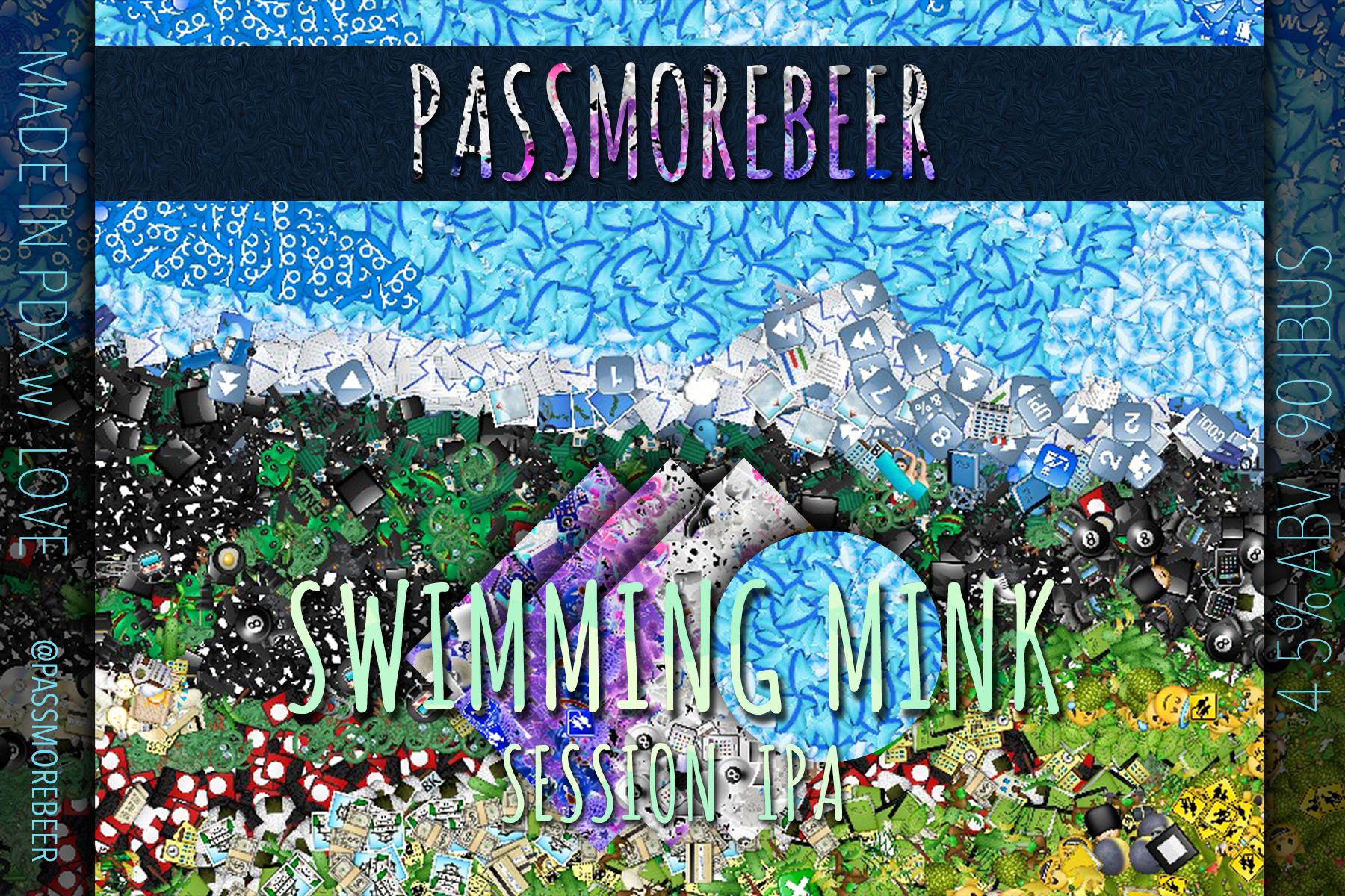
Ok here's some process stuff. Started with this instagram photo I took last summer https://igcdn-photos-e-a.akamaihd.n...-15/1209592_1479939682245372_1622140875_n.jpg .

Pumped it through here: http://ericandrewlewis.github.io/emoji-mosaic/

I use photoshop for production, so I put the result in there and cropped it down to 4x6 (the label requirements for this canning company).


I added the title text, then I copied the background layer, lightened it dramatically, moved it above the title text in z-order and created a clipping layer so the text would fill with the lightened bg layer.

I then created a square shape, rotated it to a diamond, and similarly copied the background and created a clipping layer so the background would fill the diamond. I then inverted the clipped layer and played with the saturation a bit, and moved the diamond onto a part of the inverted layer that I liked - to get the purple and white. Then I added some drop shadow on them to give them some depth. I then moved the clipping layer and the clipped layer into a group so I could move them without adjusting the clipping portion. I duped this 3 times for the three diamonds, and tweaked the 2 new ones a little bit so they weren't identical.

Similarly created a circle shape and another BG copy to clip to the circle, using the blue section in the circle and adding shadow.

For the "Session ipa" placeholder text, I created a text layer then added this behind it for clipping: http://subtlepatterns.com/congruent-pentagon/ and added shadow.

For the darkened sides for the info text, I copied the background again, dropped its lightness dramatically and made that the new background. Then I put the original background in 2 more copies clipped by 2 rectangles to form the middle, "original" vibrant section, with shadows coming off the clipped shapes to form little shelves into the dark sections. Then added the simple text to those sidebars.
 
I like it, if it were me i might add a layer mask with a gradient to the background layer. Then lower the opacity of the top part of the image.

Not sure if that is possible or as easy to do as I think it would be. That might make the text pop more on the label.

Wish there was a canning service up here. That would be awesome to have your home brew canned. Is it very expensive to have it done?
 
Final label. Canning on saturday. Will post a pic of the can w/ label when I get it. Hoping the homebrew canning doesn't let in a bunch of oxygen. Time will tell.

sthsQwu.jpg
 

Latest posts

Back
Top