munche
Well-Known Member
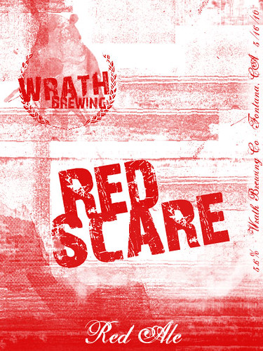
So last night I sat down with Photoshop and decided to make a label. What I came up with was honestly nothing like what I originally thought I'd be making, but I think I really like it.
I honestly was thinking of starting in a Port Brewing or Avery style, and ended up looking more like a BrewDog label. This is not a bad thing, as I think BrewDog's labels look badass.
What do you think, all?
I'll stick to the two color format, but change it appropriately when I make different beers. It looks like it's a fairly quick job to change the colors, although not as simple as I'd like. Ah well. Still came out nice, IMO.
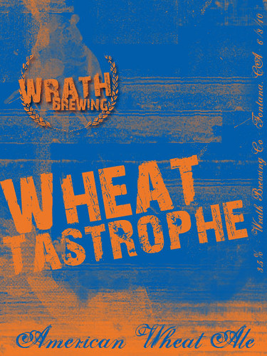