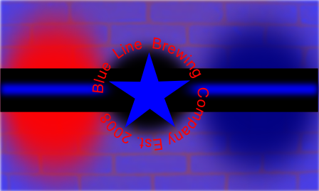
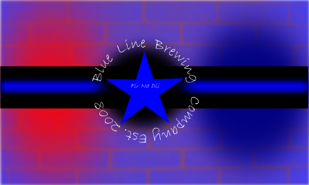
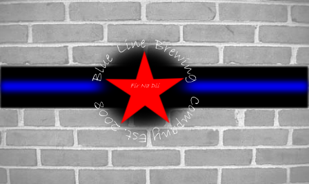
The "blue line" name & your words "it's a cop thing" (from an earlier post) tell me you want to play up the police bit ala "The Thin Blue Line." While I like Yuri's attempts, especially the blue brick background, his design overall looks very much like the US Air Force emblem. Nothing wrong with AF, it just doesn't say "cop" to me.
What about using his blue brick background with some actual cop lights over? You could use Yuri's bricks as the background, and a good photo of a police car light bar (the LED type look really good in the dark) over that. If you can, try using a REALLY bright light effect for your blue line & make it as intense/vivid/bright blue as you can so it stands out, that's the name afterall. If it were me, I'd drop the star completely, it's "Blue Line," not "Blue Star."
If you do decide to keep the star, try placing the text "Company Est. 2008" (or whatever the date is) right side up, it'll be much easier to read that way. Maybe replace the star with a shield? Like a badge. These are just a few ideas I had, I hope you find them useful. Regards, GF.