The "We'll fix your label for you" thread

Homebrew Talk - Beer, Wine, Mead, & Cider Brewing Discussion Forum

Help Support Homebrew Talk - Beer, Wine, Mead, & Cider Brewing Discussion Forum:

This site may earn a commission from merchant affiliate links, including eBay, Amazon, and others.
I have no photoshop experience and all and just taught myself some tricks in Gimp. I wanted to keep it pretty simple where all I need to change is the text and colors, but still have it look kinda nice. It's a little rough, and I wouldn't mind some help smoothing it out a little bit.

Crooked Tail Cream Ale.jpg
 
Ya the letter S and B for Shegogue brew. I guess I am looking for more of a logo that would some how include something that makes it recognizable as beer related... I know this is very broad, sorry

Well, this is what I came up with. I don't know how I feel about it haha. I'm not very good at logo design. I feel like I am better at label design.

shegoguebrew_zps22a4fb7b.png


EDIT: Here is another version of it.

shegoguebrew_zpsd64385b4.png
 
Well, this is what I came up with. I don't know how I feel about it haha. I'm not very good at logo design. I feel like I am better at label design.

shegoguebrew_zps22a4fb7b.png


EDIT: Here is another version of it.

shegoguebrew_zpsd64385b4.png

I like the second one. I do web development on the side, so I know how much of a pita it is when you get to this stage and then someone asks for changes. I guess now I understand how people dont know what they want until they see it. The second logo with the mug of beer - any way the Handle on the side of the Mug could act as the letter B and then the mug would have the S (as if it was etched/painted onto the mug)? I realize this is very different then what you came up with and if you dont want to, no worries. I def have issues creating anything other than existing imagery type thing.

Something like this (insert my horrible sketch)
IMG_20140801_161137560.jpg
 
The top Logo looked very good to me, I immediately thought if the basket weave border was hop cloves it would really say "BEER". Nice work you guys :)
 
I like the second one. I do web development on the side, so I know how much of a pita it is when you get to this stage and then someone asks for changes. I guess now I understand how people dont know what they want until they see it. The second logo with the mug of beer - any way the Handle on the side of the Mug could act as the letter B and then the mug would have the S (as if it was etched/painted onto the mug)? I realize this is very different then what you came up with and if you dont want to, no worries. I def have issues creating anything other than existing imagery type thing.

Something like this (insert my horrible sketch)
IMG_20140801_161137560.jpg

That is a cool idea. I will see if I can brush up on my Illustrator skills. I'm kinda the same way with just altering existing images. I'm sure there are some guys on here that could do it for you though.
 
I like the second one. I do web development on the side, so I know how much of a pita it is when you get to this stage and then someone asks for changes. I guess now I understand how people dont know what they want until they see it. The second logo with the mug of beer - any way the Handle on the side of the Mug could act as the letter B and then the mug would have the S (as if it was etched/painted onto the mug)? I realize this is very different then what you came up with and if you dont want to, no worries. I def have issues creating anything other than existing imagery type thing.

Something like this (insert my horrible sketch)
IMG_20140801_161137560.jpg

Alright, so this is what I came up with. I kept trying to make the S look like it was engraved on the mug but I couldn't get it to look right so I just left it black.

shegoguebrew2_zps9fe4aef9.png
 
I have no photoshop experience and all and just taught myself some tricks in Gimp. I wanted to keep it pretty simple where all I need to change is the text and colors, but still have it look kinda nice. It's a little rough, and I wouldn't mind some help smoothing it out a little bit.

I think it looks pretty good. Anything in particular you don't like?
 
I have no photoshop experience and all and just taught myself some tricks in Gimp. I wanted to keep it pretty simple where all I need to change is the text and colors, but still have it look kinda nice. It's a little rough, and I wouldn't mind some help smoothing it out a little bit.

Here's my idea of it. The name and colors should still be easy to change. I prefer a label with most of the info in the center so you don't have to turn the bottle to read the label. I kept the grayscale theme you had going on and I left the details and warning exactly how you had it before. Let me know what you think.
MaskedBandit_zps6c7244a8.png
 
Alright, so this is what I came up with. I kept trying to make the S look like it was engraved on the mug but I couldn't get it to look right so I just left it black.

shegoguebrew2_zps9fe4aef9.png

This is great! Thank you! No way I could have made the B seamless like that :mug: I am low on supply right now but will be brewing quite a bit this fall and will be sure to send you some beers! PM me with your info and any style preferences!

Thanks again!
 
This is great! Thank you! No way I could have made the B seamless like that :mug: I am low on supply right now but will be brewing quite a bit this fall and will be sure to send you some beers! PM me with your info and any style preferences!

Thanks again!

No problem. I am happy to help and I am always down for some beer!
 
Here's my idea of it. The name and colors should still be easy to change. I prefer a label with most of the info in the center so you don't have to turn the bottle to read the label. I kept the grayscale theme you had going on and I left the details and warning exactly how you had it before. Let me know what you think.
MaskedBandit_zps6c7244a8.png

Wow, that looks great! I really like it. And you got the wife's approval to. Her exact words were, "I like that one better than yours. You should use it instead if he'll let you."
 
Just a little bit of messing with the colors, and adding a simple filter to the the logo.

@cadensdad16 you are the poop!!!!:rockin:


I want to thank cadensdad once again for all the help and hard work.

Now, to make the logo into a generic lable that I can simply swap the style and info on and use across all the crap I brew....

T

LogoColorV2png.jpg
 
I want to thank cadensdad once again for all the help and hard work.

Now, to make the logo into a generic lable that I can simply swap the style and info on and use across all the crap I brew....

T

Here is a super simple label that should work for you.
TexasAleWorks_zps7da8a42c.png


No shadow. I couldn't decide which I liked more.

TexasAleWorkssansdropshadow_zps079edb24.png
 
This is a logo my brother-in-law drew for our "brewery." I would love if you could clean it up so that it can be incorporated into our labels (which are not hand-drawn).

thirsty bird logo.JPG
 
Hi - like this thread. Suggestions and such are greatly appreciated. Attached are two images; the first is my brewery logo and the second is an idea for a Scottish Ale label (without the "legalize" info).

Rural-Junction-Logo_small.jpg


McCawsHomebrew.png
 
Okay Heres my Sketch @ a logo. Paint hates me and I don't have time to draw it up at home. I really want to add some layers to the logs and hop vines wrapped around them as well. Maybe even the ole grain here and there. Idk. and don't laugh...lol no go ahead its pretty rough.

Wingnutt Brewing Company Sign.jpg
 
Hi - like this thread. Suggestions and such are greatly appreciated. Attached are two images; the first is my brewery logo and the second is an idea for a Scottish Ale label (without the "legalize" info).

McCawsHomebrew.png

The red is a little hard to make out maybe the font or just the color not sure but the rest is pretty nice.
 
Hi - like this thread. Suggestions and such are greatly appreciated. Attached are two images; the first is my brewery logo and the second is an idea for a Scottish Ale label (without the "legalize" info).

Rural-Junction-Logo_small.jpg


McCawsHomebrew.png

Alright, here is my take on your label.

McCawsHomebrew_zps96b1cb00.png


And I really like this one with the plaid background but you can't really have the written stuff on the sides with the plaid.

McCawsHomebrewplaid_zpse947570f.png


Let me know how you like it!
 
Alright, here is my take on your label.

McCawsHomebrew_zps96b1cb00.png


And I really like this one with the plaid background but you can't really have the written stuff on the sides with the plaid.

McCawsHomebrewplaid_zpse947570f.png


Let me know how you like it!

Wow!!!! It's great! Love it! Thank you.....
 
This is a logo my brother-in-law drew for our "brewery." I would love if you could clean it up so that it can be incorporated into our labels (which are not hand-drawn).

Well, I have been trying to work on this for you but as I said in earlier posts, my skills in Illustrator are minimal. I can't get it to not look hand drawn. I'm sure someone else would be willing to work on this for you.
 
If I had any confidence at all in illustrator or photoshop I would try and help out, but I'm just figuring it out now.

What can I do to make my labels less cartoonish? I feel they are alright in the layout, I have necktags to describe each specific brew. I made a seperate thread about them but may delete it so I don't feel like I'm posting them everywhere. I have the illustrator files that I used if anyone would like them.

This one just looks like the wrong color combination but I couldn't figure out what I liked.


This one I feel I'm pretty satisfied with, but if feels a little cartoony still.


The neck tags as well at the original hand drawing I did are here as well if anyone would like to see them too: http://s1346.photobucket.com/user/mythbustingpyro/library/Brewing
 
This is a logo my brother-in-law drew for our "brewery." I would love if you could clean it up so that it can be incorporated into our labels (which are not hand-drawn).

I gave this one a shot and failed pretty hard. Just couldn't get it to do anything I wanted this time. Maybe someone else can do something with it, sorry.
thirsty-bird-logo.jpg
 
If I had any confidence at all in illustrator or photoshop I would try and help out, but I'm just figuring it out now.

What can I do to make my labels less cartoonish? I feel they are alright in the layout, I have necktags to describe each specific brew. I made a seperate thread about them but may delete it so I don't feel like I'm posting them everywhere. I have the illustrator files that I used if anyone would like them.

This one just looks like the wrong color combination but I couldn't figure out what I liked.


This one I feel I'm pretty satisfied with, but if feels a little cartoony still.


The neck tags as well at the original hand drawing I did are here as well if anyone would like to see them too: http://s1346.photobucket.com/user/mythbustingpyro/library/Brewing


A little late but I found this on G**Gle add some text and make it yours.

dune___ride_the_sandworm_by_leywad-d1z1vt4.jpg
 
If anyone has a feel for amorial blazons, heraldry and coats of arms, I would very much appreciate an assist.

I've got all of the concepts but do not have the skill to put it together, except in the most rudimentary and kindergarten-art-project-ish form....
 
Ok, any help here would be much appreciated...i like my simple design, but my talents aren't very good beyong what i have. Im looking for maybe some more font options and maybe color options...like making the fish black/brown. Its a decent clear image, so maybe a better clear up. Thank you to anyone that could help! Cheers!

1414110729105.jpg
 
Ok, any help here would be much appreciated...i like my simple design, but my talents aren't very good beyong what i have. Im looking for maybe some more font options and maybe color options...like making the fish black/brown. Its a decent clear image, so maybe a better clear up. Thank you to anyone that could help! Cheers!

Do you have a font you prefer?
 
Here is my attempt to put the concept to words:

I'm thinking a rectangular label that can be easily printed and cut. I'm tentatively thinking of a background with an older-looking peasant harvest scene (a bad example is here: http://www.art-kingdom.com/upload/35515.jpg) with the "logo" and text splitting it down the middle - or super-imposed on it, perhaps....

Imaging:

What I would like is to have these three images:

https://drive.google.com/file/d/0B0Kf5Se_3A1OekNmekp6R0M1b1U/view?usp=sharing

https://drive.google.com/file/d/0B0Kf5Se_3A1ObThPbkRfdFdZSzg/view?usp=sharing

https://drive.google.com/file/d/0B0Kf5Se_3A1OT1AzRXBXT3lCTlk/view?usp=sharing

To somehow be integrated with this image:

https://drive.google.com/file/d/0B0Kf5Se_3A1OejVZb2w3ellKY1k/view?usp=sharing

In a way that is similar to yet not as primitive as this:

https://drive.google.com/file/d/0B0Kf5Se_3A1OWmtiOU91WnUwZ1U/view?usp=sharing

With the images sooth transparent and compatible in size etc....

I know that the background colour of the main image is atrocious, so I'm definitely open to ideas on improvements.

Bordering the image, I'm thinking vines of hops and sheaves of grain.

It would be nice if red, gold and black were used somehow to tie everything together to show the German roots/heritage.

The direct links to the original images are here:

Fischer guild Coat of Arms: http://upload.wikimedia.org/wikipedi...en-Fischer.svg

Obersteinbach Coat of Arms: http://images.vector-images.com/137/..._city_fr67.gif

Ukraine Coat of Arms: http://upload.wikimedia.org/wikipedi...of_UNR.svg.png

North Dakota Coat of Arms: http://upload.wikimedia.org/wikipedi...Dakota.svg.png

Text:

What I would like is "Fischer Brewing Company" above the image and "A Tradition of Family Brewing from the Banks of the Rhine and Beresan Rivers to the High Plains of North America" below the image. My instinct is that "Schwarzmeerdeutsche" (Black Sea Germans) would be more descriptive than "Fischer Brewing Company," but am not sure which would be "better." The font would be some sort of Bold, easy-to-read Germanic type. I would need an open space somewhere (perhaps below "Fischer/Schwarzmeerdeutsche") as a place to put the style of beer (eg: Chocolate Maple Porter).

Backstory: Part of my family (Fischer) emigrated from Obersteinbach in Alsace (black/gold cross, bird)) to settle and farm on the banks of the Beresan River in Ukraine in the early 1800s (trident). Around the turn of the 20th century, they emigrated from Ukraine settle in Dunn County in North Dakota (arrowhead). Throughout these moves, they held tight to their German heritage and the tradition of farming and brewing - even growing their own hops. In fact, the Fischers who stayed behind in Alsace went on to found a rather successful Brewery.

Anyway, the mess above is my attempt to pay homage to that heritage. I feel pretty lame asking for so much help, but as you can see, I don't do too well on my own. If anyone can clean it up and make it look halfway presentable, I'd be most appreciative.

If anyone reading this has a flash of inspiration that improves on my ideas above, please feel free to offer suggestions. This kind of thing is not my forte, as you can see.

Thank you -

Ron
 
Here is my attempt to put the concept to words:

I'm thinking a rectangular label that can be easily printed and cut. I'm tentatively thinking of a background with an older-looking peasant harvest scene (a bad example is here: http://www.art-kingdom.com/upload/35515.jpg) with the "logo" and text splitting it down the middle - or super-imposed on it, perhaps....

Imaging:

What I would like is to have these three images:

https://drive.google.com/file/d/0B0Kf5Se_3A1OekNmekp6R0M1b1U/view?usp=sharing
Killing a little time
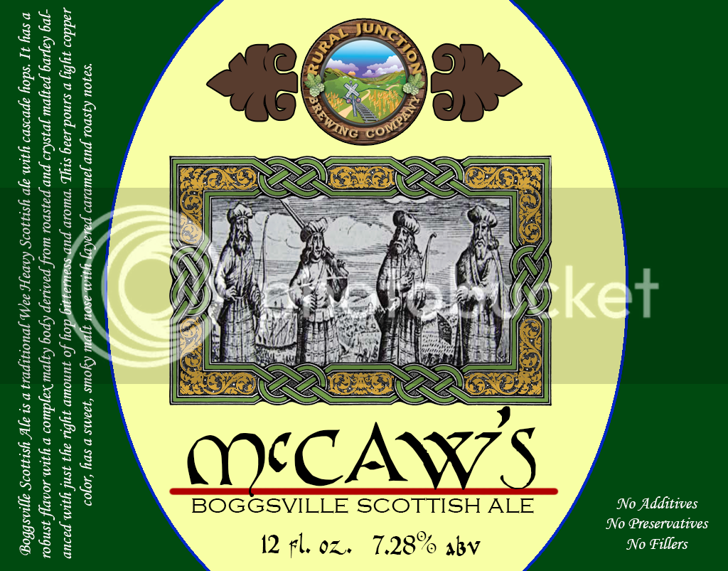
I left the whole top for beer and style
I figured the bottom right for abv and quantity.
https://drive.google.com/file/d/0B0Kf5Se_3A1ObThPbkRfdFdZSzg/view?usp=sharing

https://drive.google.com/file/d/0B0Kf5Se_3A1OT1AzRXBXT3lCTlk/view?usp=sharing

To somehow be integrated with this image:

https://drive.google.com/file/d/0B0Kf5Se_3A1OejVZb2w3ellKY1k/view?usp=sharing

In a way that is similar to yet not as primitive as this:

https://drive.google.com/file/d/0B0Kf5Se_3A1OWmtiOU91WnUwZ1U/view?usp=sharing

With the images sooth transparent and compatible in size etc....

I know that the background colour of the main image is atrocious, so I'm definitely open to ideas on improvements.

Bordering the image, I'm thinking vines of hops and sheaves of grain.

It would be nice if red, gold and black were used somehow to tie everything together to show the German roots/heritage.

The direct links to the original images are here:

Fischer guild Coat of Arms: http://upload.wikimedia.org/wikipedi...en-Fischer.svg

Obersteinbach Coat of Arms: http://images.vector-images.com/137/..._city_fr67.gif

Ukraine Coat of Arms: http://upload.wikimedia.org/wikipedi...of_UNR.svg.png

North Dakota Coat of Arms: http://upload.wikimedia.org/wikipedi...Dakota.svg.png

Text:

What I would like is "Fischer Brewing Company" above the image and "A Tradition of Family Brewing from the Banks of the Rhine and Beresan Rivers to the High Plains of North America" below the image. My instinct is that "Schwarzmeerdeutsche" (Black Sea Germans) would be more descriptive than "Fischer Brewing Company," but am not sure which would be "better." The font would be some sort of Bold, easy-to-read Germanic type. I would need an open space somewhere (perhaps below "Fischer/Schwarzmeerdeutsche") as a place to put the style of beer (eg: Chocolate Maple Porter).

Backstory: Part of my family (Fischer) emigrated from Obersteinbach in Alsace (black/gold cross, bird)) to settle and farm on the banks of the Beresan River in Ukraine in the early 1800s (trident). Around the turn of the 20th century, they emigrated from Ukraine settle in Dunn County in North Dakota (arrowhead). Throughout these moves, they held tight to their German heritage and the tradition of farming and brewing - even growing their own hops. In fact, the Fischers who stayed behind in Alsace went on to found a rather successful Brewery.

Anyway, the mess above is my attempt to pay homage to that heritage. I feel pretty lame asking for so much help, but as you can see, I don't do too well on my own. If anyone can clean it up and make it look halfway presentable, I'd be most appreciative.

If anyone reading this has a flash of inspiration that improves on my ideas above, please feel free to offer suggestions. This kind of thing is not my forte, as you can see.

Thank you -

Ron

I left the whole top for the beer and style and maybee the bottom right for alcohol % and quantity

Timekiller.jpg
 
Back
Top