
TheFlatline
Well-Known Member
Hey folks.
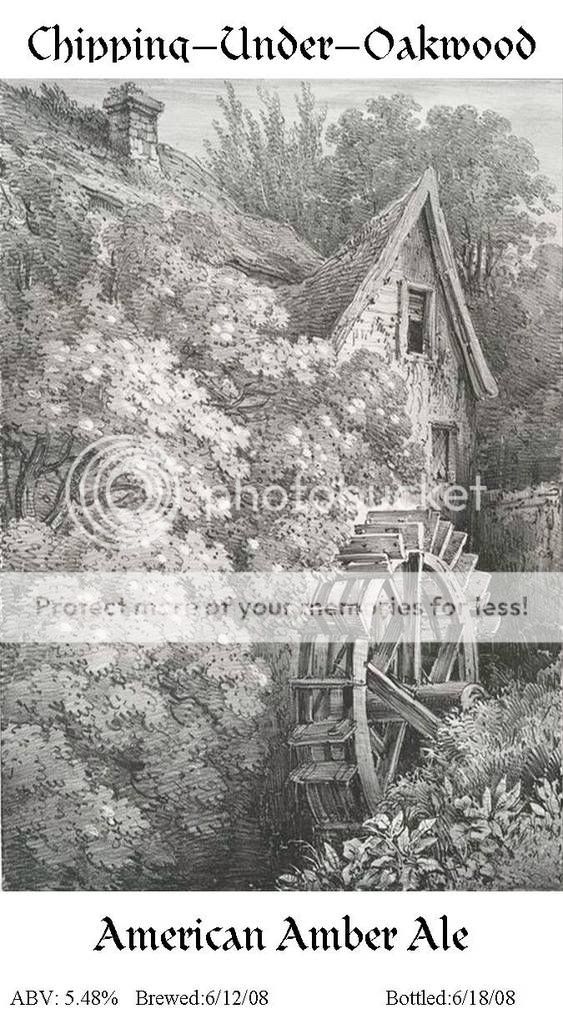
Finally decided to get around to making labels. I wasn't looking for anything fancy, but moreso something that feels a little more old-world. The below is what I came up with.
The artwork is from a lithograph done at the end of the 18th century, taken from a portfolio of old growth trees and shrubbery from all over england. I liked the artwork (most of the portfolio are old growth trees, which I vary amongst depending on the beer in the bottles, but I love this picture the best), it was more or less open domain, which is even more kickass, and it lent to a very clean, simple, aged style presentation.
The "brewery name" I picked, Chipping-Under-Oakwood, came from the Southern California Renaissance Pleasure Fair. For what I believe was around 45 years, the fair recreated life in a small English country town during the late 1500s. The word "Chipping" comes from the same latin root as "cheap", and means "marketplace". Therefore, the name of the town basically means "the market under the oak trees". While only some of my labels use oak tree lithographs, the sleepy, country atmosphere of this picture captures the concept perfectly.
I print them on my laser printer, in B&W (hence no color) using parchment to give the paper more texture. Usually if I'm in a rush or don't care especially I use a paper cropper to cut them out and they look fine. If I'm going for presentation, I'll actually carefully measure and tear the labels out by hand using a straightedge to give it a more hand-crafted feel. The eventual intent is to have the swing-cap bottles combined with an older-feeling label to evoke some nostalgia while drinking.
The labels themselves are made up in Microsoft Publisher, saved as a template, and can be modified in about 3 minutes to reflect whatever latest beer I've bottled.
And now, without further ado, I present my first attempt at labeling (unscaled, so that you can make out some detail, and forgive the clipping of the P's and G's in the text, this has since been corrected):

