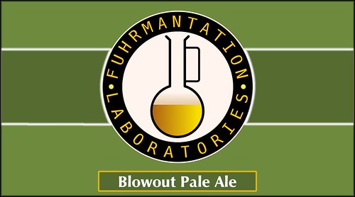
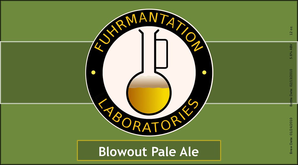
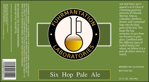
Still tweaking a bit, but designing a standard label in GIMP on linux. Will probably add a bit more text with brew date, bottle date, and ABV. Anyway what you ya think? (BTW my last name is "fuhrman" hence the name...)
I would try to tighten up the kerning between the letters and add space between the words and the dots - does that make sense? It's kinda hard to read.
I would try to tighten up the kerning between the letters and add space between the words and the dots - does that make sense? It's kinda hard to read.