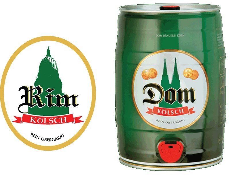
A couple of hyper-critical observations for you should you care to hear them. I am simply comparing your work to the original, not saying these are faults should your label be considered on its own metrits. Hope this doesn't come off as overly critical, because I think it's a great idea and it's executed well.
1. Overall shape is too oval. Original is more or less round.
2. Yellow border is too thick
3. Missing golden coin emblems
4. Dome of capitol building should be a shilouette, not a 2-level posterize - e.g. fill in the white space with green.
5. Yellow highlight color on "Rim" lettering is off - should be closer to the color you used on the main oval border
6. "Kolsch" should be in a sans-serif font
7. Red banner should be thicker (taller) so as to provide more bottom padding below "Kolsch"
8. The bifurcated "tails" of the banner should be shorter and curved upwards slightly
9. "Rein Obergarig" text is too curved. It is matching the curve of the oval, which in itself is incorrect.
10. Missing Uumlaut over the "A" in "Obergarig"
11. Put a slight inner shadow on the white circle background and do something with the border to give it a little more depth.
12. "Rein Obergarig" font color doesn't appear to be black in the original. Try it with something a little less saturated.
13. The red color of the banner seems just a bit off from the original even after compensating for final print - e.g. when you print yours, the red will still be off from the original.
14. White stroke around "Rim" is too thick.
Forgot one thing: If you stretch "rim" vertically, only stretch the "im" - that font is a bit off from the original, and the proportions between the capital an lower case are different.