You are using an out of date browser. It may not display this or other websites correctly.
You should upgrade or use an alternative browser.
You should upgrade or use an alternative browser.
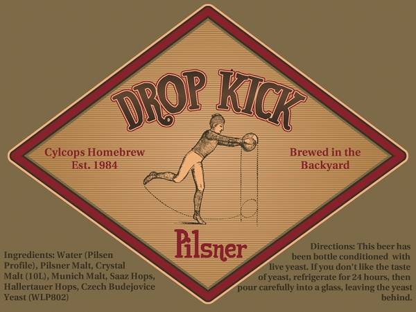
Advice needed on this label.
- Thread starter riromero
- Start date

Help Support Homebrew Talk - Beer, Wine, Mead, & Cider Brewing Discussion Forum:
This site may earn a commission from merchant affiliate
links, including eBay, Amazon, and others.
GodsStepBrother
Well-Known Member
- Joined
- Apr 22, 2009
- Messages
- 1,261
- Reaction score
- 30
That logo is actually very minimal, I like it a lot. love how you made the lettering imperfect. I think it is fine how it is.
BoxofRain
Well-Known Member
The label is really nice. That being said, I like your son's hop kick idea a lot. I would go with that and make the hop green to contrast the old school earth tones.
I like the label as is. The hop kick idea is also fun, but might give people the wrong impression, depending on how hopped up your pilsner is. By the way, is it CyClops Hombrew, or CyLcops Homebrew? I think you have a typo.
Pickngrin
Well-Known Member
Very nice! I'd stick with your original label, though the idea of kicking the hop is interesting.
Add me to the ones who love your label. I think its great as is!
I'd say the colors could be changed.
I personally would replace the...
Orange-ish middle background with an eggshell/off-white
Brick Red border with a brighter, possibly fire-engine red
And darken the outer background with a darker, olive color, to add contrast.
I personally would replace the...
Orange-ish middle background with an eggshell/off-white
Brick Red border with a brighter, possibly fire-engine red
And darken the outer background with a darker, olive color, to add contrast.
See, if it were ME I'd use a picture of Doug Flutie....

I like the minimal look, but did you mean to misspell "cyclops"?

I like the minimal look, but did you mean to misspell "cyclops"?
Similar threads
- Replies
- 27
- Views
- 1K
- Replies
- 89
- Views
- 3K


