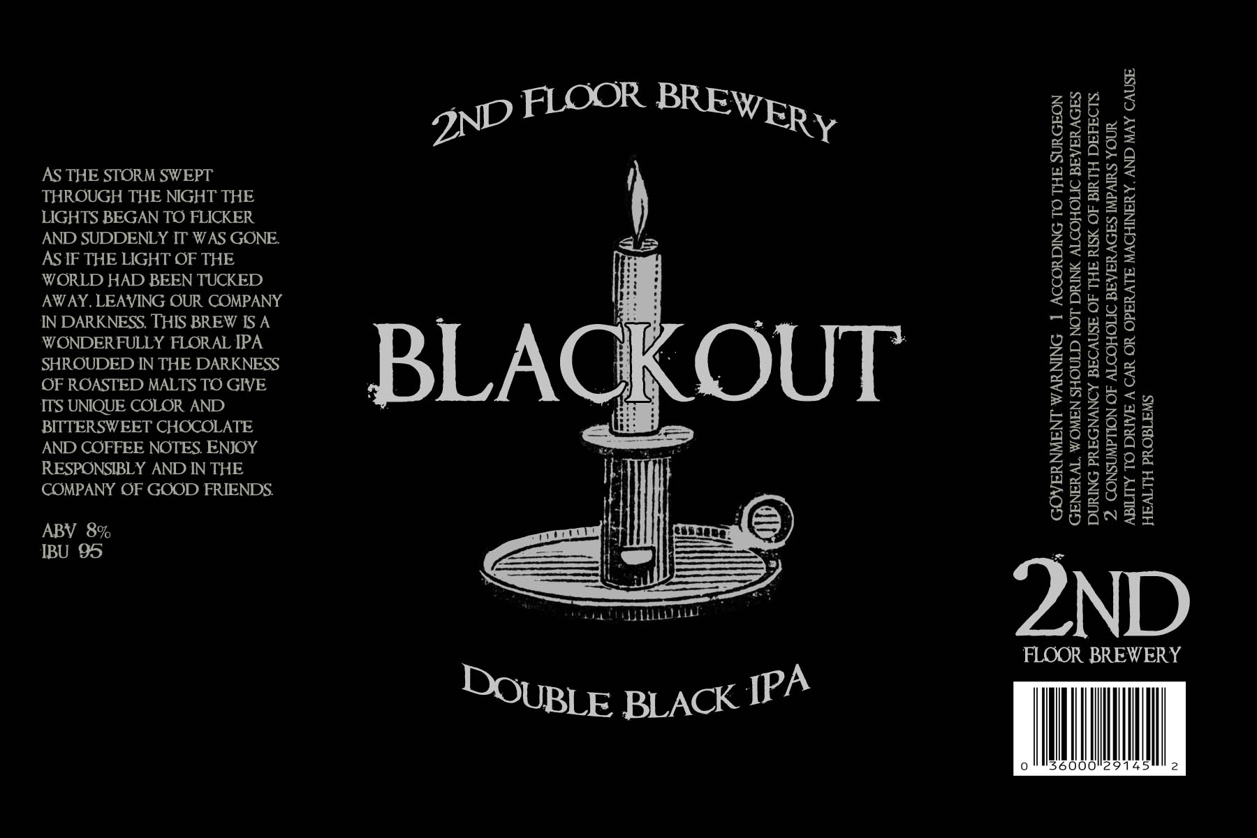
Like the darkness, and overall design of the label.
I tried the whole government warning and bar code stuff on my labels, and what I ended up doing was getting rid of it. 1.) Do you plan to sell?, 2.) Are your friends and family going to attempt to drink while pregnant? If you answered "No" to any of the above, then there is no real need for the warning or UPC. We are after all homebrewing. I'd personally have the actual part of the label(logo/name) on the right, add a good amount of negative space in the center and the description on the left. Being such a wide label, and dark and scary in design having that odd offset of logo vs type would give the drinkers a sense of eerie-ness being that the layout is so off from popular designs.