Welp, I tossed the idea. Racked my brain all last night and couldn't figure out anything that worked. The name just didn't seem right, the logo was too difficult to make work, etc.
Back to the drawing board. I needed a theme and a name that suited me. So I did what I usually do when trying to name thing: go to a random page on Wikipedia, click links that look interesting and after about 10 pages, you'll find yourself pretty well entrenched in a theme of some sort. Sure as ****, it happened.
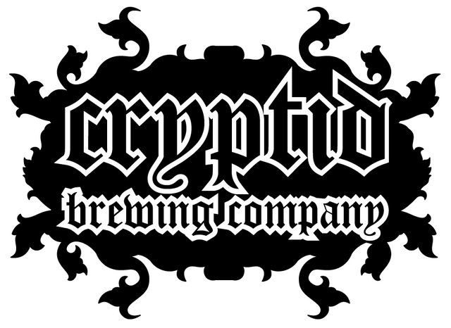
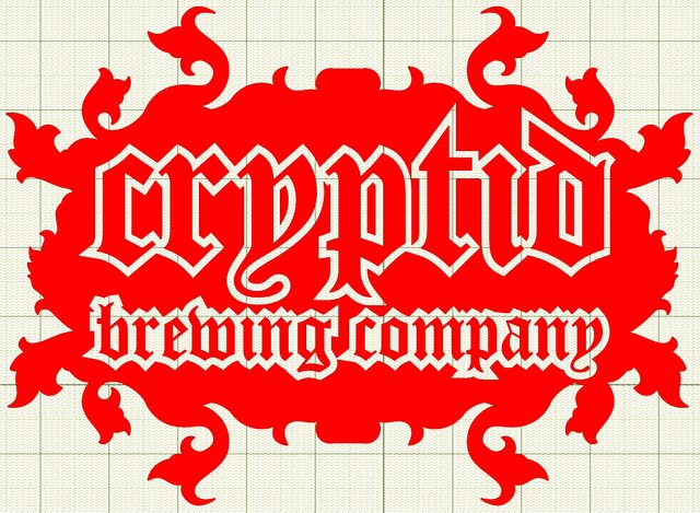
Scribbed down notes, then came home and slept. Woke up, tossed the new drawing program I'd been using out of the window, and loaded up Illustrator. Much more functional, logical, easy for me to adapt to. Here's the result.
http://imgur.com/IZzpq
A 'cryptid' is a creature or plant that science has not proven exists, but some people believe to. For example, Bigfoot. This stuff has always fascinated me. It also leaves plenty of room for themed beers.
Already planning a Triple IPA I name to 'Cerberus'.