lebucheron
Well-Known Member
Made a few more since I posted about a year ago...

Brewed this Saturday as a one-gallon experimental batch. Also planning to brew a Brown-Ale version of it later this week perhaps. I went with 20% of honey malt just to see what'll happen!
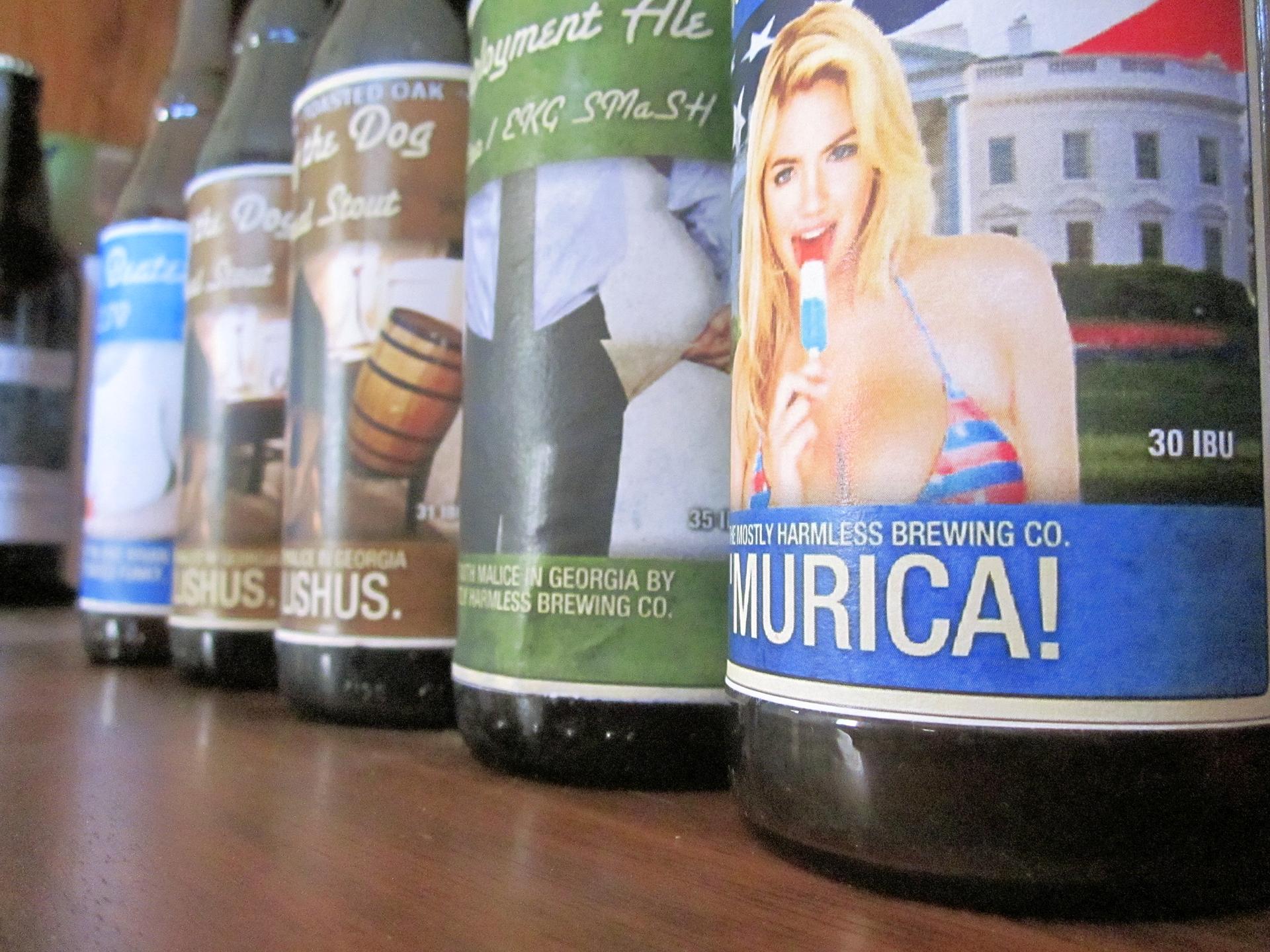
I like drawing pictures and them gluing them to my beer bottles. We brewed extract kits for the whiskey stout (my person loves whiskeys, I love stouts, so its the mushy, threw-up-in-my-mouth-a-bit label), also an imperial pale ale. We brewed a belgian tripel, and my boxer/chupacabra mix, Tesla, looks kinda like Admiral Ackbar with a severe underbite, so I just went with the horribly awful play on that. Those aren't on bottles yet, because I'm waiting for it to carb and I feel like labels = ready to drink, so I'm waiting")
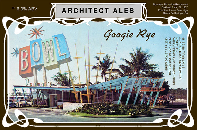
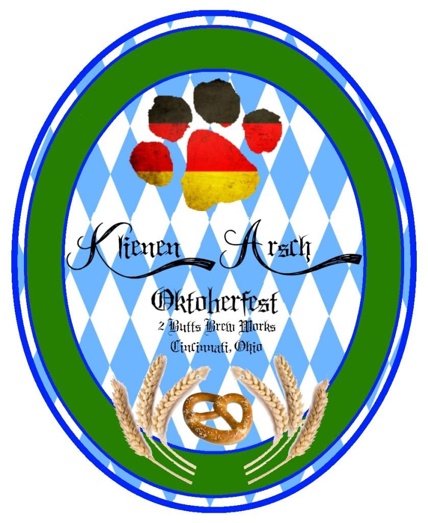
Next is the Klienen Arsch Oktoberfest (translates to Little Butt in German)


Brewed this Saturday as a one-gallon experimental batch. Also planning to brew a Brown-Ale version of it later this week perhaps. I went with 20% of honey malt just to see what'll happen!
was this one in the BYO label contest? I feel like I've seen it somewhere before...


The art in your sundowner is stunning...keep it up

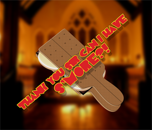
Ha. It works well, but isn't it not all that different than "Can I have S'More". The reason that those two are used so much, is because that's where the name of the treat came from.Heh, okay here we go...
I'm about to attempt a S'Mores Beer - obviously there's a handful of these around, and my original title idea - "S'Mores Sout" - turned out to be a very reputable beer by Short's Brewery in Michigan... So that's out...
"Can I have S'More" is played out... "Gimme S'More" isn't much more interesting... So I needed something really completely different. This is what I came up with... Lemme know your opinion, and note that it's still a work in progress.

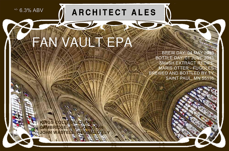
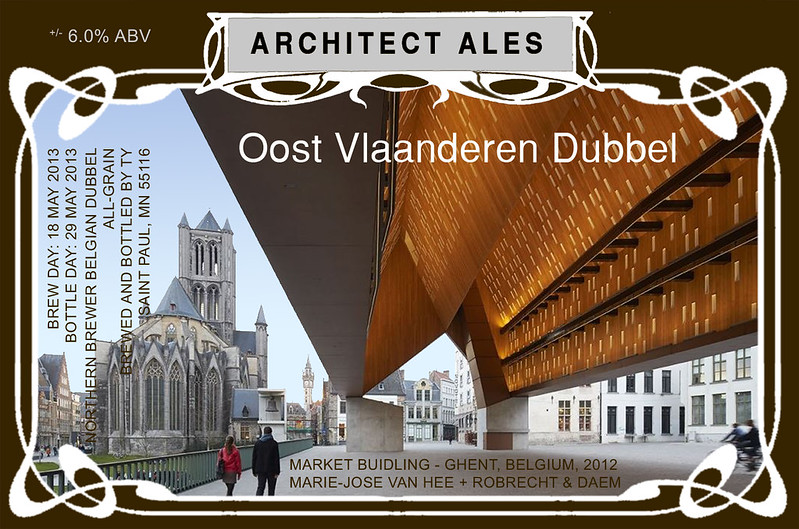
This is the basic format of all my labels. I just switch out the name and info, and I also change the color of the rusty truck font to coordinate with whatever type of beer it is. I looks a little odd with a white backround, but I actually print it on "kraft" cardboard colored labels.
I don't take full credit for the design though. Another homebrewer on HBT gave me a bit of inspiration as far as the layout goes. I just tweaked it to my own liking.
For mine, since I had never had my beer before, I didn't really want to call out S'Mores directly, so people wouldn't be disappointed if it didn't taste like S'Mores. I figured this was good enough:
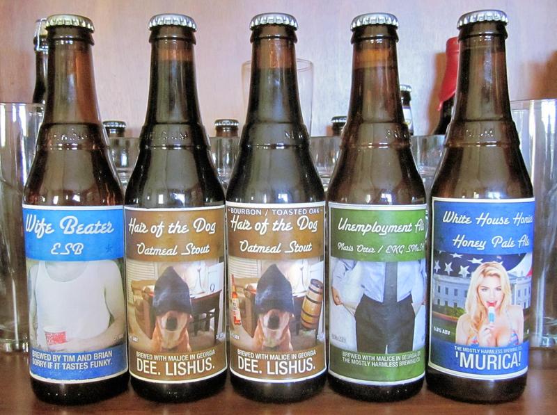
Cheers :rockin: to those excellent brewmasters and bottlers who've recently shown actual labels on actual bottles - mandasaurus_rex, greyfixer, The_Happy_Dachshund_Brewe, itsme_timd, ryden!
I've got nothin' for the rest of you bozos.
That actually makes pretty good sense to me. I like the graphic, too.
And actually after I posted that I realized I had my wording wrong - it's "Thank you sir MAY I have..." and then of course I'm using "S'More" isntead of "another."
I had also considered a Wizard of Oz theme and going with "Chocolate, Marshmallow and Graham, Oh My!"
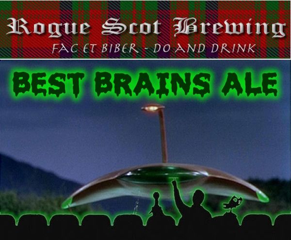
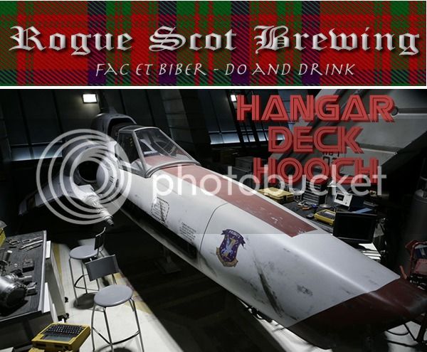
Have a label, just need a unique recipe...
Have a label, just need a unique recipe...


![Craft A Brew - Safale BE-256 Yeast - Fermentis - Belgian Ale Dry Yeast - For Belgian & Strong Ales - Ingredients for Home Brewing - Beer Making Supplies - [3 Pack]](https://m.media-amazon.com/images/I/51bcKEwQmWL._SL500_.jpg)