Noontime
Well-Known Member
New label design:
Thats a beautiful design.

New label design:
xMalachi said:My second attempt at a label. Some of you guys are crazy creative really wish I had the mind/photoshop talent for that.
The finished product


![Craft A Brew - Safale S-04 Dry Yeast - Fermentis - English Ale Dry Yeast - For English and American Ales and Hard Apple Ciders - Ingredients for Home Brewing - Beer Making Supplies - [1 Pack]](https://m.media-amazon.com/images/I/41fVGNh6JfL._SL500_.jpg)


lebucheron said:Hey, new to this forum, but your labels inspired me to make some of my own for my up-and-coming batches,
Love the Altbier font, but would separate Bay Area as I first pronounced it like Bayarea or diarrhea.
haha It was kind of a joke to put it together like that since to me it sounds kinda like Bavaira. Maybe I will just caps the A so it stands out more. BayArea.


Lefty's Lament

That's awesome, but I think the "American Pale Ale" font could be hard to read
I printed one off to check that out tonight and you are absolutely correct. The colors seemed off as well, not sure if that is because of the printer or what. I'm going to take the file to Kinkos in a couple of days and have them run a couple for me to see then decide from there. Thanks for the input!

You could try a "drop shadow" effect or a slight outline on the text. Both really help the text "pop" if that's what you're going for.I printed one off to check that out tonight and you are absolutely correct. The colors seemed off as well, not sure if that is because of the printer or what. I'm going to take the file to Kinkos in a couple of days and have them run a couple for me to see then decide from there. Thanks for the input!
Ok, here it is. I think this is my final draft of my latest

Wow this is awesome! I can't believe I missed this one... probably HBT app loading too slow
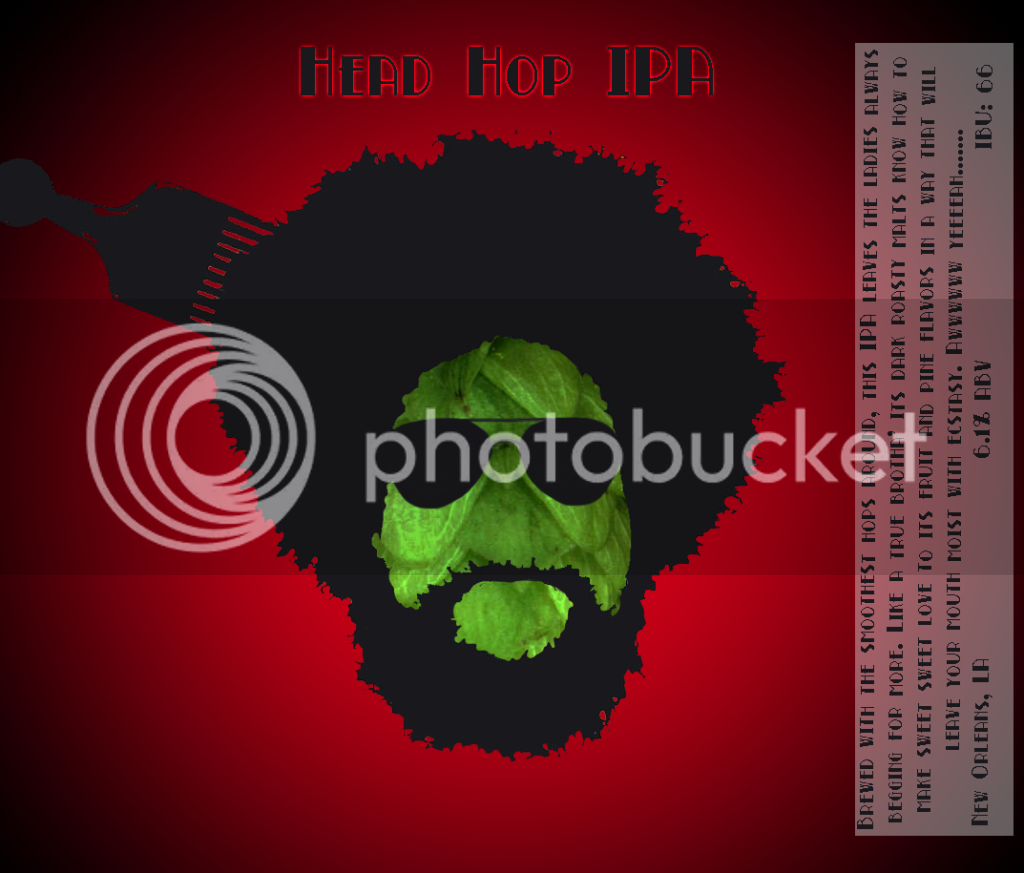
I have to ask... did you base the image on a silhouette of the drummer from The Roots?


