You are using an out of date browser. It may not display this or other websites correctly.
You should upgrade or use an alternative browser.
You should upgrade or use an alternative browser.
Free Logos or Beer Labels
- Thread starter pointcity-homebrew
- Start date

Help Support Homebrew Talk:
This site may earn a commission from merchant affiliate
links, including eBay, Amazon, and others.
pointcity-homebrew
Crafting openers 1 at a time
@pointcity-homebrew
Yes it is,very much so.
Maybe a little too dark,the bakground.
Do you want to keep it black and white or add color, if so which colors would you like to see?
pointcity-homebrew
Crafting openers 1 at a time
Hmmm
That is a hard one.
I like black and white, but also think that brown,gold and cream might work?

Wow,that is impressive!
The images are spot on,but the scrip feels a little like it could stand out(jump out) more, as I struggle to make out the words a little.
You do have a gift for this,thank you.
pointcity-homebrew
Crafting openers 1 at a time
Wow,that is impressive!
The images are spot on,but the scrip feels a little like it could stand out(jump out) more, as I struggle to make out the words a little.
You do have a gift for this,thank you.
Thanks, it is something that I have always liked to do.
I have just reinstalled windows on this pc and do not have any fonts installed. That is just Impact font. If there is a font type you'd like to see just let me know and I will try and find it.

$7.79 ($7.79 / Count)
Craft A Brew - LalBrew Voss™ - Kveik Ale Yeast - For Craft Lagers - Ingredients for Home Brewing - Beer Making Supplies - (1 Pack)
Craft a Brew

$20.94
$29.99
The Brew Your Own Big Book of Clone Recipes: Featuring 300 Homebrew Recipes from Your Favorite Breweries
Amazon.com

$28.98
Five Star - 6022b_ - Star San - 32 Ounce - High Foaming Sanitizer
Great Fermentations of Indiana

$10.99 ($31.16 / Ounce)
Hornindal Kveik Yeast for Homebrewing - Mead, Cider, Wine, Beer - 10g Packet - Saccharomyces Cerevisiae - Sold by Shadowhive.com
Shadowhive

$176.97
1pc Commercial Keg Manifold 2" Tri Clamp,Ball Lock Tapping Head,Pressure Gauge/Adjustable PRV for Kegging,Fermentation Control
hanhanbaihuoxiaoshoudian

$53.24
1pc Hose Barb/MFL 1.5" Tri Clamp to Ball Lock Post Liquid Gas Homebrew Kegging Fermentation Parts Brewer Hardware SUS304(Liquid MFL)
yunchengshiyanhuqucuichendianzishangwuyouxiangongsi

$33.99 ($17.00 / Count)
$41.99 ($21.00 / Count)
2 Pack 1 Gallon Large Fermentation Jars with 3 Airlocks and 2 SCREW Lids(100% Airtight Heavy Duty Lid w Silicone) - Wide Mouth Glass Jars w Scale Mark - Pickle Jars for Sauerkraut, Sourdough Starter
Qianfenie Direct
$22.00 ($623.23 / Ounce)
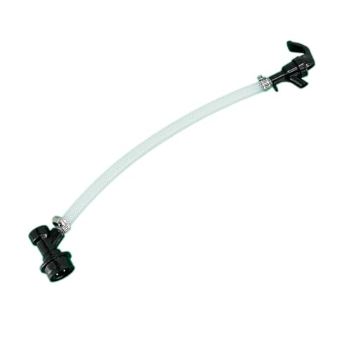
AMZLMPKNTW Ball Lock Sample Faucet 30cm Reinforced Silicone Hose Secondary Fermentation Homebrew Kegging joyful
无为中南商贸有限公司

$53.24
1pc Hose Barb/MFL 1.5" Tri Clamp to Ball Lock Post Liquid Gas Homebrew Kegging Fermentation Parts Brewer Hardware SUS304(Liquid Hose Barb)
Guangshui Weilu You Trading Co., Ltd

$58.16
HUIZHUGS Brewing Equipment Keg Ball Lock Faucet 30cm Reinforced Silicone Hose Secondary Fermentation Homebrew Kegging Brewing Equipment
xiangshuizhenzhanglingfengshop
Thanks, it is something that I have always liked to do.
I have just reinstalled windows on this pc and do not have any fonts installed. That is just Impact font. If there is a font type you'd like to see just let me know and I will try and find it.
I just had a quick muck around on my laptop and found the Harrington font,which looks immeasurably cool.
I discovered a young mutant frog in my corn field about the size of a quarter... it was a lovely sky blue rather than the typical green. Since then, I have become Blue Frog.
My image for a bottle or glass design: a blue frog is hugging the glass or bottle with his arms wrapped around the container. Maybe the image won't work.
Optionally... the name of a drink I make is Giji.
I would like to see it in the psychedelic art style of 60's concert posters created in the SF area, Something that makes you look deeper into the image & only releases its meaning to the observer after a good deal of study, tokes or hits.
pointcity-homebrew
Crafting openers 1 at a time
I just had a quick muck around on my laptop and found the Harrington font,which looks immeasurably cool.

spittybug
Well-Known Member
You can have some fun with this one... House Malbec
Yes, Malbec is my name, and no I don't make wine; just beer! I think this begs for a "Game of Thrones" style of logo like attached. Or maybe a shield style coat of arms with grapes and wine bottle X'd out in 2 quadrants and hops and grain in the others..... just ideas.
To be clear, you use the artwork for your portfolio, but all rights to use are granted, correct? I obviously reserve all rights to my name and ideas.



pointcity-homebrew
Crafting openers 1 at a time
You can have some fun with this one... House Malbec
To be clear, you use the artwork for your portfolio, but all rights to use are granted, correct? I obviously reserve all rights to my name and ideas.
Yep, as long as your not using the logo or label to make a profit.
Thanks, it is something that I have always liked to do.
I have just reinstalled windows on this pc and do not have any fonts installed. That is just Impact font. If there is a font type you'd like to see just let me know and I will try and find it.
I just had a quick muck around on my laptop and found the Harrington font,which looks immeasurably cool.
pointcity-homebrew
Crafting openers 1 at a time
@pointcity-homebrew
I think you may have it nailed with that last one.
Very well done indeed.
How can I get the file to save?
Here you go-
https://www.dropbox.com/s/0bai6ztqmt4z65f/Badlee-final.png?dl=0
I opened the dropbox link,which came out with a white background,which look super awsome.
But after saving it opens as all black. All black as in the only thing that can be made out is the flag and where the elephant and lion overlap it.
Could you help me out,please?
I may just be doing something wrong,which is possible,as I am almost computer illiterate
pointcity-homebrew
Crafting openers 1 at a time
I opened the dropbox link,which came out with a white background,which look super awsome.
But after saving it opens as all black. All black as in the only thing that can be made out is the flag and where the elephant and lion overlap it.
Could you help me out,please?
I may just be doing something wrong,which is possible,as I am almost computer illiterate
It is a png file, it has a transparent background.I opened it in IE as well as paint and it has a white BG.
I am using windows 10 and the photo app has a default black background, so the black is showing through the transparency. Seems to be a flaw with the design on Win 10.
If you upload it to a site it should not be black.
Calfj60
Well-Known Member
If you are still interested I would love to see what you can come up with for me.
Flat Broke Brewing
I'm picturing something old west,barn wood, gunslinger style.
Flat Broke Brewing
I'm picturing something old west,barn wood, gunslinger style.
Firewalker11
Brewer
Pointcity,
Thanks for taking this on. I already have the logo but need some help with a good font for the name. The name is Metal-Monkey Brewing. I would like a font that looks like cursive handwriting but very clean and easy to read from a distance. here is the logo:

Thanks for taking this on. I already have the logo but need some help with a good font for the name. The name is Metal-Monkey Brewing. I would like a font that looks like cursive handwriting but very clean and easy to read from a distance. here is the logo:

TattooCelt
Well-Known Member
A bit late to the game, but if you're still feeling creative... Nevermore Brewing Co.
Use of a Raven for sure, genre not important but some kind of "Edgar Allen Poe" feel to it would be super!.
Use of a Raven for sure, genre not important but some kind of "Edgar Allen Poe" feel to it would be super!.
pointcity-homebrew
Crafting openers 1 at a time
I have been working through the as time permits. It is crazy how busy life can get.
BGBC
Well-Known Member
@pointcity-homebrew - here's one that I've used for myself a couple times. Original idea was to have the text on the street signs ('RIVER ST' on one, and 'Alewerks' on the cross street), but I couldn't make it happen. Interested if you'd have any luck with that or other ideas.


MuddyCreek
Well-Known Member
I'll give this a whirl if you're still at it.
Label rendition:
Seeing Other People, ESB
Oh. I might be out of contention. Seeing Other People is an actual commercial product. Sorry. I just thought it would be fun to see your take on the label. (If it makes you feel better, if we choose to use your label, we WOULD pay you for it, of course.)
Label rendition:
Seeing Other People, ESB
Oh. I might be out of contention. Seeing Other People is an actual commercial product. Sorry. I just thought it would be fun to see your take on the label. (If it makes you feel better, if we choose to use your label, we WOULD pay you for it, of course.)
EcuPirate07
Beer is a food group
If you are still working through these I've changed my brewery name to Dig Dog Brewing Co. And would like a new logo, Thinking along the lines of a dog digging a hole in the ground something rustic, but thrown your spin on it. Thanks
spittybug
Well-Known Member
Yep, as long as your not using the logo or label to make a profit.
Cool, looking forward to your creation!
- Joined
- Dec 5, 2007
- Messages
- 1,719
- Reaction score
- 759
Like the Cars sang, you're just what I needed. I am designing an overlay for my control panel and I'd love to add a logo to it. I just created another thread asking for some design help before I saw your offer to design a logo which would be a great addition.
My other hobby is tennis so I'd prefer something related to it using the name Breakpoint Brewery. If that won't work then something honoring my Irish heritage using the toast, Sláinte, would be great. Here's the overlay design so far and I was thinking of a logo which would fit between the power and e-stop areas to the left of the PID:

My other hobby is tennis so I'd prefer something related to it using the name Breakpoint Brewery. If that won't work then something honoring my Irish heritage using the toast, Sláinte, would be great. Here's the overlay design so far and I was thinking of a logo which would fit between the power and e-stop areas to the left of the PID:

Cool stuff...
How about "Moonshack Brewhaus" ?
My buddy and I did shirts sometime back that had an outhouse-looking shack with a crescent moon rising in the background... the concept was good but our artistic skills were lacking.
How about "Moonshack Brewhaus" ?
My buddy and I did shirts sometime back that had an outhouse-looking shack with a crescent moon rising in the background... the concept was good but our artistic skills were lacking.
How about "Mietlowski Brothers Brewing"? My original idea was using the Polish eagle but holding hops and wheat (think the US presidential seal). Not completely married to that idea though if you have any other inspiration. There's two of us so a Polish take on Mario brothers with beer could work too. Feel free to be as creative as possible 
Similar threads
- Replies
- 1
- Views
- 533
- Replies
- 1
- Views
- 714
- Replies
- 23
- Views
- 2K
- Replies
- 84
- Views
- 5K














![Craft A Brew - Safale BE-256 Yeast - Fermentis - Belgian Ale Dry Yeast - For Belgian & Strong Ales - Ingredients for Home Brewing - Beer Making Supplies - [3 Pack]](https://m.media-amazon.com/images/I/51bcKEwQmWL._SL500_.jpg)


