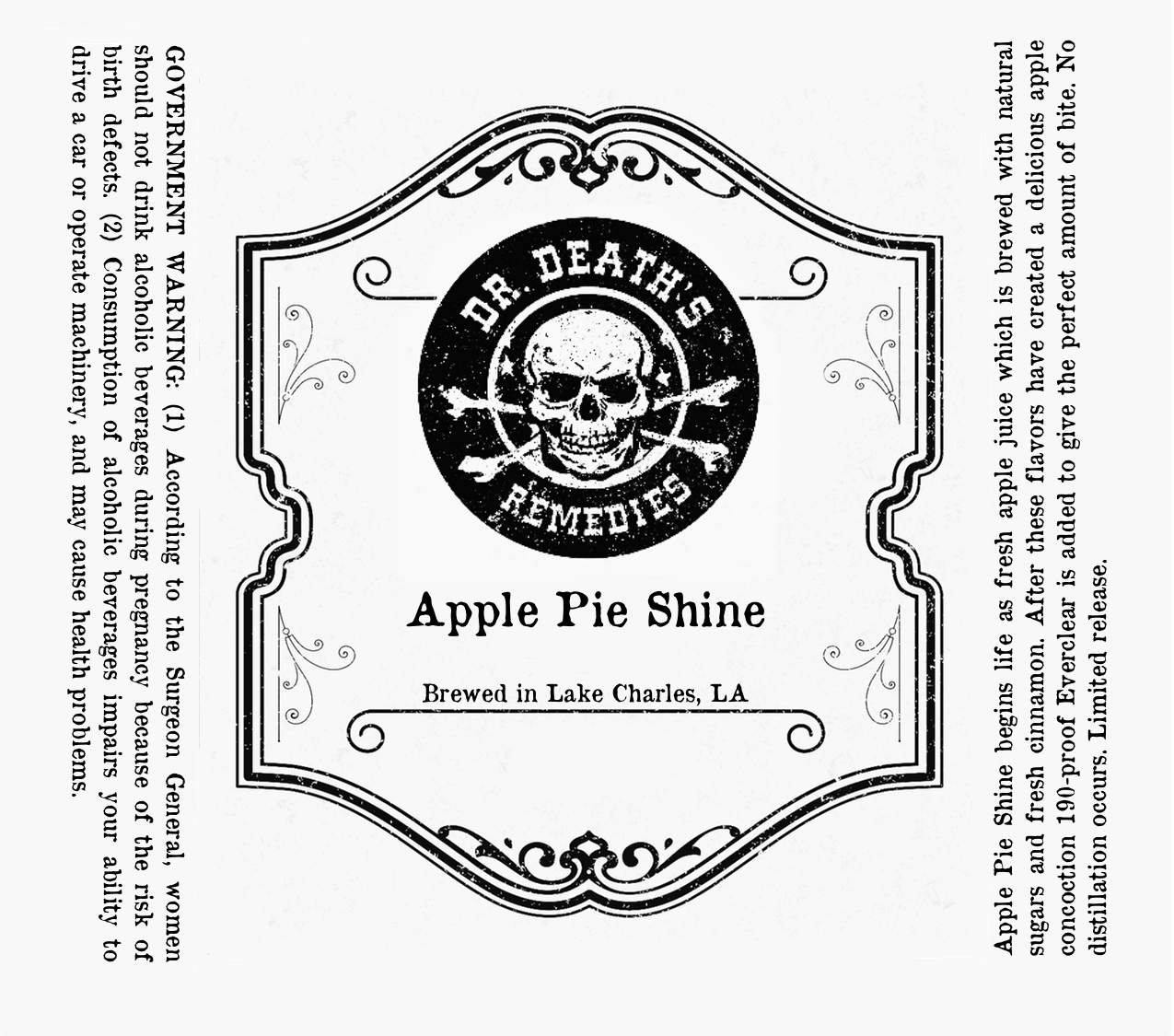
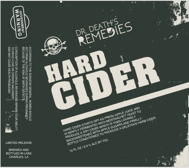
Which label do you like more?

Homebrew Talk - Beer, Wine, Mead, & Cider Brewing Discussion Forum

Help Support Homebrew Talk - Beer, Wine, Mead, & Cider Brewing Discussion Forum:

This site may earn a commission from merchant affiliate links, including eBay, Amazon, and others.

rockydog101

Well-Known Member
Joined
Feb 11, 2015
Messages
66
Reaction score
24
Hi all,

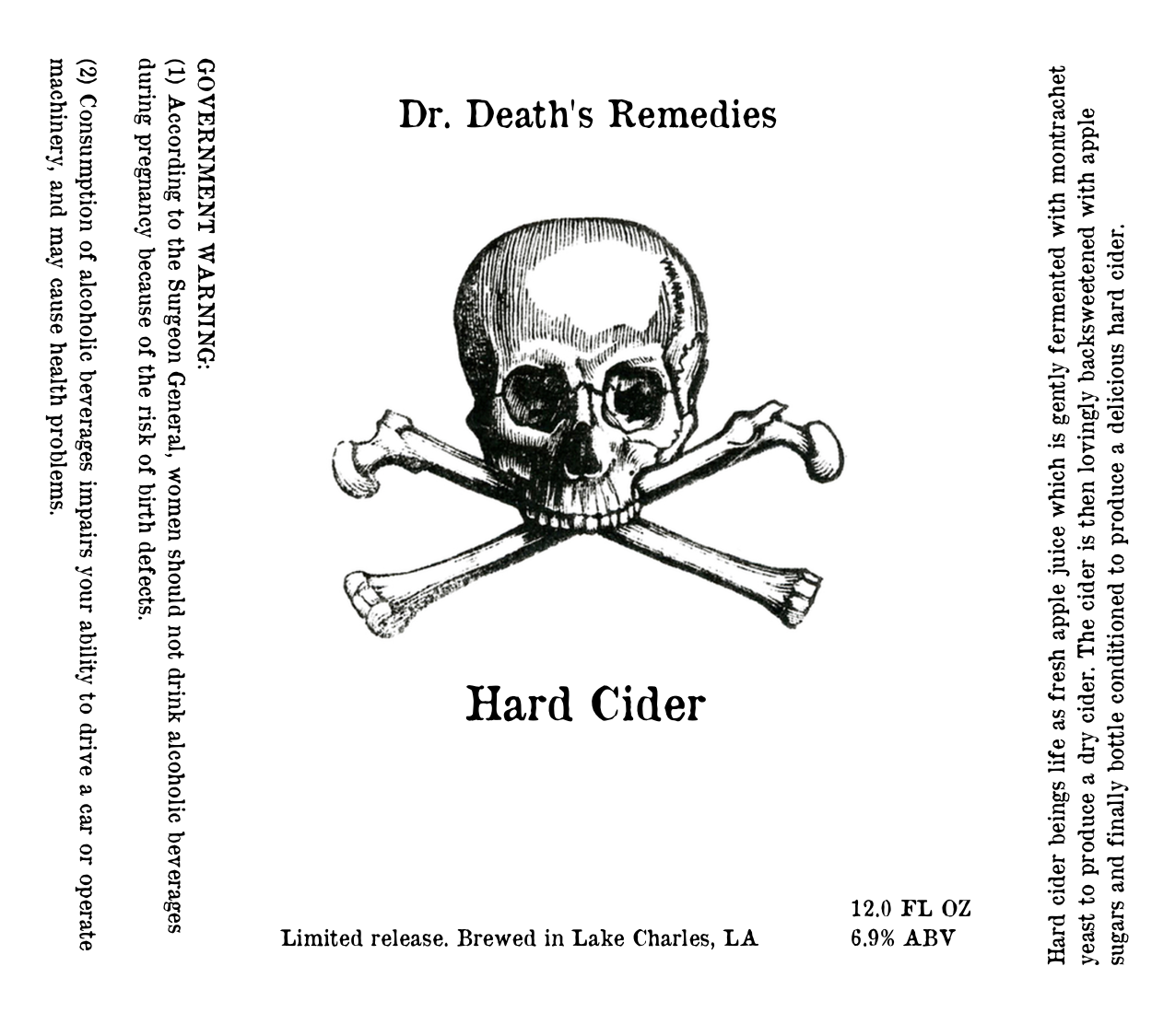
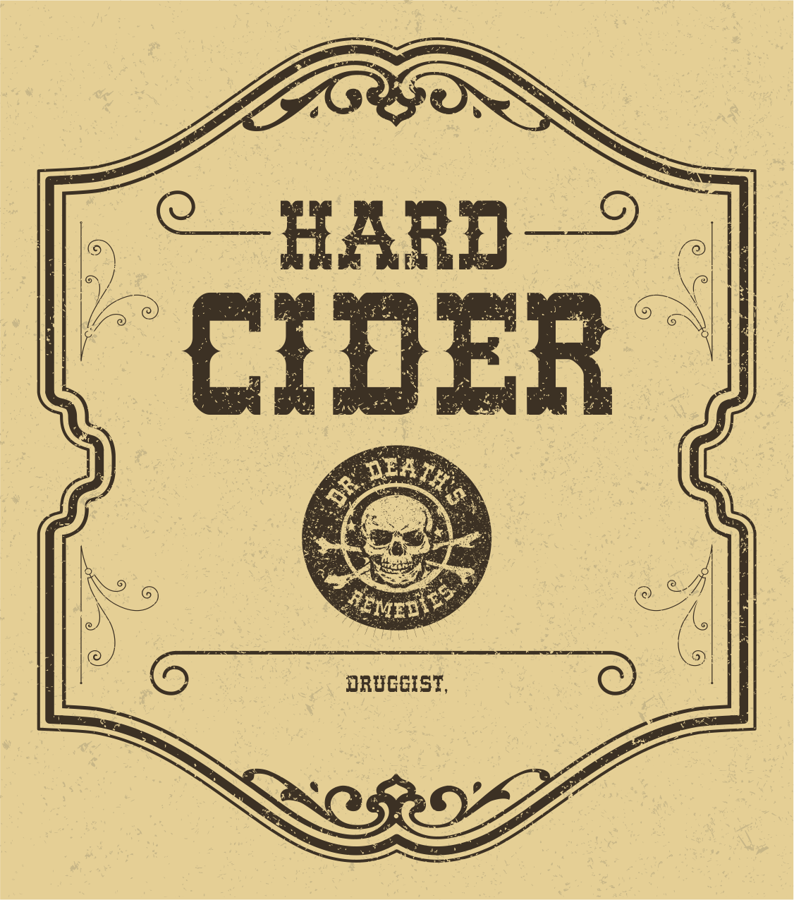
I've been working on a few different labels. I can't make up my mind. I initially just wanted a simple apothecary style label, which is when I worked on the third label posted here (the one with a yellow background.) But when I got the label printed, it just looks plain and blah. I tried one with a little more style (the green one), and then I tried a totally minimalist one (the white one.) The white one actually looks nice printed out, surprisingly.

What do you think?
idea1.png


idea2.png


MAIN LABEL.png
 
Those all look pretty slick man, nice job. Even if you think they seem lacking, it may take on a completely different form once it is on a bottle. You're going to have to test each one out on a bottle and repost :D

- Preliminary vote though, in order of most appeal for me: Green - Yellow - White
 
I like all of them, it's all about the style you want, because you have 3 totally different styles going on there.

My preference of liking is in the order you posted them, but I could easily put the second one as my favorite.
 
I'm not crazy about the yellow, but the other two are great. The green looks more modern, and I think it just depends on the theme you're going for. If you're thinking modern apothecary, that's the one.

I think your idea for a simple or classic apothecary style label would work really well with the right bottle. If you got a set of them that looked more antique, a label with a patina would really mesh. I picked up a bottle somewhere that, to me, looks medicinal, and it would be perfect.
 
The first one reminds me of brew dog, I like it and maybe a deeper color would make it pop more. At first I didn't like the second as much but then I read how you said it looks good printed and I started thinking of it printed instead of just on here and I could see it being pretty good, esp. if you want the doctor-pharmacy feel. The third one looks like like a good idea if it were cut just to the shape of the outline instead of a square but you'd have to find the right kind of paper to make it work. It would all boil down to how they fit into your other bottles but I would say one of the top two, I would personally do the second one just for the savings in ink.
 
I like the third, probaly because the skull is less prominent. Plus, it's kind of old-timey.
 
I am not trying to be the grammar police here, but in the second label there is an issue. It says "Hard Cider beings life" when I think you meant "Hard Cider begins life..." I just don't want you to pick the 2nd label, have them printed, and realize this. All of them look top notch to me though.
 
I sincerely appreciate the feedback. And DoomRider thank you for noticing that!!

I tried combining 2 and 3 together. I really want that medicinal feel to the label.

maybebest.png
 
Crap, I love all three. For real. Make a series of 3 beers and use them all, man!
 
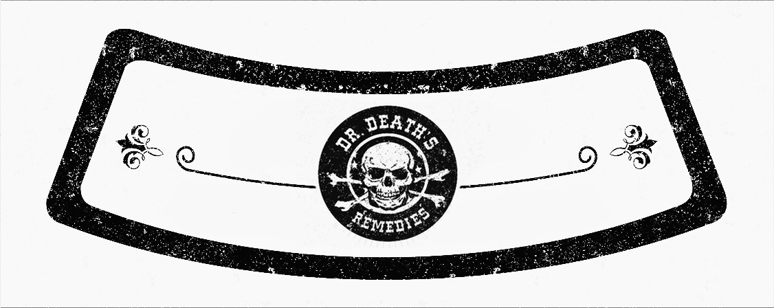
The necker and bottle cap

I'm keeping it white for that kind of minimalist and medicinal feel, and because I'm going to use Grogtag to print the stuff, and grog tag's bottle caps are white, so even if you have a colorful bottle cap you end up with this odd crown of white.

necker.png


cap.png
 
Maybe it is just me but I feel like the government warning is out of place. After all, it is what the doctor ordered.
 
My rankings are 4, 3, 2, 1. At first glance, and purely for aesthetics I liked 1 the most, but it just doesn't fit your theme to me. Good work!

And as someone else mentioned, no 1 totally had the brewdog feel to it.
 
This is tough because they're all nice but I think I'm going to vote for the first label. It does look similar to a Brew Dogs label and it is kind of "modern" looking, which might not be what you're going for given the subject matter. The others look a little too simplistic though so number #4 was the perfect medium but coupled with the neck label and cap there's too much of the Dr. Death logo. I'm rambling but trying to give constructive criticism. The first label wins.
 
Hi all,

Thank you kindly for replying to this thread and giving me feedback and suggestions. I ended up revising the label and going with #4. And I agree with BierGut saying it's redundant to have the name of the brewery in both text and graphic. So I removed the text and just enlarged the graphic. It seems to fit nicely.

The first label is the revised one. The second label is prior to revision. I've also justified the text on the sides, and compacted it a little.

What do you think of the first label? Thank you kindly.

LABEL1.png


LABEL2.png
 
it looks very nice although, it is missing "certified druggist" at the bottom. I like the antique/snake oil look. I would poke some fun at the gubbmint warnings. What a buzz kill as is. Otherwise, well done.
 
Back
Top