Help Support Homebrew Talk:
This site may earn a commission from merchant affiliate
links, including eBay, Amazon, and others.
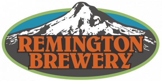
So living in Portland has made it somewhat hard to be original with Portland themed ideas. Luckily no brewery that I am that aware of uses Mount Hood. Ive been playing with colors on this general idea for a while and I wanted to get some feedback. Initially I felt it wasn't good enough and didn't stand out. But by the end of it, I feel like it sticks into the mind and works on a bunch of mediums. Still designing the black/white version.
I would say off the bat I like the colors but i think i've seen this label far too many times. It's not a criticism on your label specifically but rather to them as a whole. Maybe you could try to play with the mountain in a more abstract way so that it signifies something else. Or use different text and move it around a bit. It's something about the centered mountain but i can't figure out what. Maybe its just me! Try and make a few more and play with shapes, design and colors that you normally wouldn't use. That way you can experiment a bit more.
GOOD LUCK!
P.S. I'm also in the process of making my label


