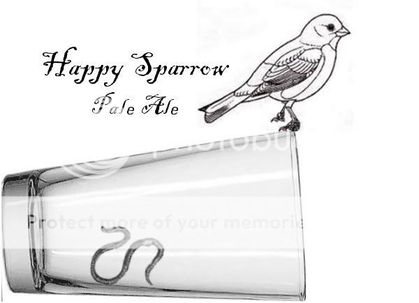
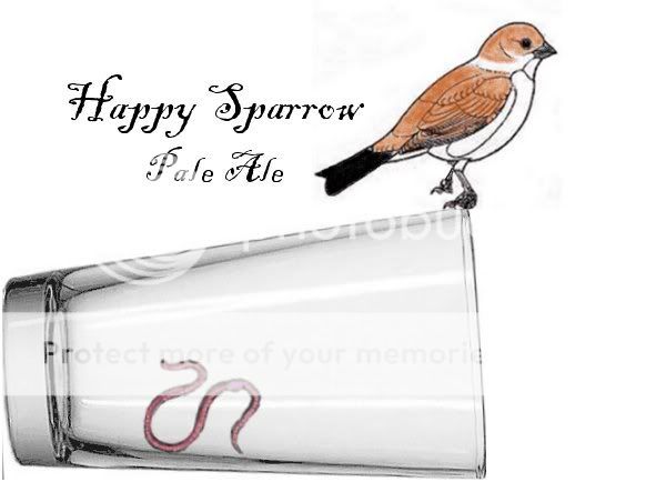
I kind of like the first one. It goes more with the fact that it's a 'pale ale'. If you were doing a brown ale, or english ale i would go for the coloured one.
I like grayscale pictures, it gives it a really simple look.. However the color looks really good... I'd say for Amber-Red-Brown beers do the color, for really Pale or really Dark beers do the b&w
Lol, hey I don't think they are all that bad....give yourself a little more credit. Actually I kind of like the way it is presented. Simple and rustic with a really good theme going on. I would keep it simple. B&W imo.
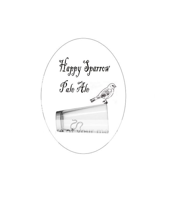
You know if you want to tweak it, here's what I'd do. Start by moving the text up about 1/3 the distance that it is now and scale it slightly larger or scale the image down respectively. Then encompass the whole thing with a single black line oval. Have the feet grasp the edge of the glass. Then when you bottle, cut oval labels. Other than that I wouldn't change the lettering style or picture or anything else.
On the whole I really like this because it has depth of meaning.