Start of new label for my Stout!

Homebrew Talk - Beer, Wine, Mead, & Cider Brewing Discussion Forum

Help Support Homebrew Talk - Beer, Wine, Mead, & Cider Brewing Discussion Forum:

This site may earn a commission from merchant affiliate links, including eBay, Amazon, and others.

middleofnowhere

Well-Known Member
Joined
Apr 15, 2008
Messages
608
Reaction score
7
Location
Labrador City, NL, Canada
jester1.png


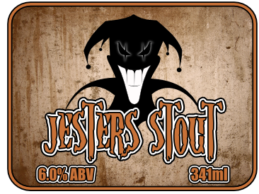
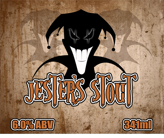
This is my preliminary design for my Stout Beer that I received from MoreBeer on Friday. 5 Days to get it from California to Labrador, must be a record! Now I need a bigger Brew Pot so I can start the brew process.
 
I like that font, but I also thought it was a little too busy for a beer label.

This is where I am now....

jester.png


I omitted the apostrophe because the apostrophe in this font is crap. I figured I would clarify before I caused another english lesson...lol
 
The second one looks better. I like everything except for the font color. To me it is a bit too dark. Other than that, I like it a lot. Are you going to add any text to the left and right?
 
Yep, I definitely plan on putting text on the sides. I am trying to figure out a colour for Jesters Stout, but I don't like anything I choose. I may still change the complete colour scheme yet. Not sure, I can never make up my mind. Good thing I don't do this for a living.
 
The green and white are both just to bright for me, the text seems hard to read. It has a cool look Id just keep tweaking it maybe a green that isnt so neon and the text a light grey or maybe they need a mask or something I dont know.
 
I printed the label last night s a test, and my printer doesn't print the green well at all, it comes out too dark, and you can barely read the label. maybe the black is too dark as well, when applied to a beer bottle it looks like crap!

I will have to rethink the colour scheme completely.
 
I printed the label last night s a test, and my printer doesn't print the green well at all, it comes out too dark, and you can barely read the label. maybe the black is too dark as well, when applied to a beer bottle it looks like crap!

I will have to rethink the colour scheme completely.

most greens wont print the way you want them to. You cant produce neon green with CMYK
 
That is one sweet label you got there, but yes green sucks royal a$$ when printing. p.s wheat king your avatar is the coolest thing evah!
 
Looks great, I like the style. The stone texturing in the font looks really cool, but I doubt it would come out that great on an inkjet. :(

Maybe go to a darker green and gray?
 
I have a new design done, less complex shape, just rectangular. still needs work. Different colours as well. I am also looking into buying a colour laser printer, just have to convince the SWMBO. Our inkjet has pretty well come to the end of its usable life.

The rectangular design is for simplicity, as I have picked up some rectangular Avery Labels.

Here is the redesign.

jester5.png
 
The redesign looks much better.

I'd avoid using an inkjet, if possible. The DPI is just too low to print fine text and good colors. See if you can print them on a CYMK color laser at work, or maybe ask a friend? If you are not using a vector art program, I'd highly suggest drawing the label to fit the exact dimensions of the Avery labels. It also helps to use a CYMK color palette in your design for better color reproduction.
 
Yeah, I am working on an apostrophe. I just printed this label on my inkjet and it looks a lot better. Can't wait to start actually brewing the beer. I got my kit Friday, gonna buy a new brew pot Thursday and brew it sometime this weekend.
 
The Jester has been a nickname of mine since 1997, and my friend drew me a cartoony Jester for a tattoo that same year. The jester in the logo is a modified version of my tattoo. The background is actually a concrete wall texture that was released free for use on deviant art. The font is Nightmare 5 from dafont.com.

The apostrophe is made by me. I take full credit for it...lol

This is the final version of the logo, I have been working on it all day....and I am done.

jester6.png
 
Well thanks to the brainstorming of me and everyone who posted their comments, I have an awesome label which will be the basis of all my beer labels from now on. The three Jesters will be the common theme, and the same font, but different colours and different textured background.

Thanks a bunch guys!
 
Back
Top