Some new labeling from Townie Brewing Co!

Homebrew Talk - Beer, Wine, Mead, & Cider Brewing Discussion Forum

Help Support Homebrew Talk - Beer, Wine, Mead, & Cider Brewing Discussion Forum:

This site may earn a commission from merchant affiliate links, including eBay, Amazon, and others.

GloHoppa

Well-Known Member
Joined
Dec 26, 2007
Messages
440
Reaction score
2
Well I downloaded GIMP for my mac and watched a couple tutorials. It is starting to come together slowly but surely. So thank you all for the nudging in the GIMP direction:mug:

Here is my first attempt with GIMP making a simple brewery logo:

n114500262_31084358_1337.jpg


Using that logo generator I found stickied on this section of the forum:

n114500262_31084360_6514.jpg


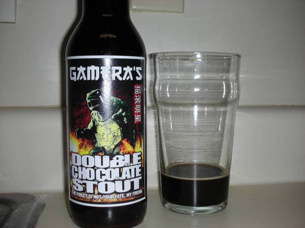
Finally my first real label using GIMP:

n114500262_31084361_279.jpg


I would love honest feedback folks!!
 
The badge logo made me LOL a little. So did the first label! Nice work, I like your ideas.

My main suggestion with the labels is to play with the text more. It doesn't stand out from the image very well. Maybe try lighter colors on the first label and/or some stroking or drop shadow type effects that would make things more legible.

I quite like the font you used for the Steam Beer text on the second label, it matches the serene beach scene quite well. The smaller text fades into the background a little too much, though. I would play with color/effects to try to bring those out a little more.

And going in a completely different direction... Maybe your label fonts should more closely match the font on the badge logo for continuity? I'm not sure, but you might play with it to see how that looks. Just thinking...

Keep up the good work!
 
I think your doing great just learning the program. I really like the image and feel of the steam beer label. The description is a little hard to read due to blending in a tad with the water. I don't know if making it a smidgen larger would do it, or possible tweak the color some?....hummm ....I am still pretty new to GIMP as well so take my advice with a grain of salt....lol

I also like the logo.....

I also recommend drawing a border around the image. I found they can be a pain in the butt to cut out right sometimes. So if you use a color close to the color of the bottle you don't have to be as exact when cutting them out. I didn't do it my first two and found myself getting frustrated with a little white from the paper showing up around the edges. It's a small thing, but I was anal about it. I just use a small pencil and fit it exactly in the corner and make a single mark. Then scroll over to the next corner, press shift (this makes a straight line from the first mark you made), and click again. This will give you a straight line. I just do it all around the image..... I'm sure there is other ways to do it, but it's easy enough for noobs like us to do....lol
 
Thanks for the feedback guys...unfortunately i flattened my image and THEN saved it so right now i will keep the steam beer image as is unless i can figure out how to unflatten it...

I did make another one, let me know what you all think!

n114500262_31085167_6834.jpg


This one only took me about 45 mins to do, so its starting to get easier!! :mug:

If it is not apparent, i tried to go with leaf colors as a motif for my font colors, so greens and oranges with the obligatory shield ;)
 
Trying outlining the text in the opposite colors, brown or at least white.

I would go white outline on the bottom line.

Use the green in the "Apfelwein" and border the "7%" with it.

Outline "Apfelwein" in some other color or put a shadow on it or both.

And finally, try a thin white line on the Brewery name. That should make everything stand out a little more.

Also try putting a white border around the entire image.

Like so ...

DSCN1123.jpg


2883255069_dc9b54821d.jpg


On that image there is actually a black border, then a white border on top of that. You can see it if you look real close.
 
I like going with a black or very dark brown around my borders simply for cutting out reasons. The color will blend in with the color of the bottle better and wont show less than perfect cuts nearly as bad.
 
The issue I have been having with making a border is making one using the filter-> decor-> border feature on GIMP. It keeps wanting to give some sort of color change on the picture when I want a solid color border. I believe it is because I want the delta value to be zero but it will only allow a minimum value of 1. Does this make sense to anyone?

Secondly I am trying to paste in my shield a lot easier than what i have been doing. My basic idea is to copy the shield picture and paste it in, then zoom to 800% and use the eraser tool to eliminate any white around the shield. There has to be an easier way, so someone should show me what that is:)

I am also working with a different picture than the one previously posted for the apfelwein...until its done I will just keep you all in suspense ;)
 
All the advice above is solid.

I would personally make a bottom layer black, then a smaller
white box on top of it to create the border. That way you have
total control over it.

Sucks that you saved after flattening. Bet that's the last time
you do that!

;)

I would limit myself to 2 fonts and make sure that they are as
readable as possible. Make sure they aren't too small, and aren't
the same color as the background they sit on.

Making a ~30% transparent box for the text to sit on, or making
it outlined in white/black like mentioned usually does the trick.

+1 to framing the label. Everything needs a home.

Edit - That badge is really funny. Good stuff
 
thanks for the comments everyone, keep em coming!

heres another submission for your review and commentary:

n114500262_31086326_9899.jpg


It is another take for my Apfelwein label, but I decided on going a classier route. I was inspired a little bit by the SunnyDock Wheat label that I saw on another thread. I used a photo of mine, added some poetry, my logo, and voila!

I know i forgot to include a closed parenthesis...i just realized it and I am too lazy to change it...
 
Another label for your perusal...

n114500262_31086477_5011.jpg


This label is MUCH smaller than the rest, because judging by my measurements, this will be the size that fits on a bottle. This means that I applied text and other things for the intention of how it will really look on the bottle.

I know some of the text is hard to see, but I figure that when you have it in your hands you will be able to see it. Let me know what you think!

EDIT added my new apfelwein label as well as per chefchris's suggestions. dude you rock! thank you so much for your feedback!!!

n114500262_31086478_7366.jpg
 
Looking good. I would maybe try stretching out the "Apfelwein". I attached a quick image so you can see what I'm talking about. I didn't have the font so I just copied the text and stretched it. It will look much better if you can mess with the fonts.

Just a suggestion.

apfelwein.jpg
 
I know some of the text is hard to see, but I figure that when you have it in your hands you will be able to see it. Let me know what you think!

I recommend doing a test print to make sure it's legible, and then adjusting if necessary. the last thing you want is to print off or pay for a bunch of labels you can't read!
 
I recommend doing a test print to make sure it's legible, and then adjusting if necessary. the last thing you want is to print off or pay for a bunch of labels you can't read!

good point. i will do that next time i get home (at some point tomorrow since im staying in the town of bean tonight to get smashed at my buddy's show:rockin: )

i love the feedback that i have been getting, it really has been helping me with my GIMP skills:mug:
 
Back
Top