Here are two images, displaying most of the options at hand:
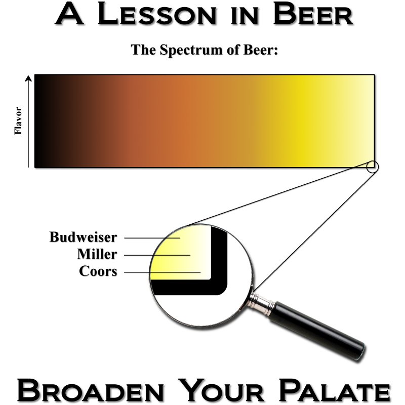
Image #1:

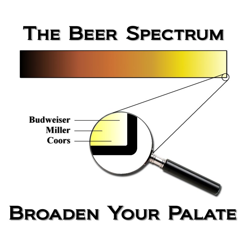
Image #2:

Poll is open for one day only!
Here's a link to the original discussion thread.
Image #1:
Image #2:
Poll is open for one day only!
Here's a link to the original discussion thread.