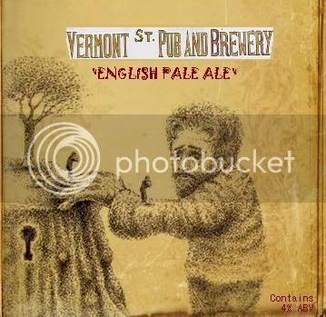
Looks good. I think you chose the correct fonts. It would be improved if you removed the white box from behind the brewery name. If you need something for readability just put a drop shadow back there.
Looks good. I think you chose the correct fonts. It would be improved if you removed the white box from behind the brewery name. If you need something for readability just put a drop shadow back there.
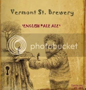
I did another one but I deleted it for some reason. I have it in my email box at home though so I will repost it. It looks much better with the brewery name changed.
The imagery was inspired by a band that my brother and I have taken a liking to. We listened to that CD while remodeling the basement and main floor of the house we bought. And its only fitting that I put the imagery on the beer brewed in the house where that CD helped with the renovation.
I agree I would remove the white background and combine both lines of text into something else or use a different background.
I also like the brown color on the label it will definitely look good on the bottle.