hightechlofi
Well-Known Member
Hi all,
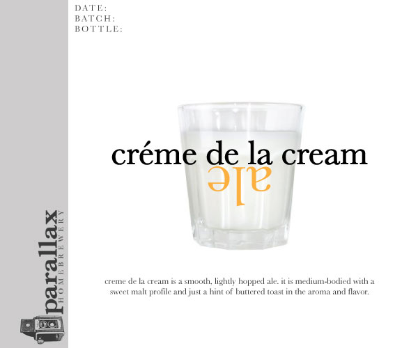
I just started brewing (waiting for my first batch to finish fermenting), but of course had to go ahead and whip up some logo's and labels. I would love your input and feedback. I have them posted on my blog: http://hightechlofi.wordpress.com
Thanks,
Josh
I just started brewing (waiting for my first batch to finish fermenting), but of course had to go ahead and whip up some logo's and labels. I would love your input and feedback. I have them posted on my blog: http://hightechlofi.wordpress.com
Thanks,
Josh