
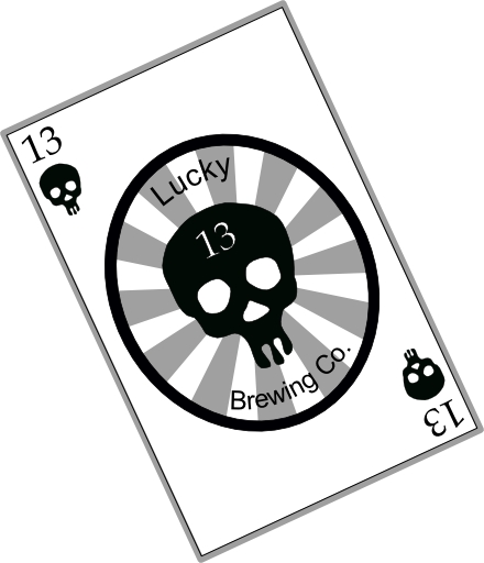
Alright, I've stumbled my way into this and here is what I got, it's between 3...
1:
2:
3:
The last two have really only minor differences but I guess I am trying to decide between the two. And in the first one, the words are in red and a bit larger, I just couldn't figure out how to post it.
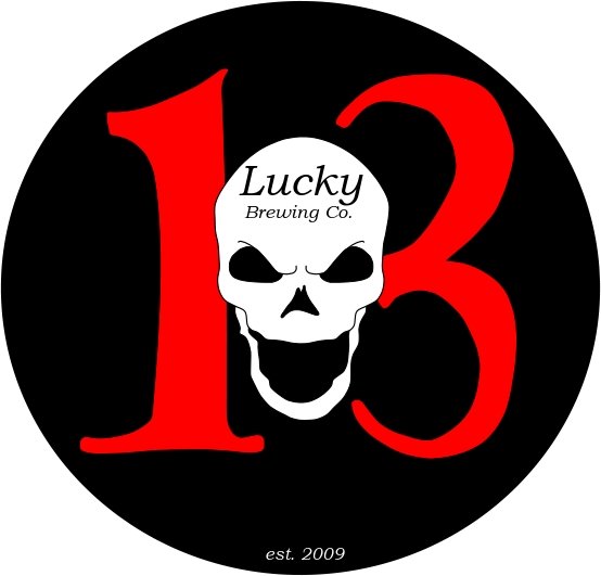
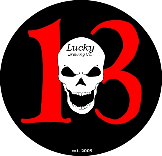
1:
2:
3:
The last two have really only minor differences but I guess I am trying to decide between the two. And in the first one, the words are in red and a bit larger, I just couldn't figure out how to post it.


![Craft A Brew - Safale BE-256 Yeast - Fermentis - Belgian Ale Dry Yeast - For Belgian & Strong Ales - Ingredients for Home Brewing - Beer Making Supplies - [3 Pack]](https://m.media-amazon.com/images/I/51bcKEwQmWL._SL500_.jpg)


