Label Review

Homebrew Talk - Beer, Wine, Mead, & Cider Brewing Discussion Forum

Help Support Homebrew Talk - Beer, Wine, Mead, & Cider Brewing Discussion Forum:

This site may earn a commission from merchant affiliate links, including eBay, Amazon, and others.

nairb80

Member
Joined
Feb 25, 2008
Messages
19
Reaction score
0
Location
West Palm Beac, FL
My first label that I made. Any comment or suggestions. I think its pretty good for a first label.

bbb.jpg
 
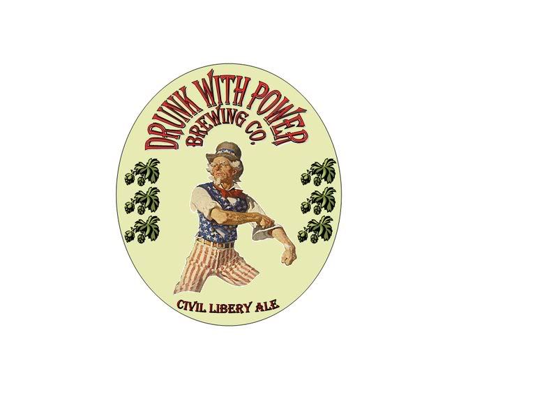
I love it - that is a very nice label! The balance and the colour scheme is really impressive. I love the font, I think it's appropriate.

I'd suggest mirroring the right-side hop pictures to make a frame for the image, and I think that the beer name has to be a bit more prominent. Right now it looks like a footnote to the brewery name.

edit: on close inspection, I've noticed that the hops are a bit clip-arty next to the rest of it, which makes them seem OOC. Perhaps someone else can suggest a source for a more old-timey hop vine border?
 
I agree with everything Kai says. It's funny and political and well-designed. I like the hops better than Kai does, I think, but flipping the ones on the left is a good thought.

You missed a T in "Liberty."
 
Looks great!!

I suggest, if anything at all, scaling the hops images down slightly and have them follow the curve of the label as opposed to straight up and down. Just my $0.02
 
Back
Top