Hockey Beer label

Homebrew Talk - Beer, Wine, Mead, & Cider Brewing Discussion Forum

Help Support Homebrew Talk - Beer, Wine, Mead, & Cider Brewing Discussion Forum:

This site may earn a commission from merchant affiliate links, including eBay, Amazon, and others.

StittsvilleJames

Well-Known Member
Joined
Jan 19, 2011
Messages
505
Reaction score
44
Location
Stittsville
In honour of my Ottawa Senators, just brewed up a batch to enjoy while I watch games this winter. If it's decent, I will keep it around all the time, as a house pale ale. It should be strong enough to keep you warm in the winter, and the only thing better than hockey and beer, is hockey and beer with a buzz! (I'll have to change the abv once I get the final gravity, but it should be pretty close).

The name, hockey beer, comes from my son who used to shout "Hockey Beer!" everytime he saw a senators logo when he was learning to talk (I guess I drink too much in my jersey, but in the immortal words of Molson, "I..Am..Canadian!!. :))

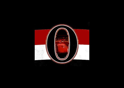
I drew inspiration from the new Sens heritage jersey, which has a big stylized O, and a semi-barber pole look to it.

Here's my label and the jersey.

In conclusion...Go Sens Go!!! Let's get first (in the draft) this year and win (the draft lottery)!!

jers_black.jpg


hockey-beer.jpg
 
I like the design, but you should modify the font. Bolder at least. not sure I like the handwritten-ness of it. Just my .02
 
I like the meaning behind the name and the overall look but believe if you tweak the fonts everything will come together. Not too crazy about the Quality beer, maybe change that to handcrafted? Good luck and Go Blackhawks!
 
I think you guys are right about the font, so I looked around and found a new font, called Bauer, which is pretty darn hockey ish.

So, what do you think of this iteration of it?

Thanks!

hockey-beer.jpg
 
You're gonna need a hell of a lot of beer to watch the Sens all winter.

Suggestion: "Hockey beer" is lame. Get creative. Maybe something like "Our-captain-is-a-dirty-Swede-Ale" or "Ray-Emery-wasn't-the-problem Ale", but you might want to shorten it.
 
You're gonna need a hell of a lot of beer to watch the Sens all winter.

Suggestion: "Hockey beer" is lame. Get creative. Maybe something like "Our-captain-is-a-dirty-Swede-Ale" or "Ray-Emery-wasn't-the-problem Ale", but you might want to shorten it.

LOL

How about "6-long-years-and-still-no-playoffs"? Oh wait.... :ban:
 
You should find the font that the Sens use for their lettering if you want to carry the theme throughout.

Edit: Also might look better if the O matches the jersey a little more...larger sides.

I love hockey themed beer and logos.
 
How did you design the oval?

Dean

I just used GIMP and drew a whole bunch of ovals on different layers, filled them with colour, and resized them until they seemed to fit.

I have Photoshop CS5 here too, but I'm more familiar with gimp, and I don't feel guilty for not paying for it everytime I launch it. ;)
 
I just used GIMP and drew a whole bunch of ovals on different layers, filled them with colour, and resized them until they seemed to fit.

I have Photoshop CS5 here too, but I'm more familiar with gimp, and I don't feel guilty for not paying for it everytime I launch it. ;)

Why not actually lift the oval off the jersey and use that?? If you have GIMP or PS or Corel PP...


Threw this together in class today...lecture was really boring. Obviously needs cleaned up, but I think it looks kinda cool.


Threw this together in class today...lecture was really boring. Obviously needs cleaned up, but I think it looks kinda cool.

I think I may steal you idea, but will use it on the neck of the bottle.

:rockin:

EDIT:

Thanks for the inspiration for the neck label Boleslaus! I'm worried that the picture inside the O may be a little too small to see when it's printed, but if it ends up not working out, I will just put a picture of Alfreddson's jerseyin there.

Here is the finished product:

hockey_ber-necklabel.jpg
 
Back
Top