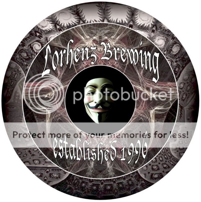
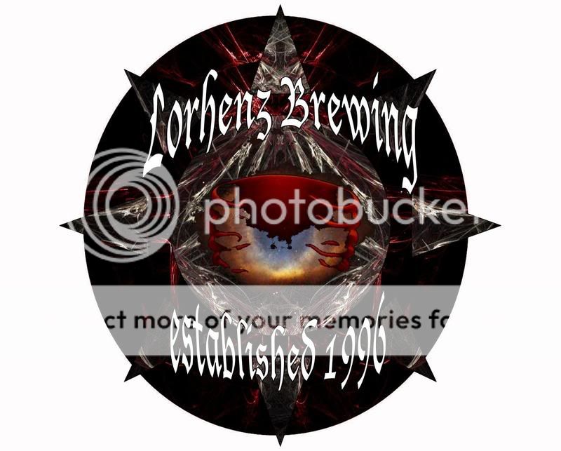
Logo too busy?

Homebrew Talk - Beer, Wine, Mead, & Cider Brewing Discussion Forum

Help Support Homebrew Talk - Beer, Wine, Mead, & Cider Brewing Discussion Forum:

This site may earn a commission from merchant affiliate links, including eBay, Amazon, and others.
not overly busy, just change the font...just because it catches your eye doesnt mean that people will stop to look at it if they cant read it
 
rh348877 said:
Is this too much crap on my logo? It seems kinda hard to read

I apologize in advance for that you have to follow a link.

http://i9.photobucket.com/albums/a78/rh348877/newlogo2.jpg

Use the image tag.

newlogo2.jpg
 
Denny's Evil Concoctions said:
I don't think you need to change the font, just the outlining or something to make the font stand out from the background. There are many options there.


I really like the font, but it is hard to read. I have a black outline around the text. I tried pretty much every possible color but black came out the best.
 
Im sorry, but it reminds me of V for Vendetta. awful movie.

It is awfully busy. I would go in another direction or darken the graphic border alot.
 
thanks for the input guys. I'll keep working on it. You must have something to do while you're not making beer right?
 
Denny's Evil Concoctions said:
Try a drop shadow.
Word, it looks great and I like the font. A drop shadow will make it pop out a bit more and separate it from the background.
 
If you would like my graphical advice, I'd add a little bit bigger black outline on your text, to bold it out. Then maybe simplify the outermost ring, so your eye is drawn into the center. The busy outside ring competes with the main focal point.

Just my 2 cents.
 
That was my first reaction too Kahuna. It looks really cool, but a bit much for a logo.

I think with that much detail, it can't be that dark. And by brightening it up a bit, you wouldn't have as much contrast with the text, which would be kinder on the eyes.
 
Back
Top