Favorite Commecial Labels

Homebrew Talk - Beer, Wine, Mead, & Cider Brewing Discussion Forum

Help Support Homebrew Talk - Beer, Wine, Mead, & Cider Brewing Discussion Forum:

This site may earn a commission from merchant affiliate links, including eBay, Amazon, and others.

Short Drive

Brewer Baseball!
HBT Supporter
Joined
Oct 14, 2006
Messages
1,785
Reaction score
1
Location
Racine WI
I think some beer labels are starting to become real works of art. My favorite are from Flying Dog Ales.
beer-varietypack.jpg


They are original and eye catching.

"Art is our first language and we like and agree with what Ralph Steadman chooses to say through his art on our labels; that this is a wonderful world on a wacky path."
- Flying Dog Co-founder George Stranahan

Any other favorites out there?

Al
 
I tend to shy away from labels that look like they were drawn by 3rd graders. I prefer a more classical appearance. Focus your energies on the INSIDE of the bottle...
 
Hey, don't knock Steadman. He rocks. Saying his art looks like it was drawn by third graders is kind of like saying that French Impressionist era artwork looks like it was painted by people with really bad vision.

BTW, Flying Dog does a great job on the stuff inside too. You know, i is possible to make great beer AND have nice labels too. And if you knew anything about the industry, you'd know that label design plays a huge part in the success of your beverage. Poorly done labels can turn off potential customers, while graphically pleasing ones can draw in those who would otherwise walk right by your beer. You'd be surprised how many people come into our shop and buy stuff just by what the label looks like. Yes, silly, but that's the market. The same market that buys 'Goats do Roam' because of the silly name.
 
Short Drive said:
I think some beer labels are starting to become real works of art. My favorite are from Flying Dog Ales.
beer-varietypack.jpg


They are original and eye catching.

"Art is our first language and we like and agree with what Ralph Steadman chooses to say through his art on our labels; that this is a wonderful world on a wacky path."
- Flying Dog Co-founder George Stranahan

Any other favorites out there?

Al

I shall have to agree that the Flying Dog labels have to be some of the best out there. I'm always finding something new on them that I've never noticed before. My favorite label has to be the Road Dog Porter. Good Beer - No ****! Good People Drink Good Beer. 2 great quotes on 1 label :tank: 
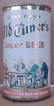
I also really liked the older Shiner Hefeweizen label. They used to have the large picture of the guy on the label. Was always a pleasure making that guy smile! :mug:
 
I think that the flying dog labels are too busy. When I seem them on tap handles, it's tough to tell what kind of beer it is. I'm not a fan of the beer, but I like this label

RogueAlesDeadGuyAle.gif


I like this one too

monty_pythons_holy_grail_ale.jpg
 
I think one of the coolest things about homebrewing is the fact that the best beer some people will ever have will come in a plain brown unmarked bottle with just maybe some simple handwriting on it. There's something cool about that....

I agree, the Flying Dog labels are too busy. I have to walk right up to tell what the heck kind of beer it is and that seems counterproductive to getting me to pick it up on a whim. And just because "people" walk in and buy something just because of the label doesn't mean that it is a smart thing to do. Flying dog is one of the few breweries where I can't name the styles of beer they sell. I know they have a barley wine, because I tried it. But I don't know what their other styles are because I can't tell from the package without staring at them for 5 minutes. LOL. And the only reason I bought the barleywine is that I was looking for one and SWMBO noticed it on the package. She was drawn in. I was repulsed.

I have avoided their beers because the over-the-top style makes me think they are trying to overhype themselves.

The Dark Lord has a similarly goofy label. The dark lord is released once a year, has a waxed top, and is 13% abv. It's a beer brewed with extreme passion. There is a once-a-year party surrounding this beer. I can overlook the label.

I still prefer product info over flashy design. I know there are others that think differently and I know they must be marketed to as well. I'm just saying the appearance of their product has always made me extremely skeptical...

Then again, NASCAR is brightly colored too, and I can't stand that either...
 
Toot said:
And just because "people" walk in and buy something just because of the label doesn't mean that it is a smart thing to do.

I suppose that that decision is ultimately in the hands of the free market. Is it "smart" in terms of whether it is too busy for certain people? No. Is it "smart" in that getting a renowned artist to design your labels with wacked-out drawings may just draw in a certain clientèle? I suppose if it wasn't, then they'd stop doing it. It must still be making money for them, or they'd switch up. Unless they like not making money just to do a favor for Ralph Steadman. It certainly hasn't hurt Bonny Doon as far as I can see.

I have avoided their beers because the over-the-top style makes me think they are trying to overhype themselves.

Like I said, if that was the market consensus, I think they'd have changed up their strategy by now.

I still prefer product info over flashy design. I know there are others that think differently and I know they must be marketed to as well. I'm just saying the appearance of their product has always made me extremely skeptical...

But if you prejudge based on a flashy label, are you really any different from the people who would buy it because of the flashy label? If the beer inside is good, then it shouldn't matter either way. For the non-beer-geeks who are looking for something cool to buy, it matters, so they make their labels flashy and catchy. For the beer geeks, the label shouldn't matter either way, so what do they have to lose? I for one never base my opinions of a beer or wine on the label.
 
Evan! said:
But if you prejudge based on a flashy label, are you really any different from the people who would buy it because of the flashy label? If the beer inside is good, then it shouldn't matter either way. For the non-beer-geeks who are looking for something cool to buy, it matters, so they make their labels flashy and catchy. For the beer geeks, the label shouldn't matter either way, so what do they have to lose? I for one never base my opinions of a beer or wine on the label.

I tried the barleywine. I was unimpressed. It wasn't bad, but it was one of the 5 least interesting ones I've ever had. It struck me as the BMC of barleywines. There is only one barleywine which I've had and would rate lower overall, although I would choose the Flying Dog over about 4 or 5 others that just don't suit my palate.

Now, if they make a beer that I am absolutely missing out on, I'm all ears, but I tried one 4-pack and felt as though my suspicions were confirmed. I didn't feel ripped off or anything, just a little disappointed.

Anyway, this is about labels, not beers, so I'll bow out of the discussion. You may have the last word if you choose. I'll go find a label I like... hold on..
 
Yeah, they have some good stuff and fortunately they're not too far away from where I live. Although I don't know if I'd ever find them without a GPS.

It's not a beer label, but I don't think anything beats the simplicity of this porto label:

porto.jpg


A stencil and paint. Brilliant!
 
abarilla said:
Yeah, they have some good stuff and fortunately they're not too far away from where I live. Although I don't know if I'd ever find them without a GPS.

It's not a beer label, but I don't think anything beats the simplicity of this porto label:

porto.jpg


A stencil and paint. Brilliant!


Especially since port is meant to be aged and a label would be too easy to slip off or change. I'd really hate to drop a few hundred on a bottle and then discover that they switched the labels on me (assuming you could even tell the difference in some cases)


Anyway, I like the design for Rogue's Imperial Pilsner. Looks very Japanesey to me for some reason.


Trois Pistoles is a great label as well.


And of course, I don't think anything is as identifiable as Delirium Tremens. "Just look for the pink elephant!" lol
 
The reason I started this thread was to really talk about the art on the labels, which Flying Dog has in abundance. What got me thinking about it was seeing a bottle of Mouton Rothschild.
Mr1998.jpg


Mouton has always had great labels and great wine. Why should they be mutually exclusive? To me, in Flying Dog's case, their labels represent a corporate philosophy of trying to put out the best product both taste wise and visually. I know this philosophy is shared by many here. Why else would so much work have gone into helping Brew Pastor design his Iconoclast label. Art has a place on the outside of the bottle as well as in.

Al
 
First of all I think a world class product should be well designed and executed on all fronts. The label is part of the presentation and is not terribly different than evaluating a beer's color or the glass that it is served in.

It's a detail that helps discriminate and differentiate a product.

Is it the controlling factor? No, of course not.
 
I think some of the Stone labels are good. I like how they are printed on the bottle, at least until I try and reuse them and it won't come off. You have to like a label that says you are not worthy of drinking the beer.
 
olllllo said:
First of all I think a world class product should be well designed and executed on all fronts. The label is part of the presentation and is not terribly different than evaluating a beer's color or the glass that it is served in.

It's a detail that helps discriminate and differentiate a product.

Is it the controlling factor? No, of course not.


The term "product" is interesting. It's like a business school term that suggests it is interchangeable with anything else. I'll trade you this product for that product, hey, they're both products! Bah... To me, every beer is special, every beer is sacred... They do not deserve to be compared by their labels any more than people do.

That's right, I am a card-carrying member of the North American Association for the Advancement of Tasty Beers. N Triple-A T B. We will not let our beers be denigrated. We will not let our beers be marginalized!

*hic!* :drunk:
 
Hermish said:
I think some of the Stone labels are good. I like how they are printed on the bottle, at least until I try and reuse them and it won't come off. You have to like a label that says you are not worthy of drinking the beer.

agreed!

intro.gif


ipaleft.jpg
 
Toot said:
The term "product" is interesting. It's like a business school term that suggests it is interchangeable with anything else. I'll trade you this product for that product, hey, they're both products! Bah... To me, every beer is special, every beer is sacred... They do not deserve to be compared by their labels any more than people do.

That's right, I am a card-carrying member of the North American Association for the Advancement of Tasty Beers. N Triple-A T B. We will not let our beers be denigrated. We will not let our beers be marginalized!

*hic!* :drunk:

The fungability of products and services is the cornerstone of our way of life.
If your not satisfied with that, I'll be glad to peel the labels off your commercial beers if you turn over all of your President logo'd green paper.
 
olllllo said:
The fungability of products and services is the cornerstone of our way of life.

Speak for yourself. The cornerstone of my way of life is the acknowledgment that I am primarily focused on the maximization of enjoyment and satisfaction, doing as much of whatever I want whenever I want regardless of what others may think. The fungibility of goods and products isn't the cornerstone of my way of life, it just makes it a little easier for me to further my own interests... :)

If your not satisfied with that, I'll be glad to peel the labels off your commercial beers if you turn over all of your President logo'd green paper.

So exactly which flavor is enhanced by the fungibility of goods and services? Does that add malty aroma or hoppy bitterness?
 
Toot said:
Speak for yourself. The cornerstone of my way of life is the acknowledgment that I am primarily focused on the maximization of enjoyment and satisfaction, doing as much of whatever I want whenever I want regardless of what others may think. The fungibility of goods and products isn't the cornerstone of my way of life, it just makes it a little easier for me to further my own interests... :)

So exactly which flavor is enhanced by the fungibility of goods and services? Does that add malty aroma or hoppy bitterness?

The nature of a post is to speak for oneself.

I'm sorry, I guess you're off the grid also?
In your uptopia, if people enjoy a well designed logo may they also
"<focus> on the maximization of enjoyment and satisfaction, doing as much of whatever <they> want whenever <they> want regardless of what others may think<?>"

How do you feel about a poorly designed label then. Are you apt to pick up a Tub Girl Ale (with graphic label)?

Taste and our other senses are tied to the external environment. Things are experienced differently in different contexts.
 
I agree that the overall presentation is important, but then art is important to me. As an artist it is often apparent to me that a LARGE % of the population (here in the U.S. at least) could not give flying F%&# about artistic concerns be they visual/musical/ or what have you, yet art is EVERYWHERE. I guess the question is, would people care if the art was not there.

Okay back to labels...

I too enjoy the old labels, but then I also have a "thing" for most anything antiquated.

I have to say I cannot really think of too many modern labels I am fond of save maybe:

BoulevardBullyPorterGRI.jpg


pretty tasty contents too.
 
olllllo said:
I'm sorry, I guess you're off the grid also?
Of course not! Because 1. that wouldn't be fun for me; 2. Electricity is a product which requires no branding or differentiation. Electricity is Electricity. Kind of like Budweiser and Coors and Miller. They're all the same, they just have different labels. 3. See point 1- I wouldn't enjoy it.

How do you feel about a poorly designed label then. Are you apt to pick up a Tub Girl Ale (with graphic label)?
If it was truly an amazing beer? I definitely would. I would then pour it into a glass like a civilized human being and throw the bottle away. Wouldn't you?

Taste and our other senses are tied to the external environment. Things are experienced differently in different contexts.

But that doesn't change the reality. If you don't like a beer because tub girl is on the label, then I question whether you really have full control of your faculties. I could understand a 5 year old acting like that, getting excited about a cereal with a cartoon character on it, but aren't we supposed to grow up at some point and be a little less superficial?

To me, fancy labels that make it difficult to recognize the product is a big turn off. I want to be able to walk down the aisle, glance at a package, and know what's inside. I guess if I were LOOKING for the Flying Dog Ales, then the labels would help me identify them on the shelves, but the problem is, I don't have brand loyalty. If FD's barley wine sucks and their porter is good, then I will seek out their porter. But the busy-ness of the labels make me look three times harder for the style of beer. So I generally look at the easier to read bottles first and then, if I don't find what I'm looking for, I wade through "the rest" which are more difficult to read and decipher...
 
knights of Gambrinus said:
I have to say I cannot really think of too many modern labels I am fond of save maybe:

BoulevardBullyPorterGRI.jpg


pretty tasty contents too.

It's modern but has historic qualities.
When was the last time you saw anyone with a monacle or heard someone (other than Baron von Bee Gee) exclaim "Bully".

Boulevard logo and script has elements of the 20's.
 
Toot said:
I question whether you really have full control of your faculties. I could understand a 5 year old acting like that, getting excited about a cereal with a cartoon character on it, but aren't we supposed to grow up at some point and be a little less superficial?

Um...

I think you described your girlfriend as looking hot.
 
Label?
https://www.homebrewtalk.com/showpost.php?p=215621&postcount=6

My first serious girlfriend was a middle-eastern brunette... great olive skin, fantastic set of tits, just awesome.

Then I dated a bunch of white girls and couldn't stand them. I never found any one that I liked, even slightly. I thought none could ever compare to my first love.

Then I discovered latinas. Dated one from Costa Rica, one from Mexico and a few others and my faith in womankind was restored. I just love that middle-of-the-road year-round tan, ya know? But as I was dating my most recent latina, I found my eye being drawn more and more to blondes again. And to white girls.. and I thought to myself, "Damn.. if I stay with this girl, I'll never nail another white chick again and that would be sad."

So we broke up because she was a raging latina beeotch (it's amazing how many of those are out there... and how well they can hide it!!!) and now I'm dating a a 5'8" athletic blonde chick with a D-cup and a penchant for eiswein, Optimator, and tequila. Best of all though, she cooks like mad!!! So far this year, I've had homemade chili, pierogies from scratch, mousaka, and a variety of other similarly complicated dishes. The woman cooks a whole turkey, makes soup from the carcas, and is done by 2pm as though it were no big deal. And for Valentine's day? She found an "I Dream of Genie" costume. OMFG...

So yeah, now I'm back to blondes. Sure, I still look longingly at the foreign ladies in the middle of the winter with their 24/7/365 tans. That'd be really nice to have. And if SWMBO ever permits me to have a second wife, I know where to start looking. But for now, I'm happy with my wonderful girlfriend...
 
olllllo said:
It's modern but has historic qualities.
When was the last time you saw anyone with a monacle or heard someone (other than Baron von Bee Gee) exclaim "Bully".

Boulevard logo and script has elements of the 20's.

Exactly, plus they simulate wood engraving/ woodcut techniques for their images, a personal weakness. Additionally speaking of overall presnetation, there packaging was pretty cool too (have not seen it lately) 6 and 12 pack boxes.


On a different note, I use to get a beer in college with an awful name. I think they went out of business. The beer was always cheap but pretty decent. It was called "Goats Breath Bock" Cannot recall the labels, alas.
 
olllllo said:
Um...

I think you described your girlfriend as looking hot.


I appreciate hotness. I even appreciate the artwork on the Flying Dog bottles. I would definitely hang a piece of that guy's art up in my office.

It's great artwork... but a really ****ty beer label, imho.
 
Vermicous said:
some of my personal favorites

smuttynose.JPG


I'm with you. I like the Smuttynose labels! Middle Ages Brewing Company has some good labels too (Wailing Wench, Grail Ale, Duke of Winship).
 
Same here. I like Steadman, but it can be too much for such a small patch of 'canvas', so to speak. I love old beer artwork like this:

oldtimerswestflat1.jpg


Or some of the old Schmidt cans - "The Brew That Grew with the Great Northwest!


BeerCans4_002.jpg


And finally, these classics:

noflash.gif
 
I'm a big fan of Steadman and was happy to see his artwork on a beer bottle.

Another amusing one, though they had to change the name.

goldenshower.jpg
 
I love the story behind Maudite. (The Damned)

Maudite has a typically Quebecois name that is reminiscent of the legend of the Chasse-Galerie (the legend of the Flying Canoe). Legend has it that a group of lumberjacks struck a deal with the devil to fly home in their canoes, guided by Satan himself, to make it home in time for Christmas.

The deal was though they could never land.
 
As an artist it is often apparent to me that a LARGE % of the population (here in the U.S. at least) could not give flying F%&# about artistic concerns be they visual/musical/ or what have you, yet art is EVERYWHERE. I guess the question is, would people care if the art was not there.

I think people take visual presentation for granted. They act like they don't give a damn, and sarcastically flap their wrist and say "la-de-da" whenever someone talks about art and design. But if nobody made the effort and everything just looked plain, people would piss and moan about it. I am acutely aware of this attitude as a graphic designer looking for work in this horrendous economy.

That said, here are some labels that I like.

No pretense here, a label that says "you're not f***ing around if you buy this beer"
sixtus_label_us.jpg


Here's another cool one I found. I wish they still used this one.
orval.gif


Found this on some guys website, the beer is probably a run-of-the mill lager, but the label is undisputably cool as hell.
Label.jpg
 
While it may not be "commercial", Brewtopia has the best labels I have seen with his Naked City line. I think my favorite is the Pale Rider label. The rest of his labels are great as well. All of the old films and such.

5979-PaleRiderAPALabel_thumb.jpg
 
Back
Top